

Project Overview
Flex Index is a platform that aggregates flexible work and workplace metrics, enabling leaders to assess their office space and policies. The project aimed to redesign the existing dashboard to allow users dive deeper into their own data, improve data visualization, and provide clarity and insights. From these user improvements, we ultimately hoped to increase user engagement, enhance perceived product value, and drive new customer data acquisition for the business.
Objectives
1. Redesign the dashboard for enhanced visual appeal and usability
2. Reevaluate and optimize displayed data
3. Implement office data visualization
4. Enable data filtering for specific offices or office groups
5. Facilitate data comparison between offices or office groups
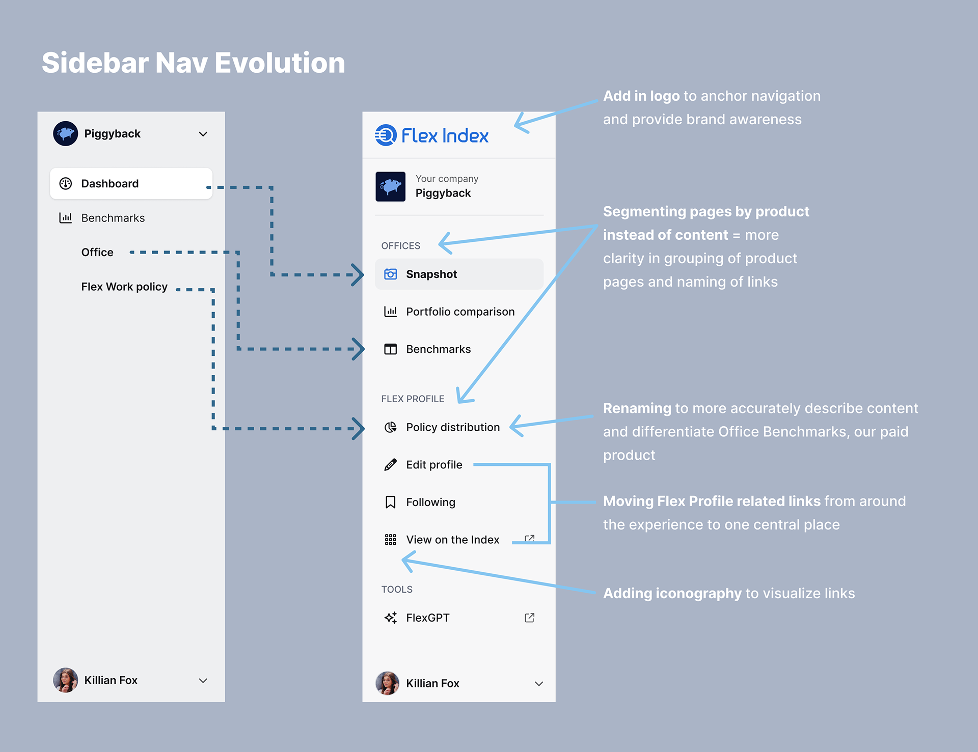
6. Revamp overall navigation (visual and architectural)
Designs
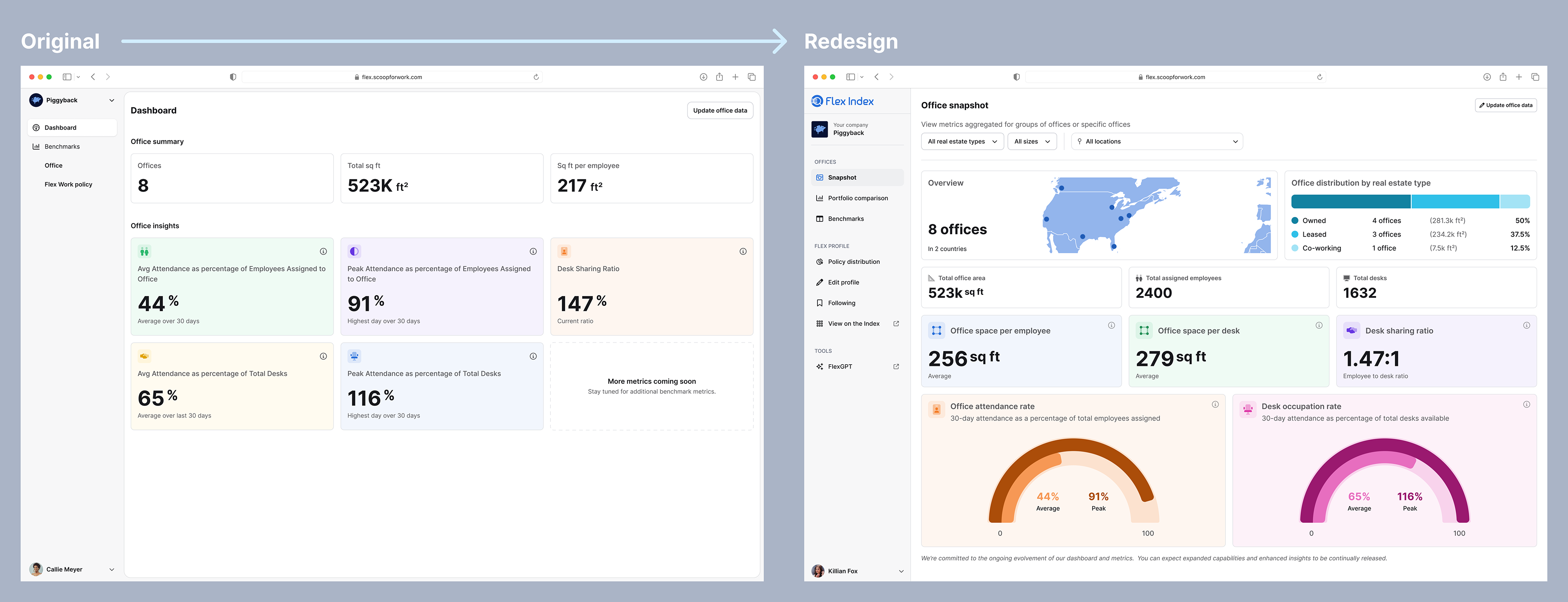
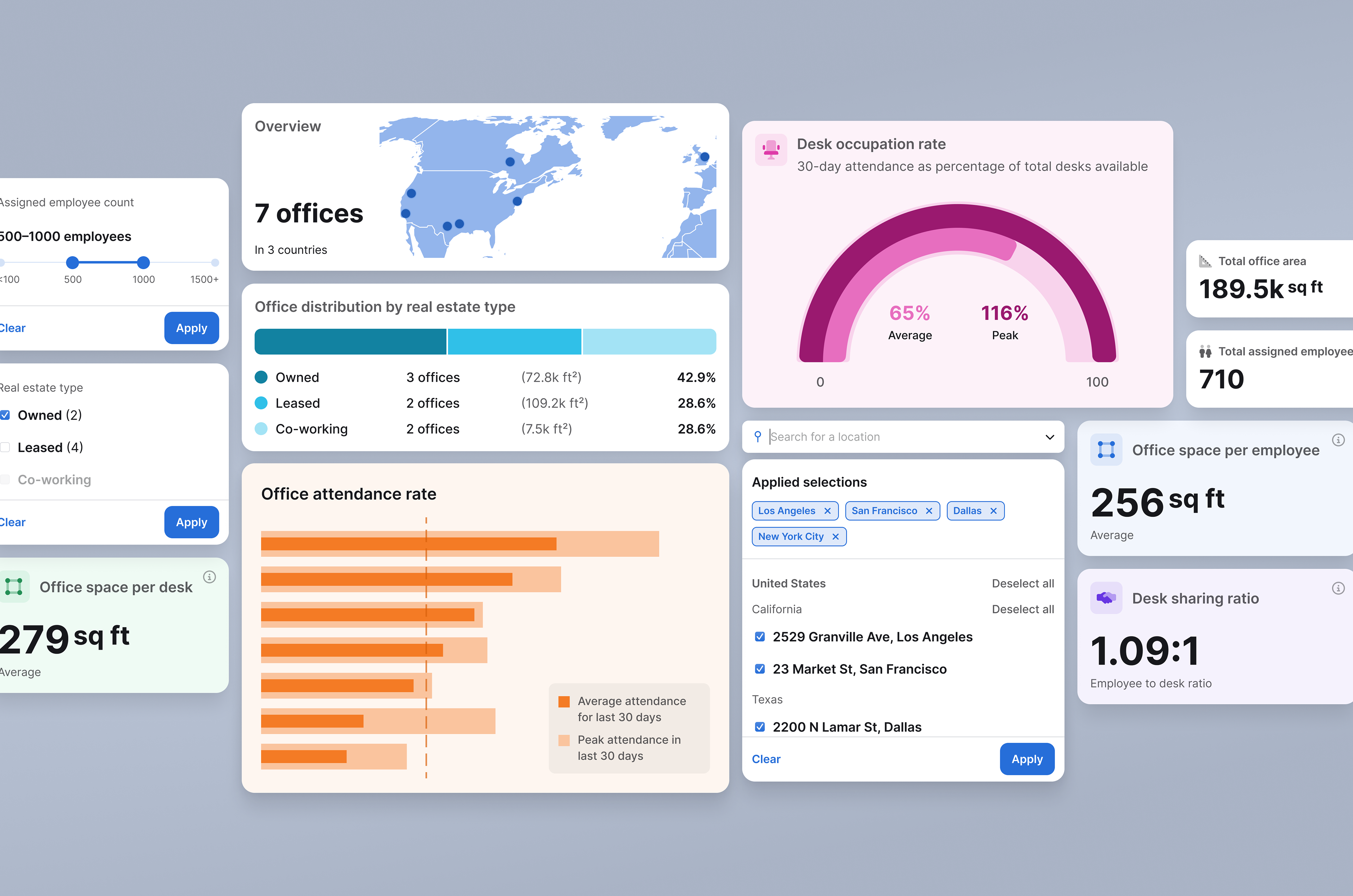
I redesigned the dashboard view to add visualizations, to optimize both what and how data is displayed and to enable data filtering.
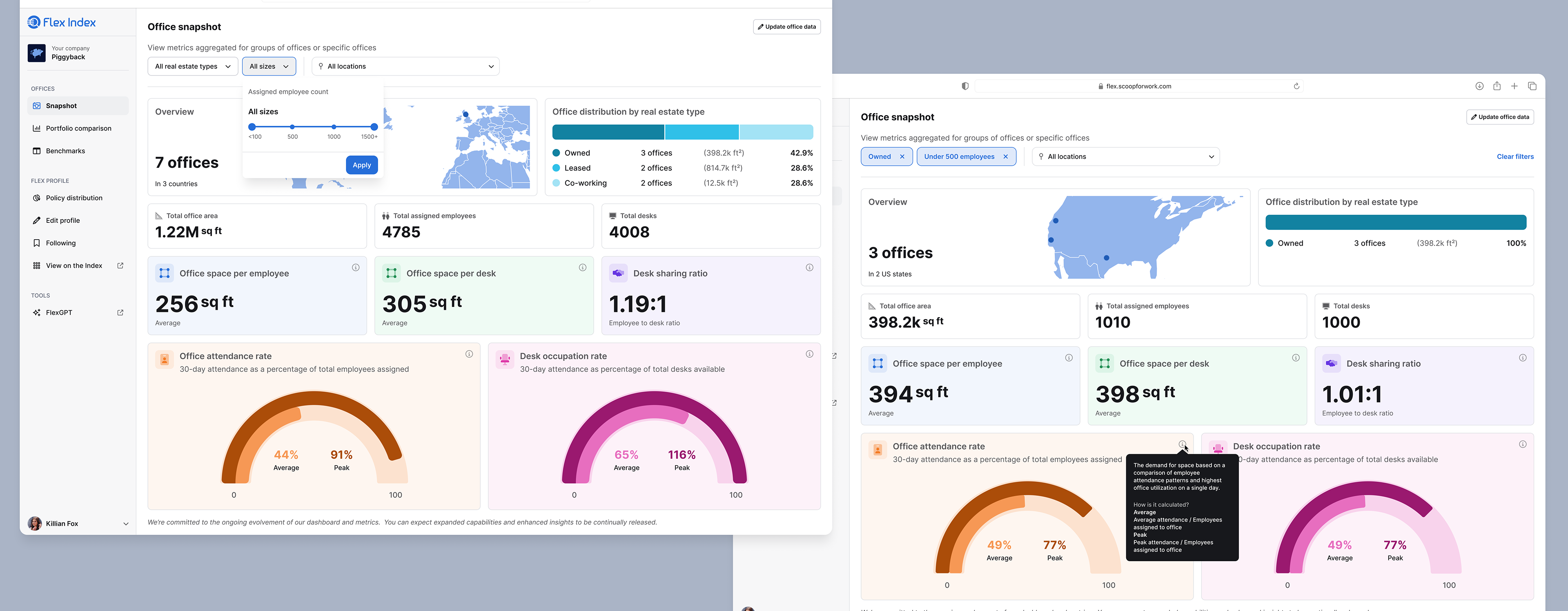
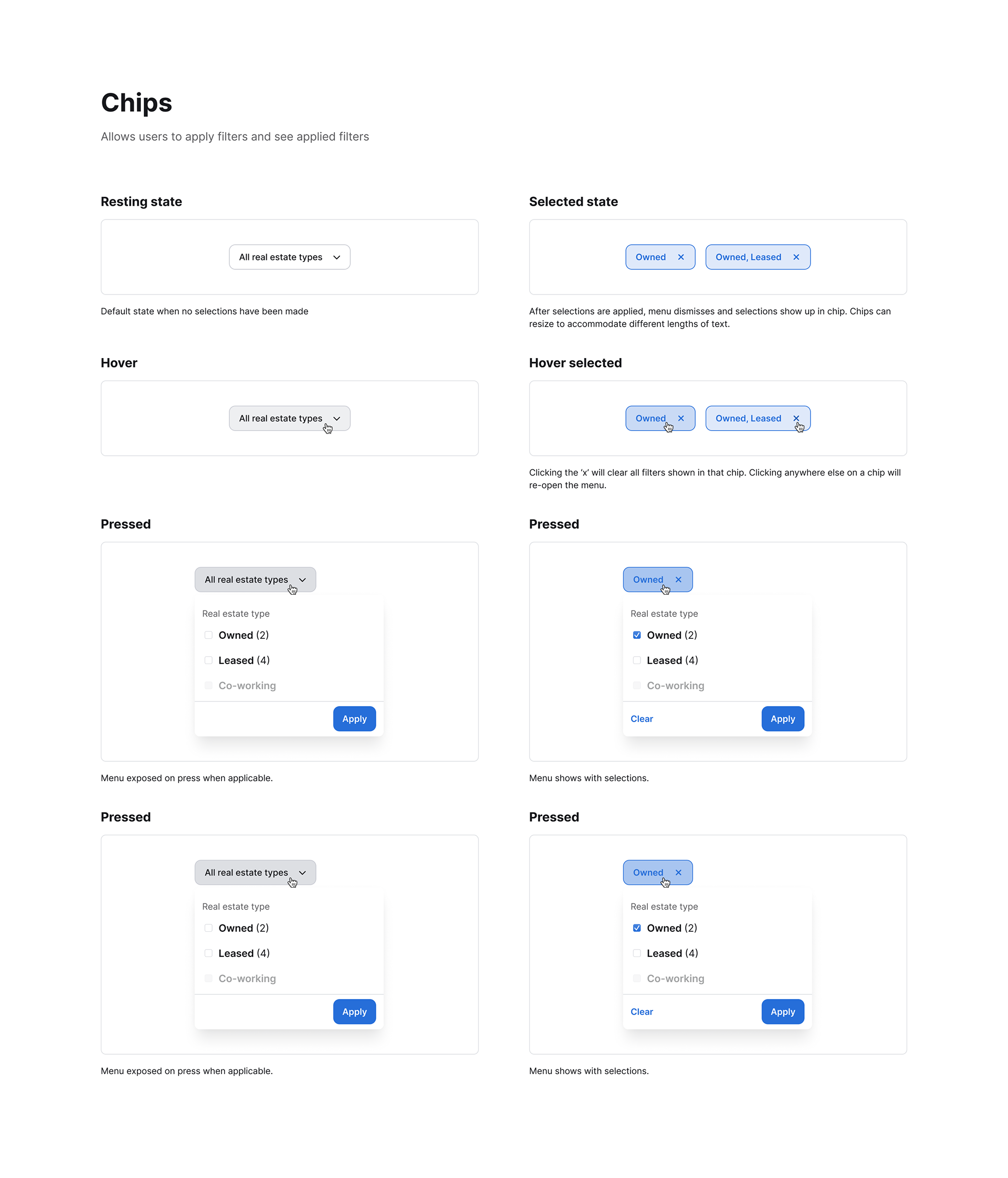
Along with the redesign, filters are added to allow more granular analysis of an office portfolio. The first two filters are group filters. Shown in their selected state on the right, the dashboard is filtered to only show offices that fit in selected groups (e.g. Owned office spaces with under 500 employees).
The more complex metrics have a tooltip shown on the right. This provides extra context about what insights to draw from this metric and how it is calculated.
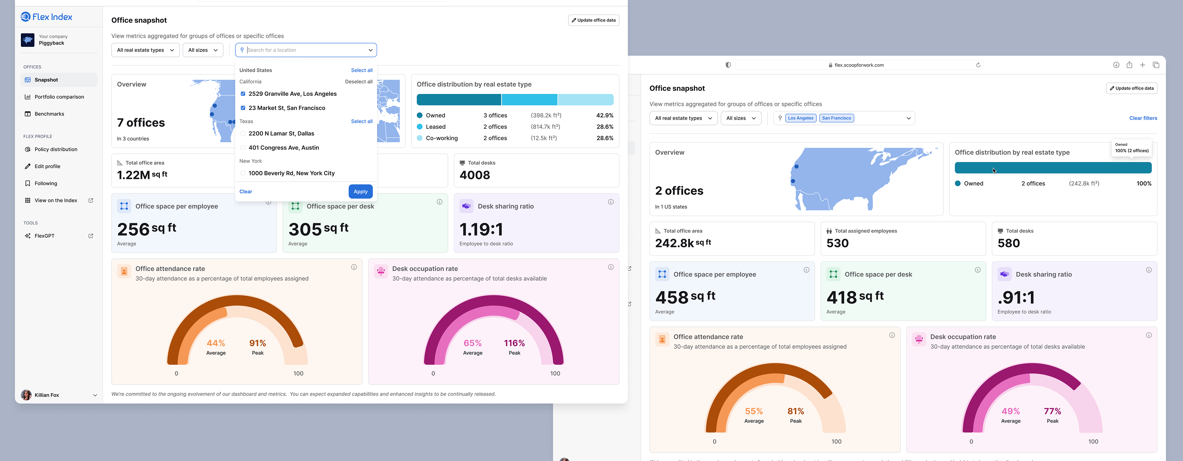
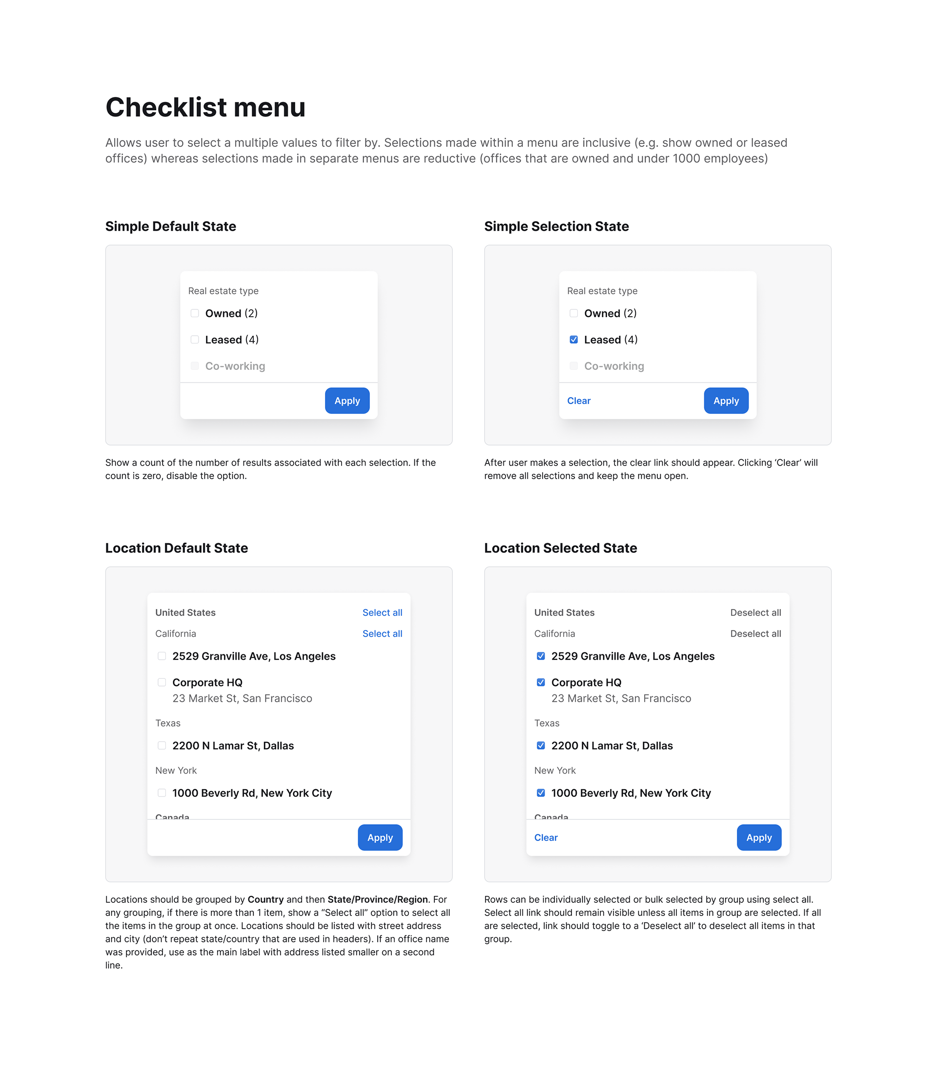
The location filter is designed to allow users to search for and select both specific offices and groups of offices in a location (Country and State/Region). After selection, all metrics are updated to reflect aggregates of those specific offices.
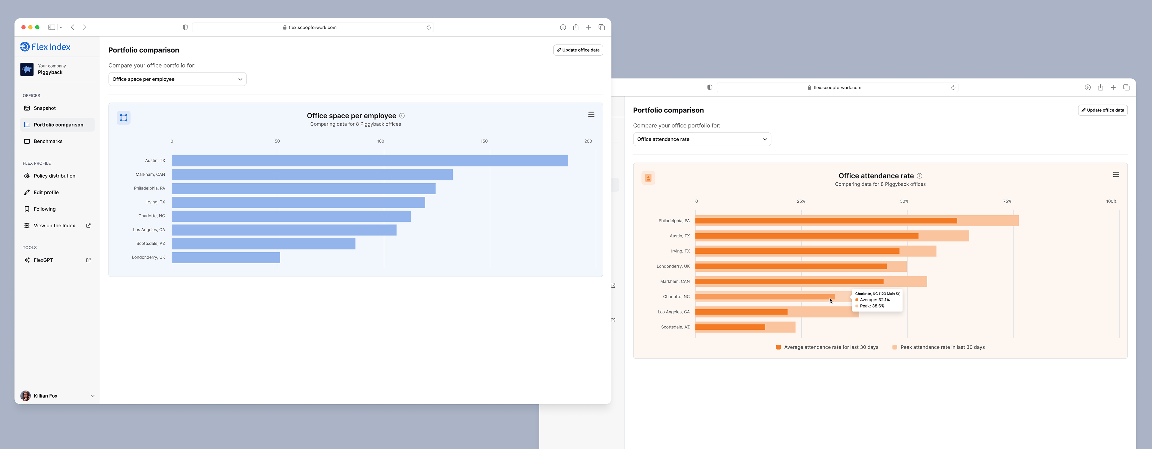
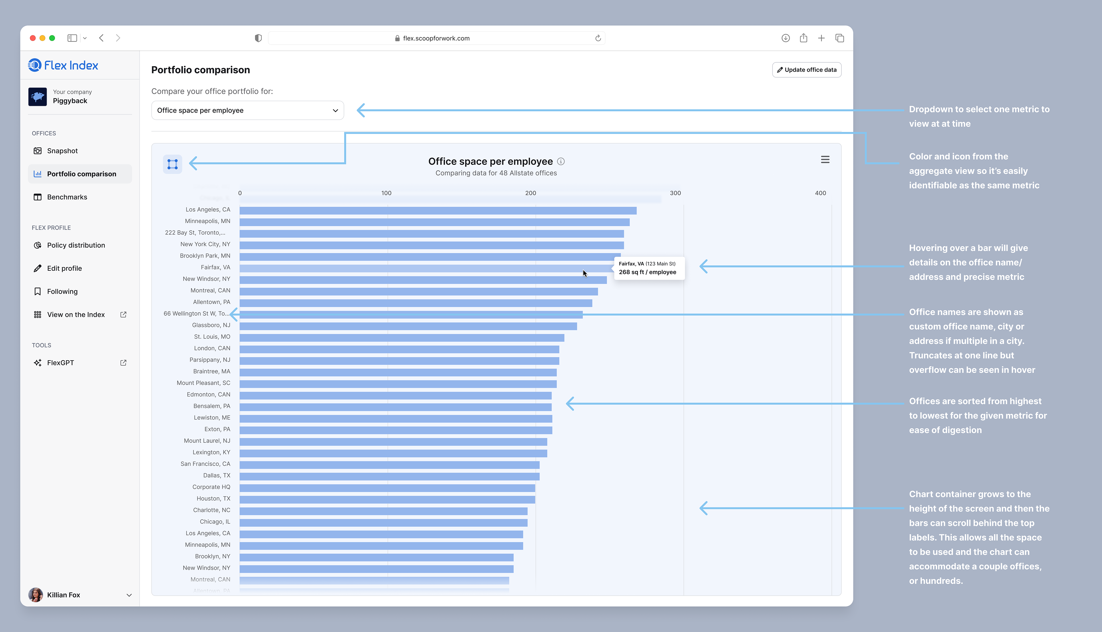
The comparison view allows a user to compare their offices for a selected metric. Shown above for "Office space per employee" and "Office attendance rate"
Process
Research and Discovery
• Collaborated with the product manager to compile requirements
• Consulted sales and business teams for insights on office data presentation
• Gathered user feedback on desired features post-data upload
• Analyzed the existing design to identify areas for improvement in language, design, and outputs
• Explored Highcharts (third party charting library) for potential graph visualizations
Design Strategy
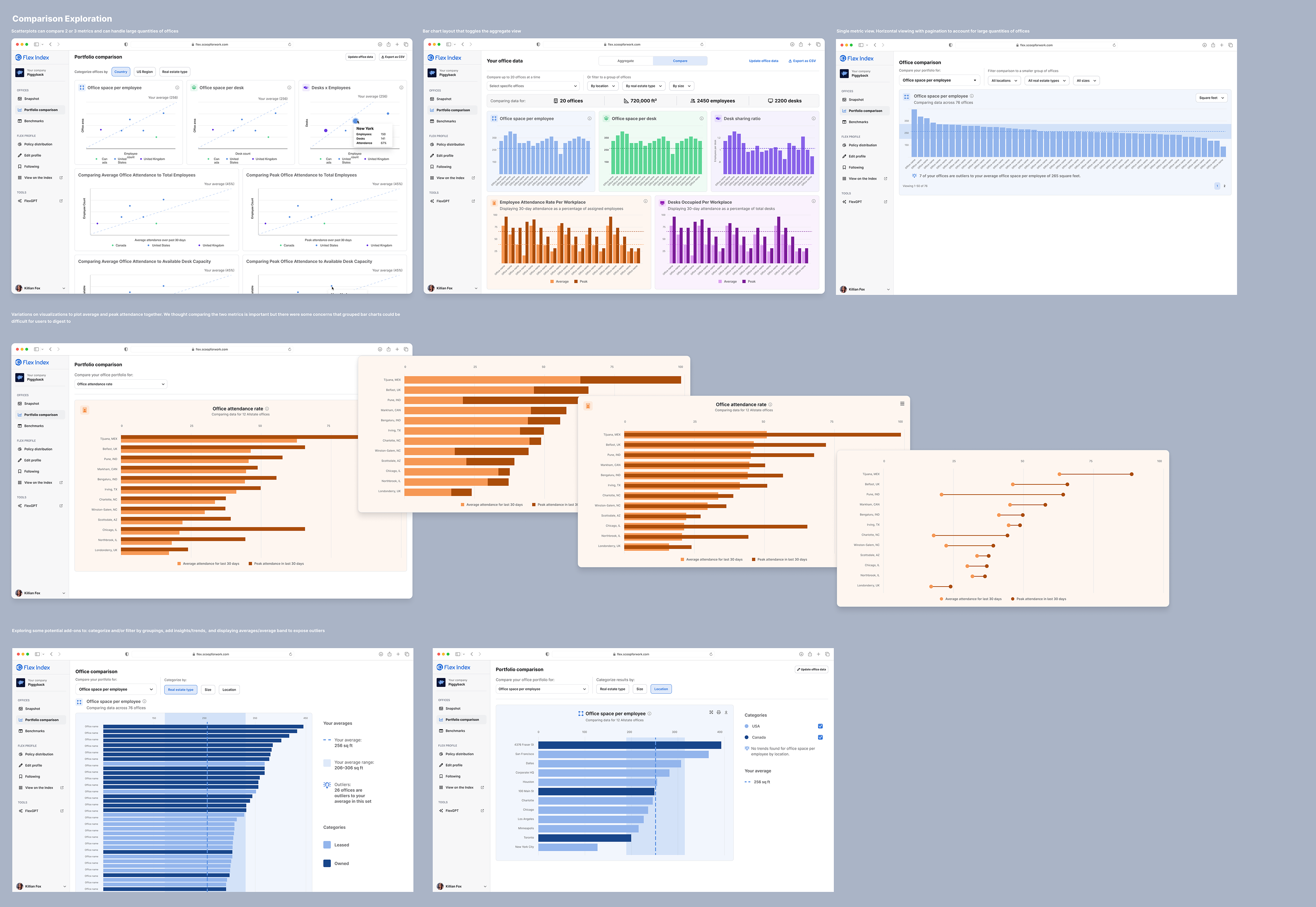
Based on the research, the proposal was to create two separate views:
1. Aggregate data view for a company's office portfolio
2. Comparative data view for office portfolio analysis
2. Comparative data view for office portfolio analysis
This segmentation aimed to maintain focus and improve digestibility for each data set. This also helped to inform the adjustments I made to the navigation in which we grouped all "Office" views together (two new views, plus Benchmarks) and "Flex Profile" views in a separate grouping.
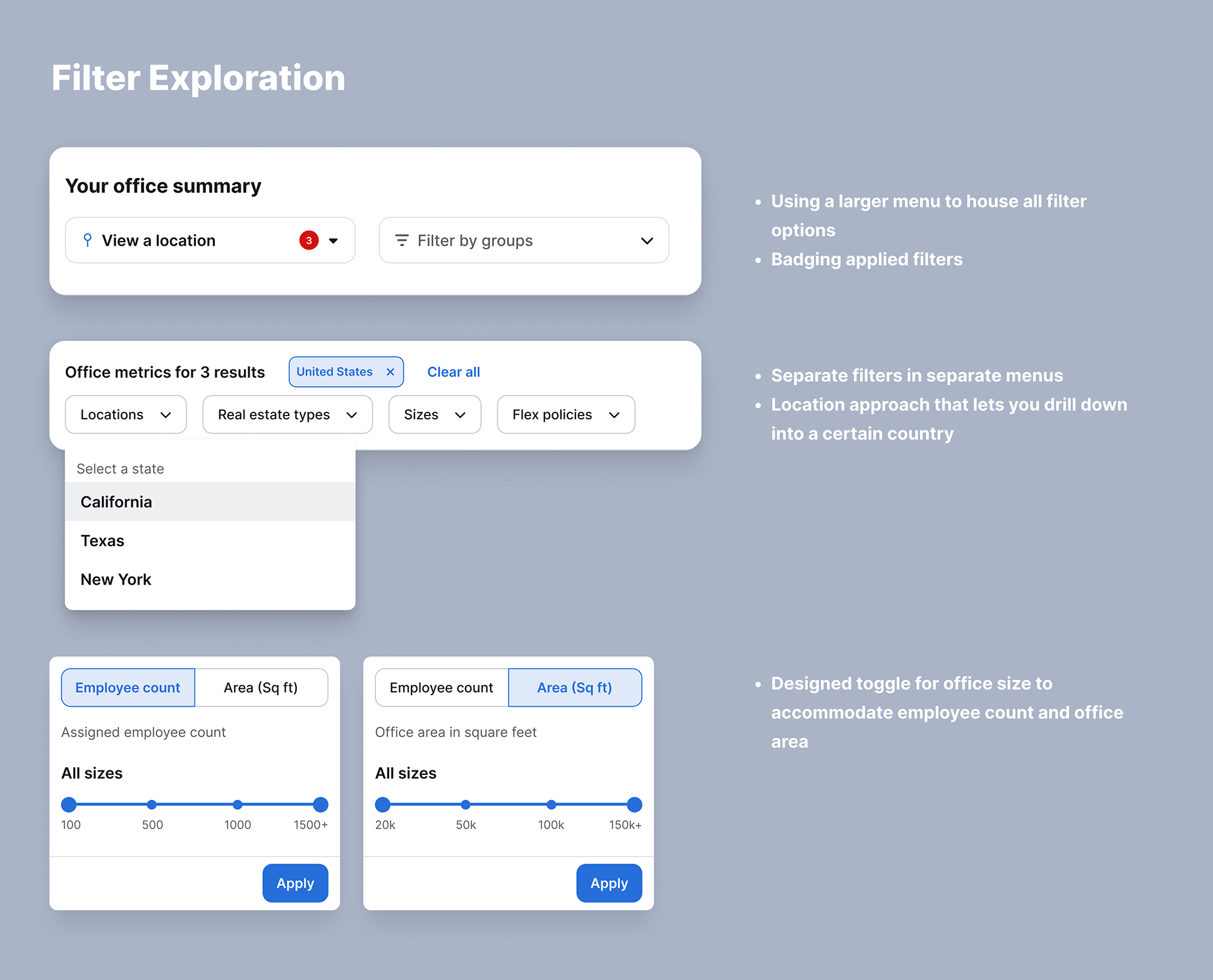
Aggregate View Design
Filtering System
The design of the filtering system required careful consideration to balance flexibility, usability, and data representation. Here's a detailed breakdown of the thought process for each filter type:
1. Real Estate Type: A checkbox list with different real estate types
Rationale: With only three specific options, a simple and clear UI was crucial.
Key Features:
- Displays the number of offices in each categorization
- Allows multiple selections for comprehensive analysis
- Displays the number of offices in each categorization
- Allows multiple selections for comprehensive analysis
User Benefit: Quick visual understanding of portfolio composition across real estate types and ability to easily compare metrics between them
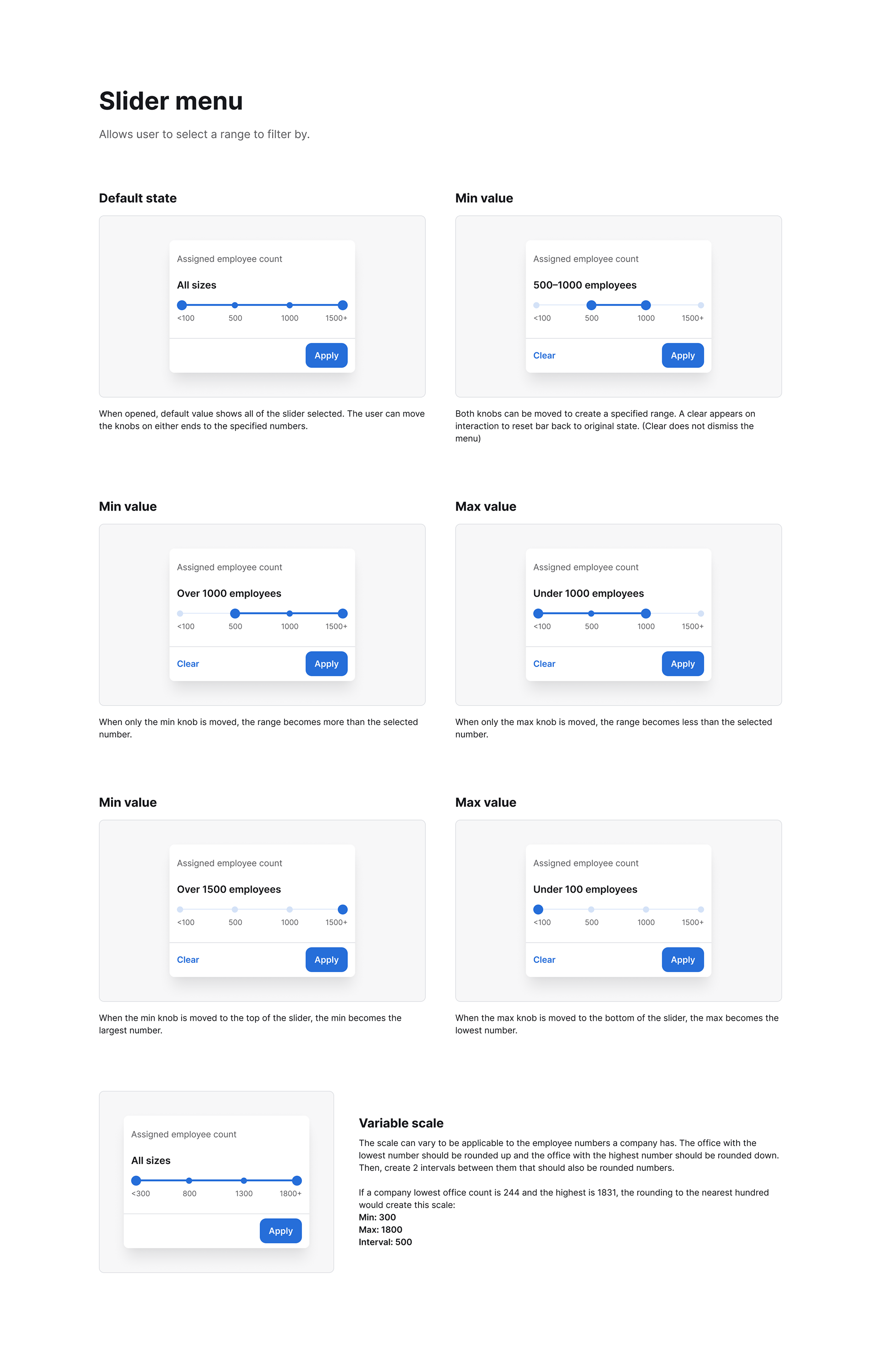
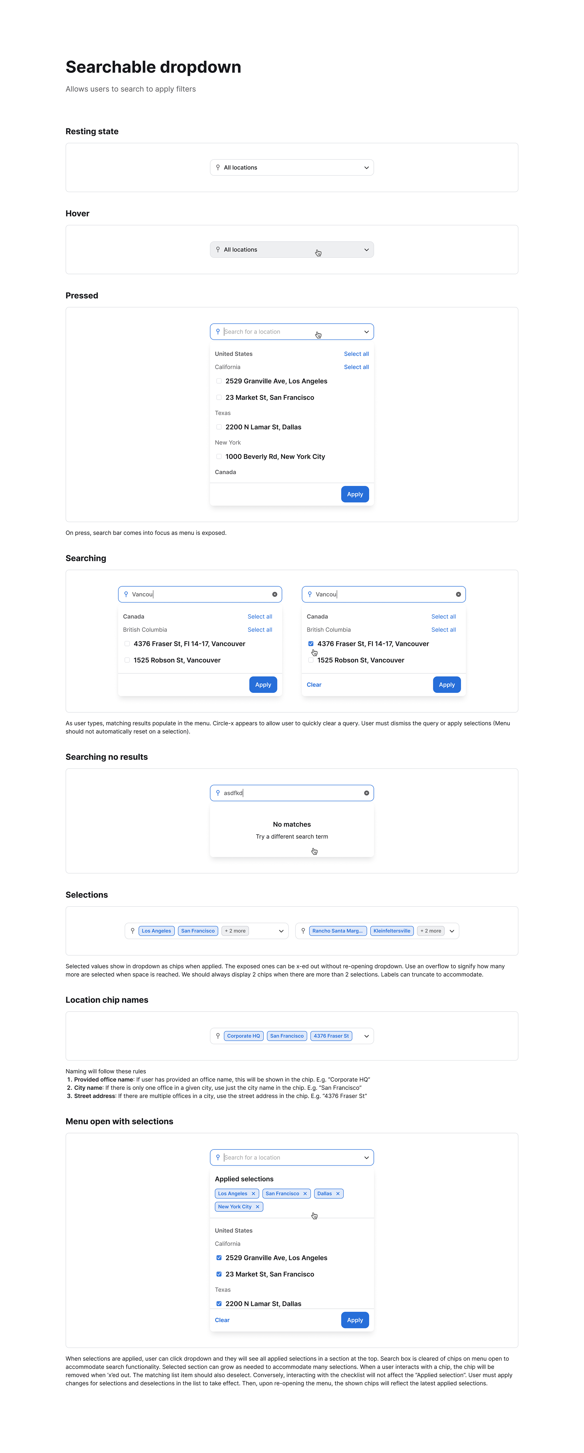
2. Office Size: An interval slider based on employee count
Initial Dilemma: Choose between filtering by office area (sq ft) or employee count
Decision Process:
- Considered implementing both but realized it could lead to complexity and potential "no results" scenarios
- Conducted quick user research to determine preference and found users more commonly think in terms of employee count
- Considered implementing both but realized it could lead to complexity and potential "no results" scenarios
- Conducted quick user research to determine preference and found users more commonly think in terms of employee count
Key Features:
- Uses common language for ranges (e.g., "Over 1000 employees")
- Size ranges are dynamic to align with office portfolio and avoid no result scenarios
- Designed a toggle to switch size filter to 'office area' for future flexibility
- Uses common language for ranges (e.g., "Over 1000 employees")
- Size ranges are dynamic to align with office portfolio and avoid no result scenarios
- Designed a toggle to switch size filter to 'office area' for future flexibility
User Benefit: Intuitive selection of size ranges aligning with user mental models
3. Location: Hierarchical list selection (country > state/region > individual offices)
Challenge: Designing for varying portfolio sizes and global distributions
Design Process: I initially explored cascading menus (country > state/region > city) but evolved to a more flexible list-based approach with select all options.
Key Features:
- Country-level grouping with state/region sub-groupings
- 'Select all' links at each level
- Individual office selection capability
- Pill design to show selections at the top of the list
- Country-level grouping with state/region sub-groupings
- 'Select all' links at each level
- Individual office selection capability
- Pill design to show selections at the top of the list
User Benefit: Granular control over location selection, accommodating both broad and specific filtering needs
Filter Interaction Design:
I implemented a cumulative filtering system where each filter narrows the dataset further
Rationale: Allows users to create specific data views (e.g., leased offices in the US with over 500 employees) and deep dive into specific segments of the office portfolio.
This approach to filter design demonstrates a user-centric design process, balancing the need for powerful data manipulation with an intuitive and accessible user interface. The decisions were driven by a combination of user research, consideration of various use cases, and the goal of providing meaningful insights from complex datasets.
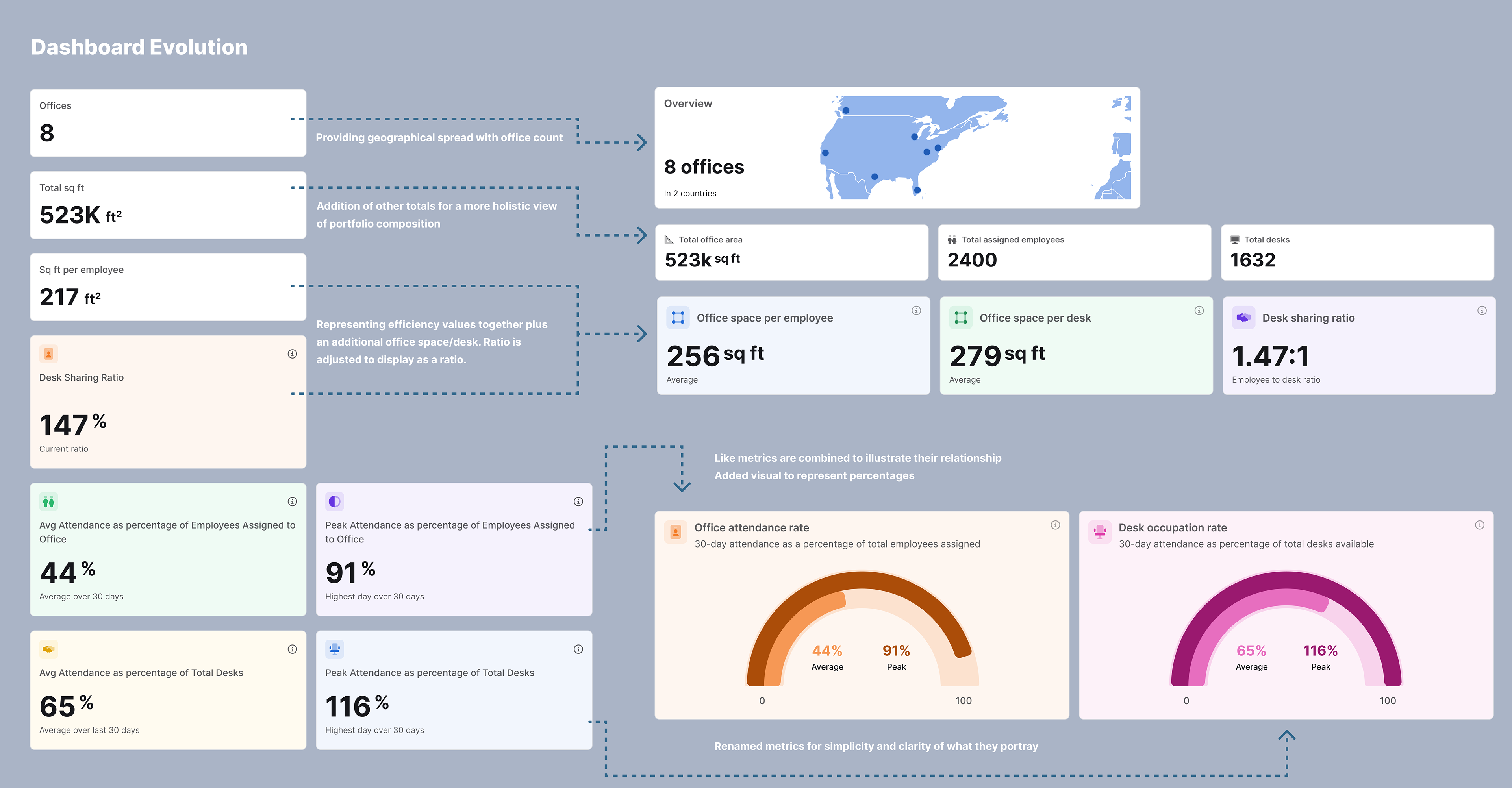
Dashboard Metrics
The redesign of the dashboard metrics required increased visualizations, better clarity and restructured data representation. I rebranded this view as a company's "office snapshot" with three main sections:
1. Portfolio Totals: Number of Offices, Real Estate Type Distribution, Total Office Area, Total Employees, Total Desks
Design: Combined text and visual representations. I added a location map and stacked bar chart for real estate types
Rationale: Provide quick overview of portfolio composition and geographic spread, especially when filtering
2. Basic Calculations: Office Space Per Employee, Office Space Per Desk, Desk Sharing Ratio
Design: Simple numerical displays with descriptive labels
Rationale: Easy-to-understand efficiency metrics for space utilization
3. Attendance Metrics: Attendance Rate and Desk Occupation Rate, both average and peak
Design: Gauge graphs out of 100%
Rationale:
- Visually represent percentages for intuitive understanding
- Combine average and peak on single graph to illustrate relationship
- Renamed metrics for simplicity and clarity based on user-testing
- Visually represent percentages for intuitive understanding
- Combine average and peak on single graph to illustrate relationship
- Renamed metrics for simplicity and clarity based on user-testing
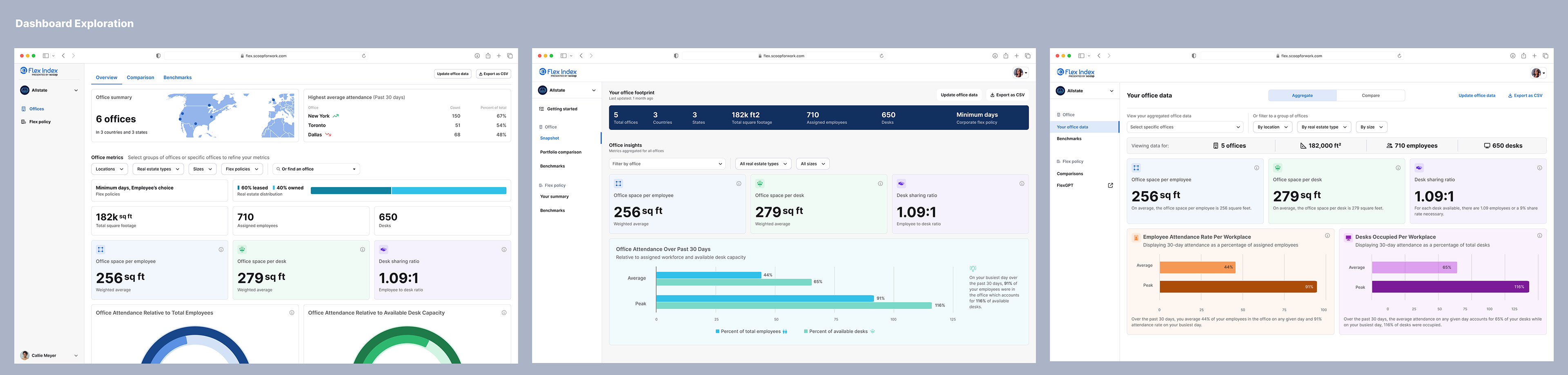
Comparison View Design
While the aggregate view would let a user view one office, the comparison view was designed to enable them to compare their offices for the same metrics and identify outliers. The design choice for this metric comparisons was to use bar graphs and only display one metric at time. Here's a deeper dive into the design choices:
1. Data visualization
Design: Bar graphs
Rationale: Familiar format for easy visual comparison across multiple offices
2. Single metric display
Design: Selection menu at the top lets user choose one metric to view at time
Rationale: Allow users to focus on one metric at a time for clarity. Additionally, displaying one metric gives space for increased detail.
3. Vertical display
Design: Offices listed on y-axis with scrollable graph
Rationale: Accommodate any number of offices without pagination or filtering
Ideas for future optimizations
1. Office categorization (e.g., color-coding by continent, size, or type)
2. Aggregate average plotting on graphs
3. Range visualization around averages for outlier identification
4. Insights section to encourage benchmark product adoption
Outcome and Impact
The redesigned dashboard offers a more intuitive and visually engaging experience for Flex Index users. By presenting data in a clear, actionable format, the new design aims to increase user engagement and drive adoption of Flex Index's premium benchmarking services. Within the first couple weeks of release, we received positive feedback related to usability and features from current customers and grew our benchmark data by 27%.