In an effort to increase brand loyalty and app customers, Vivid Seats launched an app exclusive rewards program giving customers credit back for every purchase made. As the lead product designer on this project, I handled the process end-to-end from research and journey-mapping to final UI designs and micro-animations for the customer journey on mobile and tablet.
The Solution: A Three-Tier Rewards Program
Core Features
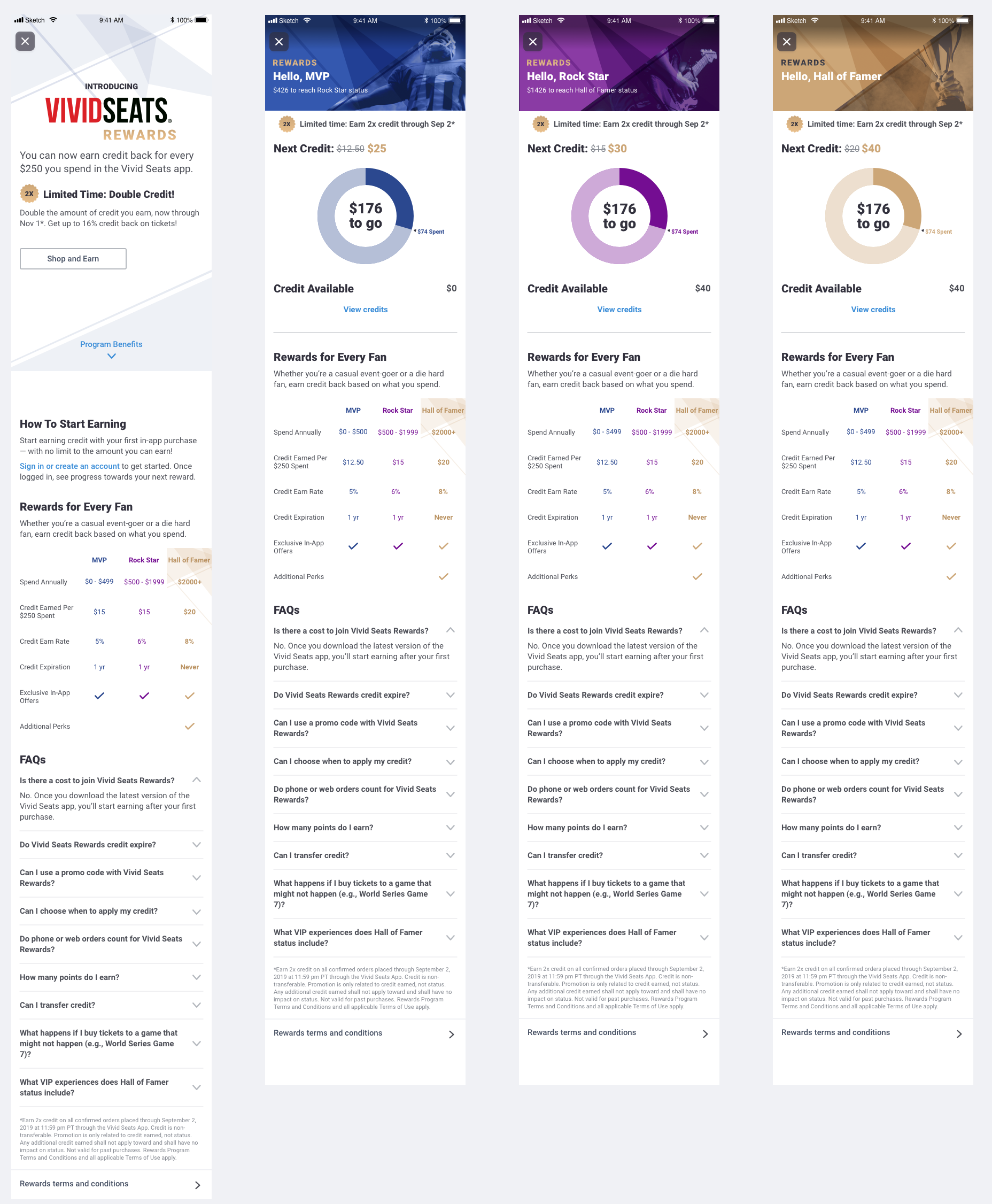
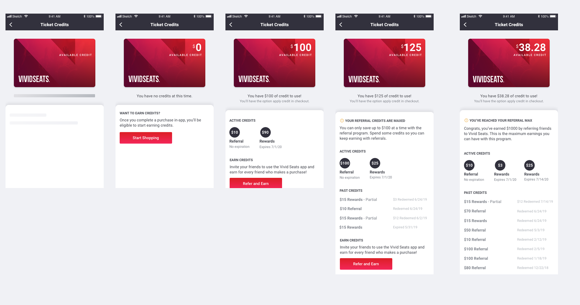
Vivid Seats Rewards was designed as a three-tier program offering customers increasing percentages of Cash Back with increased yearly spend. The main placements gave customers an overview of their tier, rewards progress, next reward amount and current balance. I anchored the design around current tier and added progress animations to draw attention and encourage users to interact.
Purchase Funnel Placements
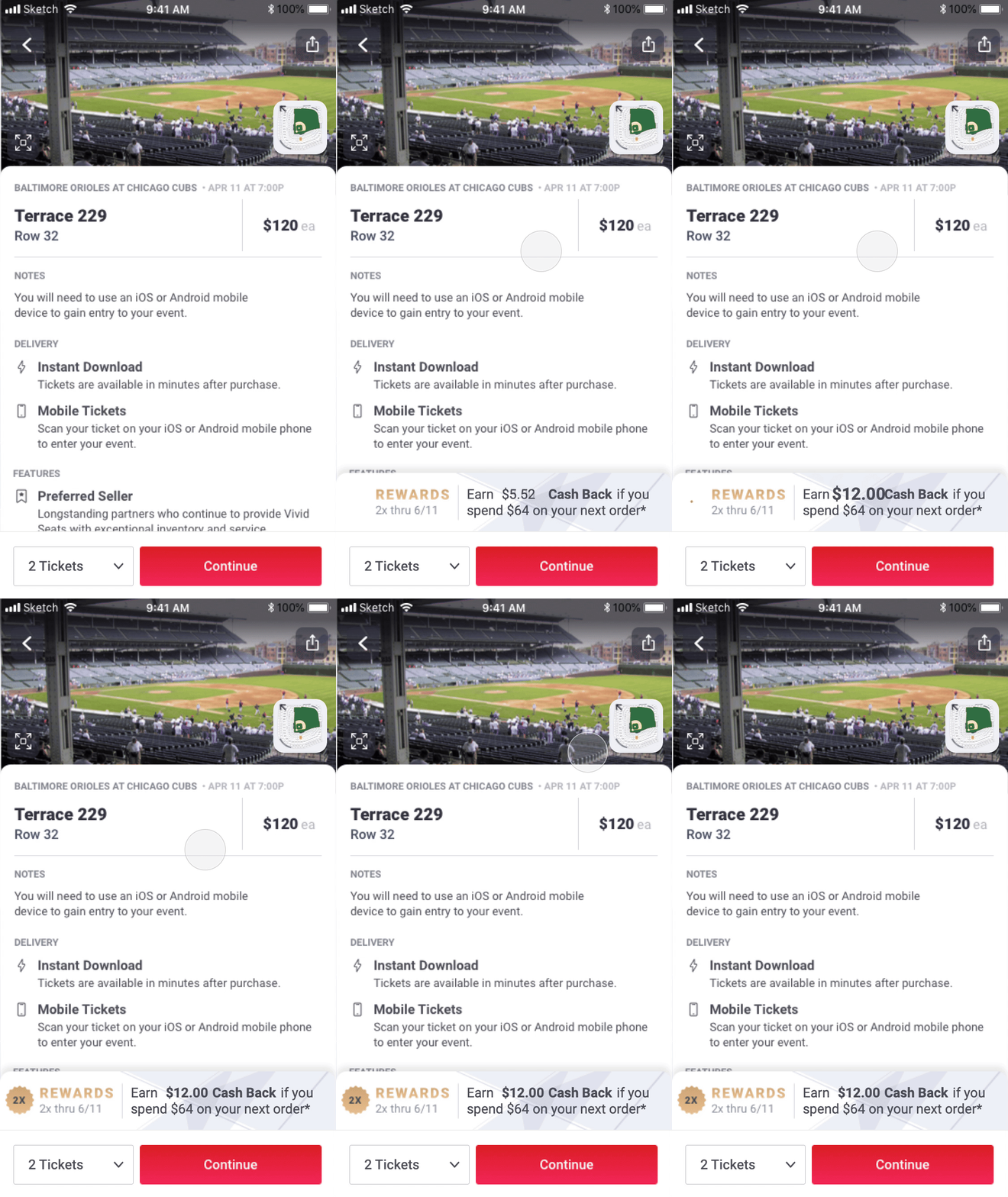
Throughout the purchase funnel, I added strategic placements to encourage customers to make their next purchase to earn cash back or to spend existing rewards. Small animations and transitions on the Rewards banners drew attention without impeding the purchase process.
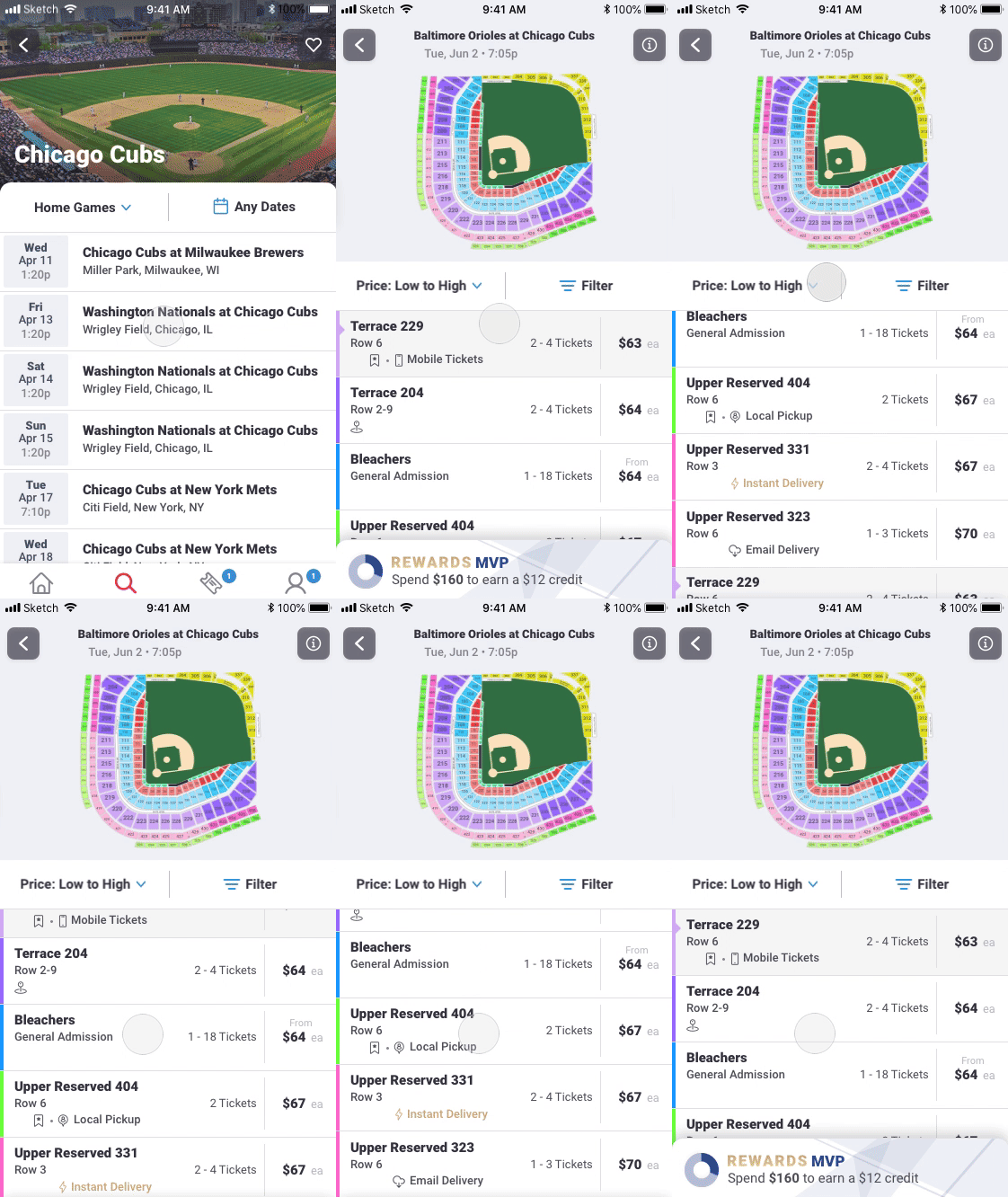
Reminding the user of rewards progress during their ticket selection without being obstructive to their shopping flow.
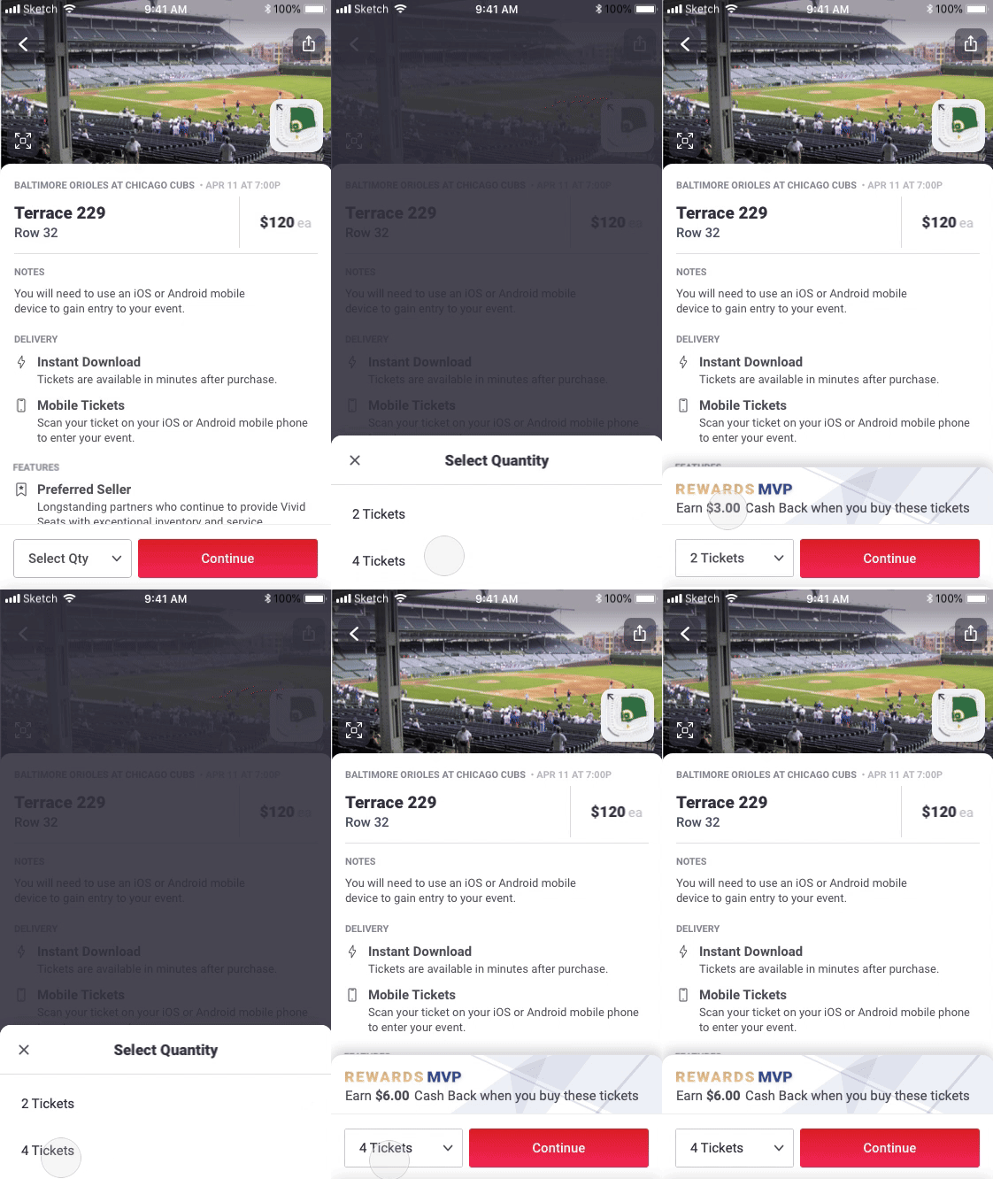
Actual Reward Credit that will be earned is reflected on quantity selection. Count up animation adds some delight as they make selection.
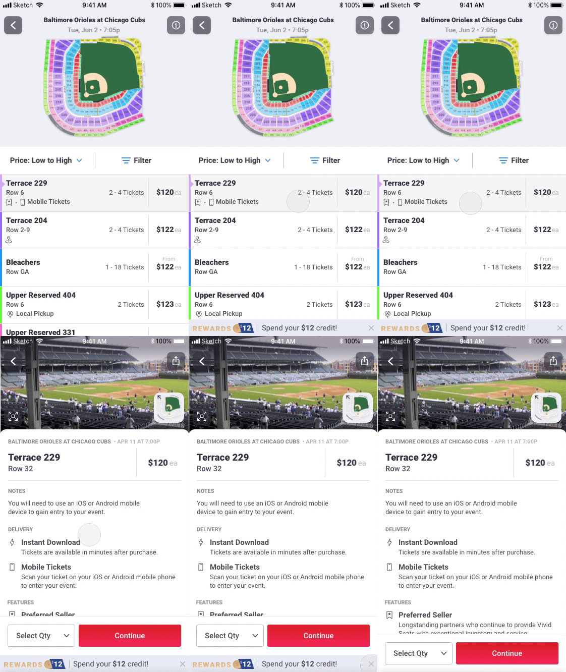
Animate credit banner in to catch attention during ticket ticket selection but add dismissable feature so the user has option to open up their screen real estate.
Multiplier Promotion
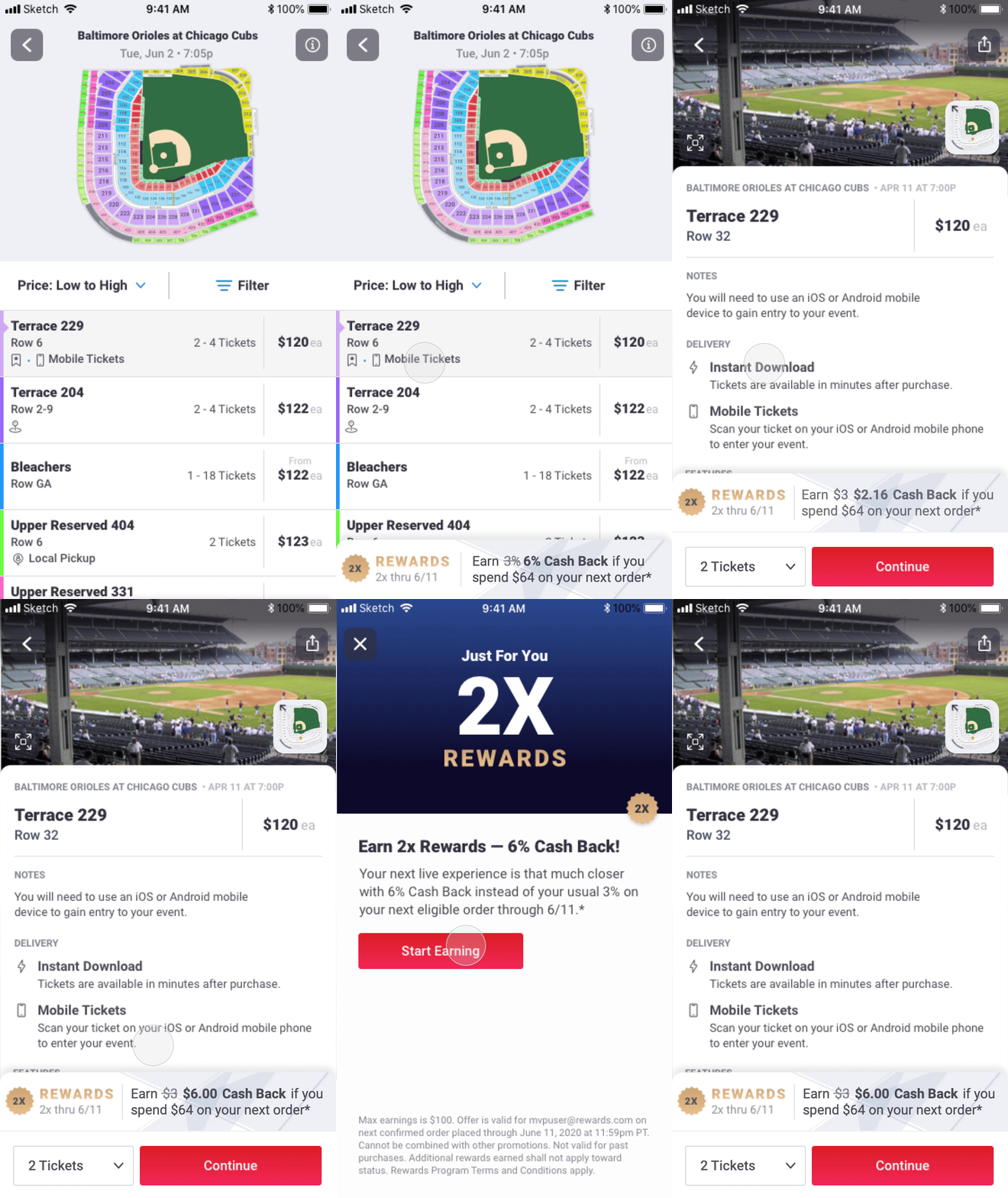
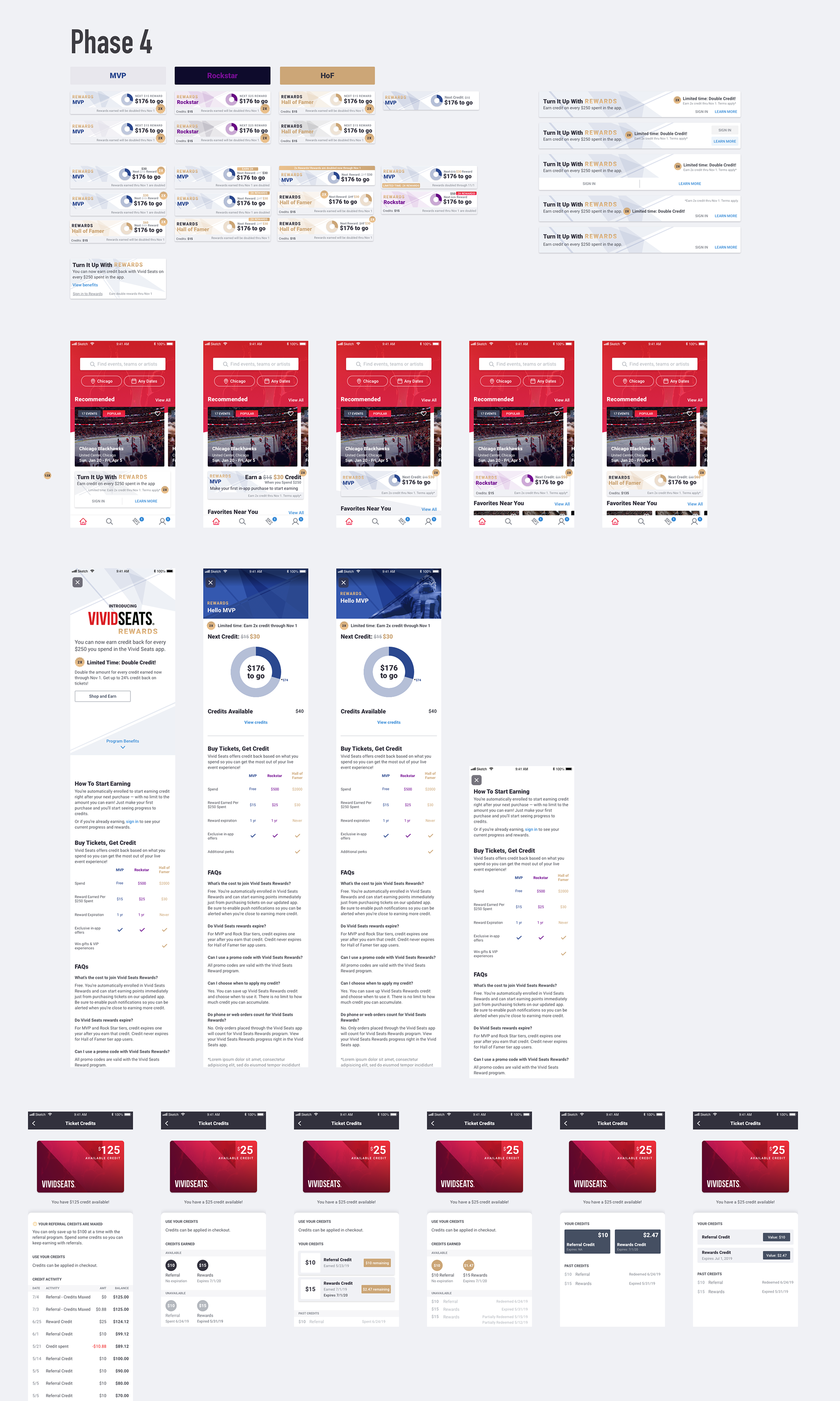
Rewards was designed with a multiplier capability for personalized or app-wide promotions where customers' rewards could be multiplied on purchases. I created a consistent visual language using a gold badge for active multiplier promotions and developed animations to make these promotions stand out.
Earning on Web
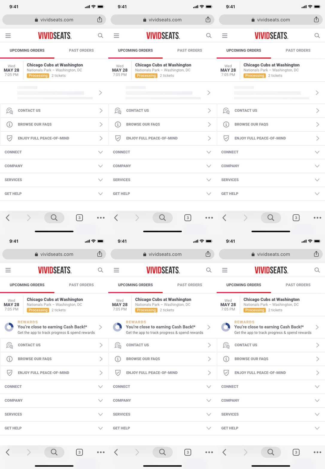
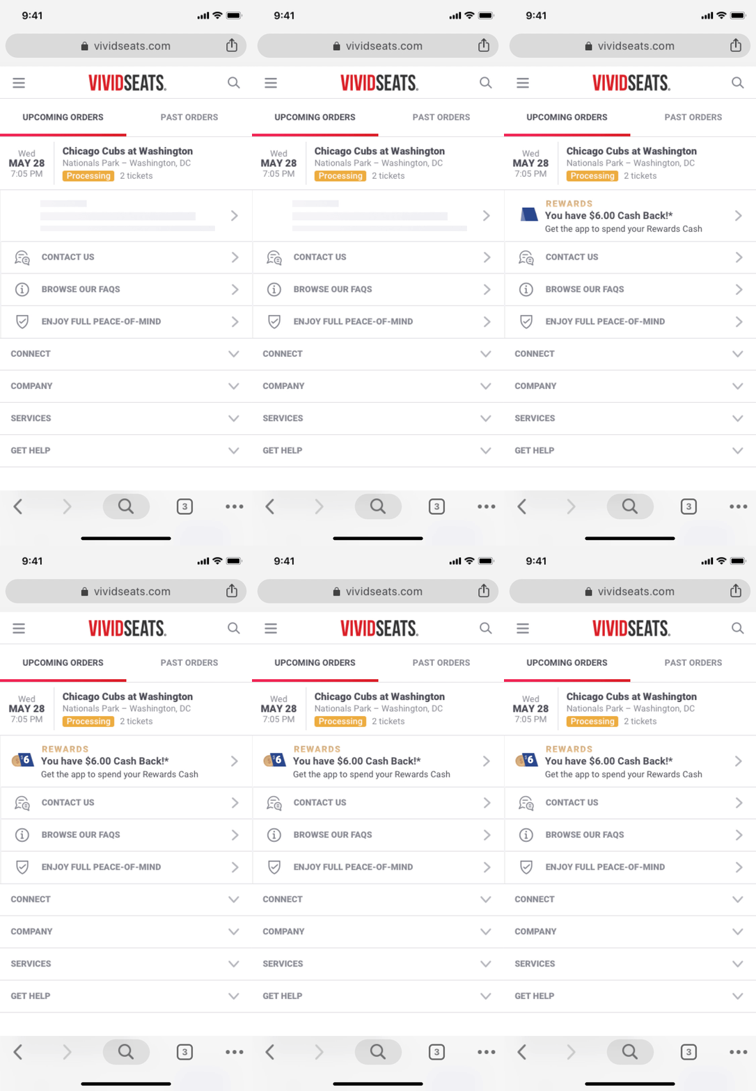
Although not in the initial release, we eventually expanded the program to allow customers to earn rewards on web purchases. This kept users engaged throughout the conversion path and enabled us to use spending credits in the app as a driver to convert web users into app users. Web placements were strategically designed to inform users about the program and guide them to the app once they had credits to spend.
I designed Rewards progress and the Rewards wallet with consistent, subtle animations that would draw attention when a user was viewing them throughout the experience, as shown here from their web account.
The Process
Research
Since we were pioneering this type of program in our industry, I conducted extensive research on rewards programs across various sectors including ride share apps, movie theaters, airlines, apparel retail, and coffee shops. This research provided valuable insights into program standards and typical information presentation.

User Needs
To design an empathetic experience, I defined several behavioral archetypes to better understand our users' goals and needs. Our target users were typically app-savvy individuals familiar with other rewards programs who were looking for the best deals on live events. Their primary goals included accessing discounts, understanding the program before purchasing, easily tracking progress, knowing when rewards were available, and viewing their reward history.
I also identified several distinct user types we needed to accommodate, from first-time users to returning customers with varying levels of engagement and rewards status. We also included web users who we wanted to convert into app users.
Business Objectives
The program was designed to address three key business goals: increasing repeat users, establishing brand loyalty, and driving traffic to the app.
Journey Mapping
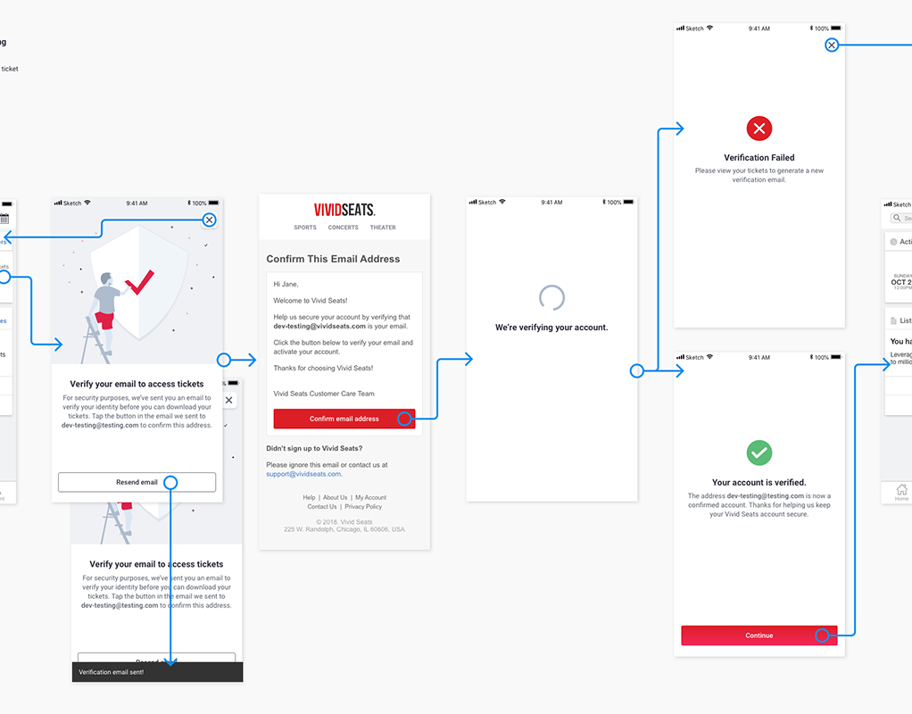
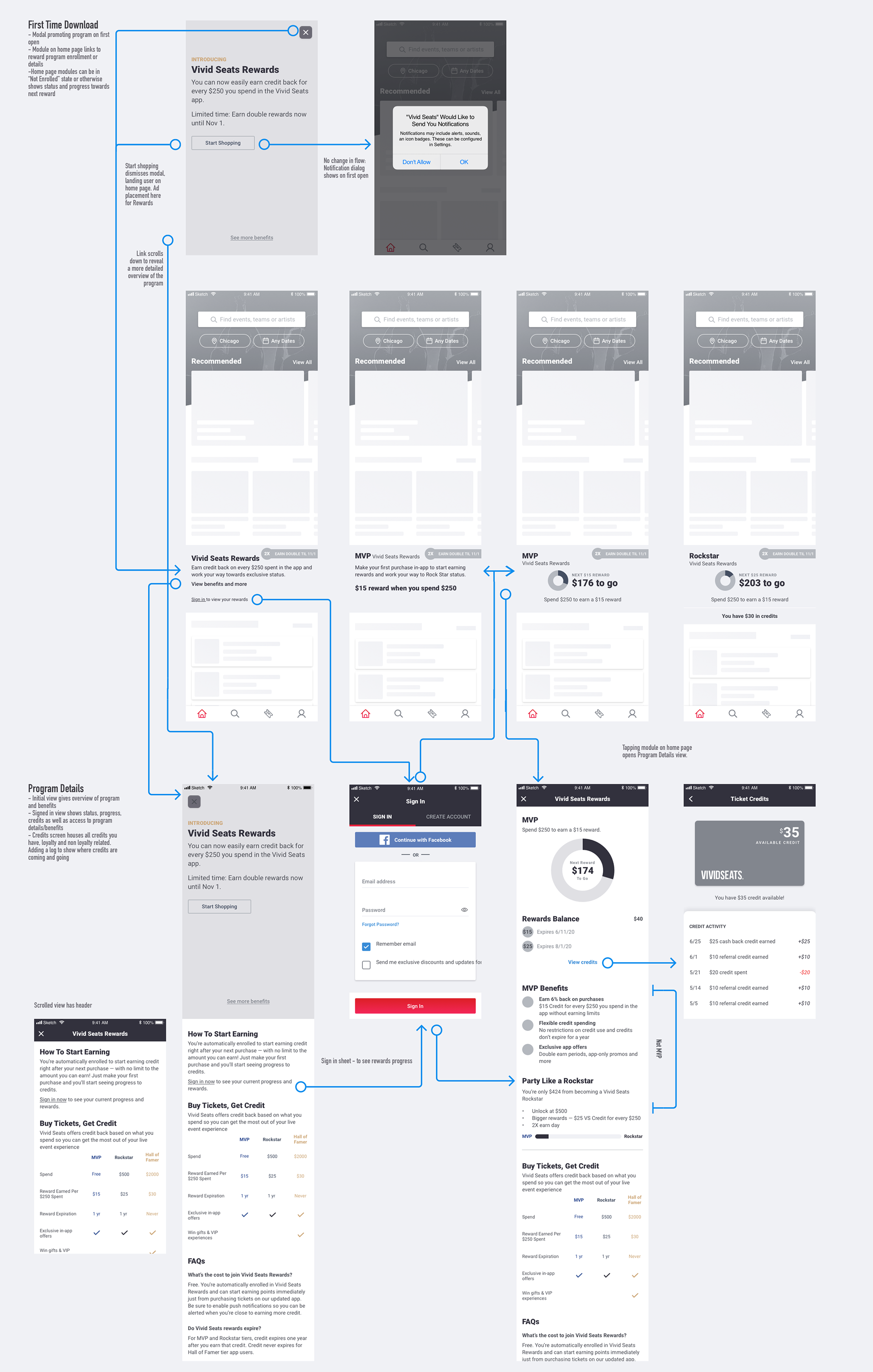
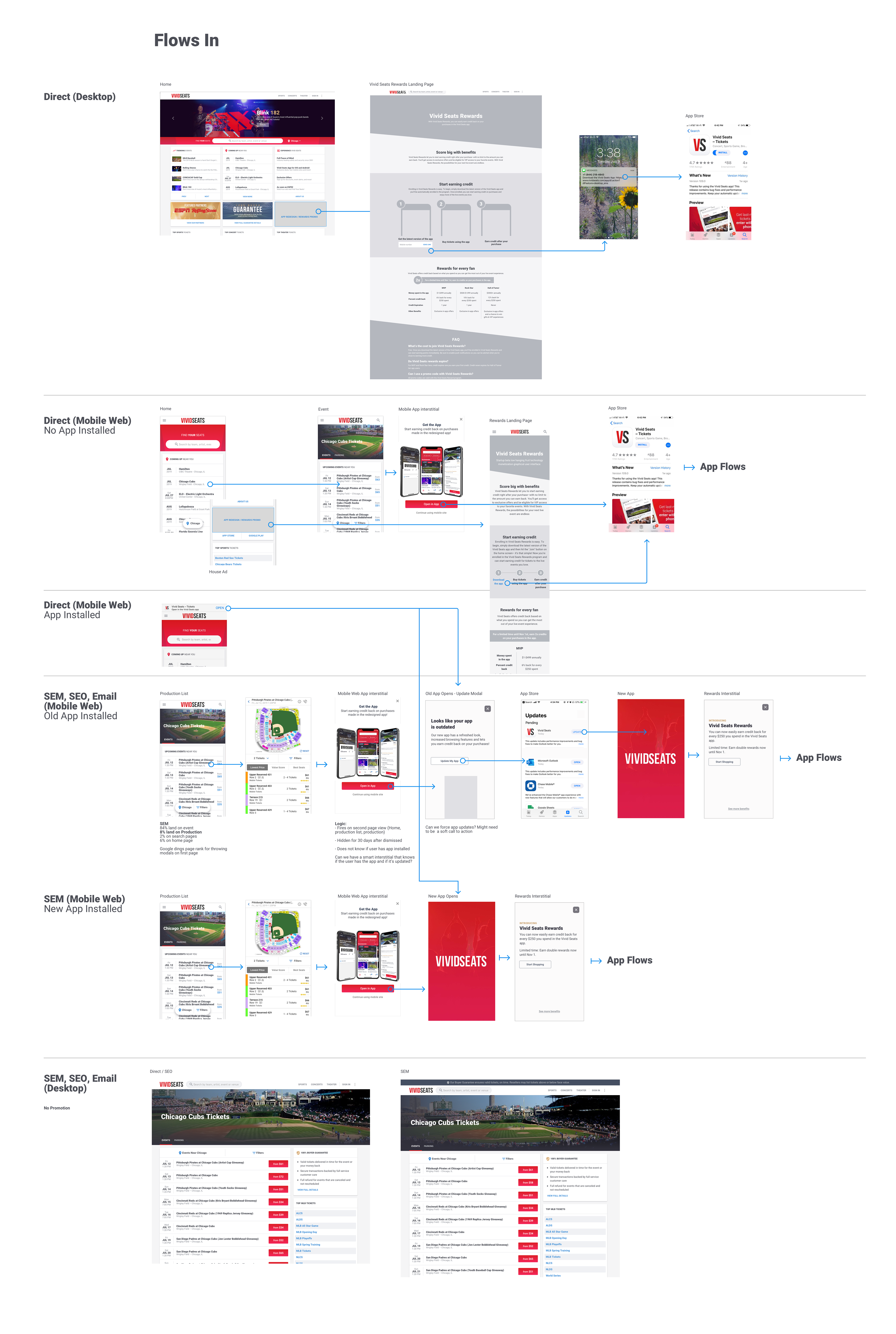
I mapped all touchpoints within the app for each defined user type, working in wireframe/low-fidelity state to determine flow, content, and required screens. This comprehensive mapping included both in-app experiences and marketing touchpoints like emails and web referrals.



Visual/UI Exploration
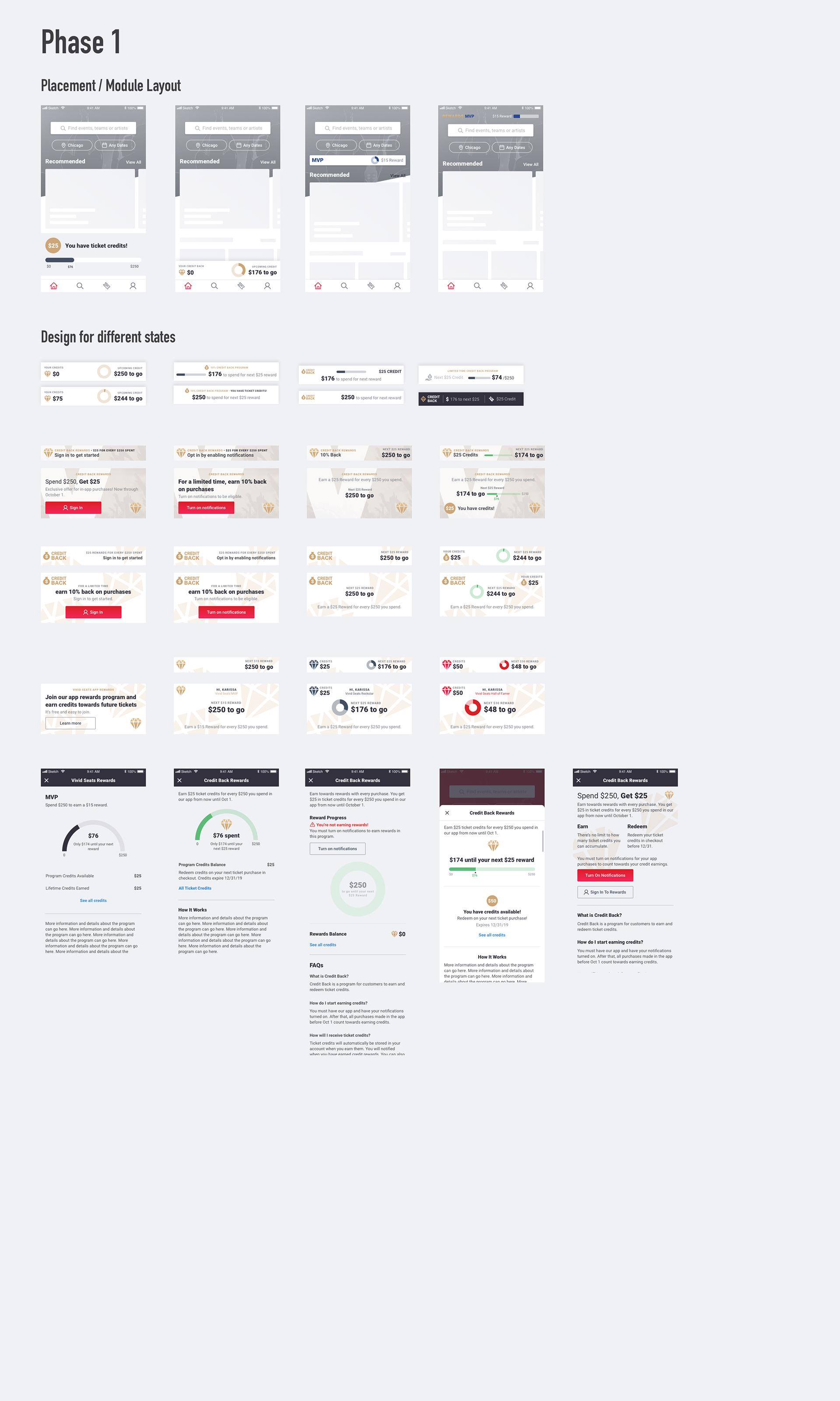
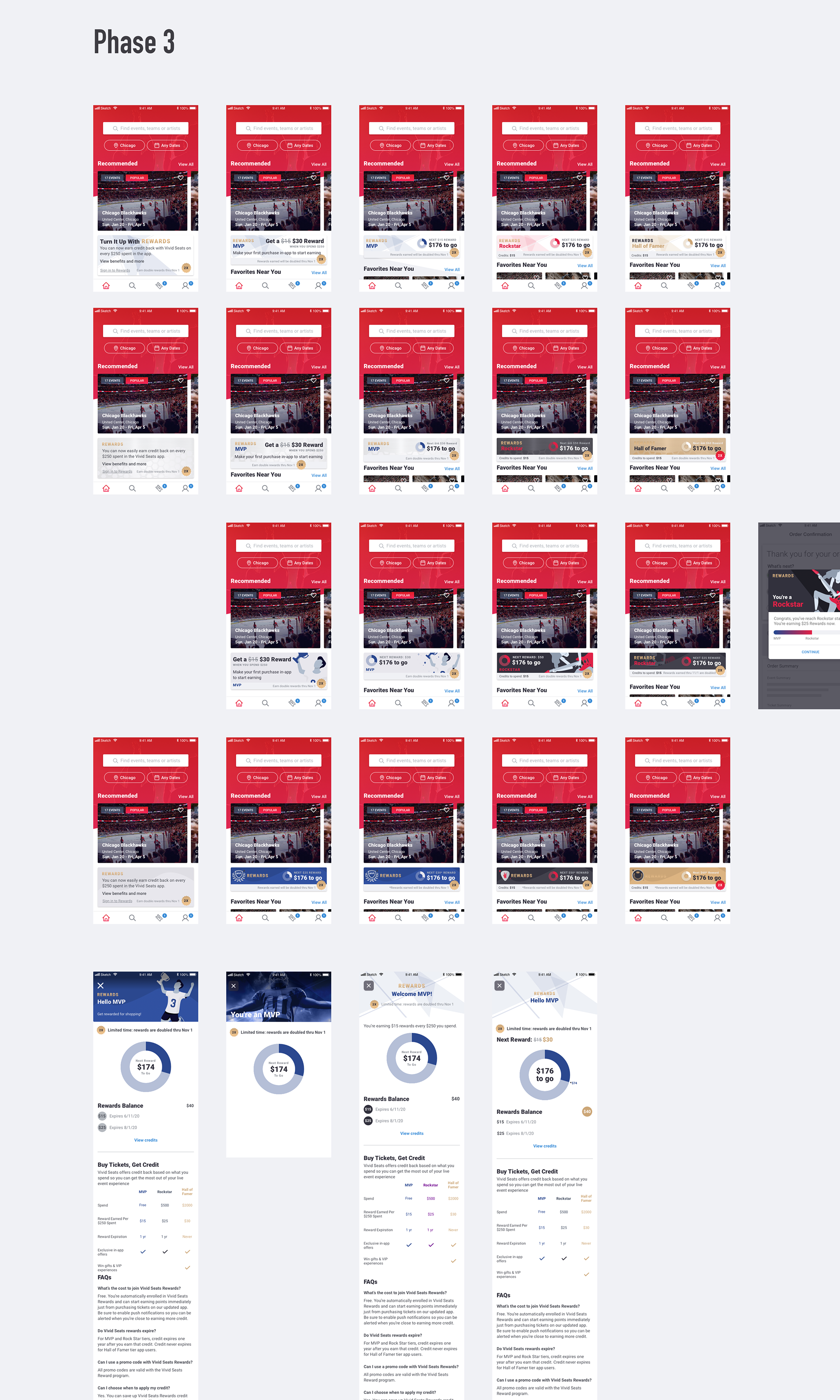
The visual design went through several iterations to establish the right look and feel. This exploration included module placement, visual variations, and layout considerations. I developed a color-coding system for the different reward tiers to enhance recognition and program understanding. I designed interactive animation to highlight key information and produce a consistent visual presence.

Implementation
Designs were created in Sketch with animations in Principle, then handed off to developers via Zeplin and JIRA. We adopted an MVP approach to expedite initial launch, focusing on core functionality while planning future enhancements.


Results and Iteration
After release, we gathered qualitative feedback through surveys and user testing to identify pain points. Our primary success metric—increased app downloads and traffic—showed impressive results with 15% growth within just three months. There was increased app engagement and higher conversion rates when rewards messaging was present.
Based on performance data and user feedback, we continued to iterate on the program, adjusting cashback percentages from 5/10/15% to 3/6/9%, lowering cashback thresholds from $250 to $100, and and lowering tier qualification thresholds. These changes made the program more sustainable while maintaining its appeal to users.
We also expanded web touchpoints and enhanced customer outreach to further drive app adoption, creating a continuous improvement cycle that supported our business objectives while delivering increasing value to users.
