About
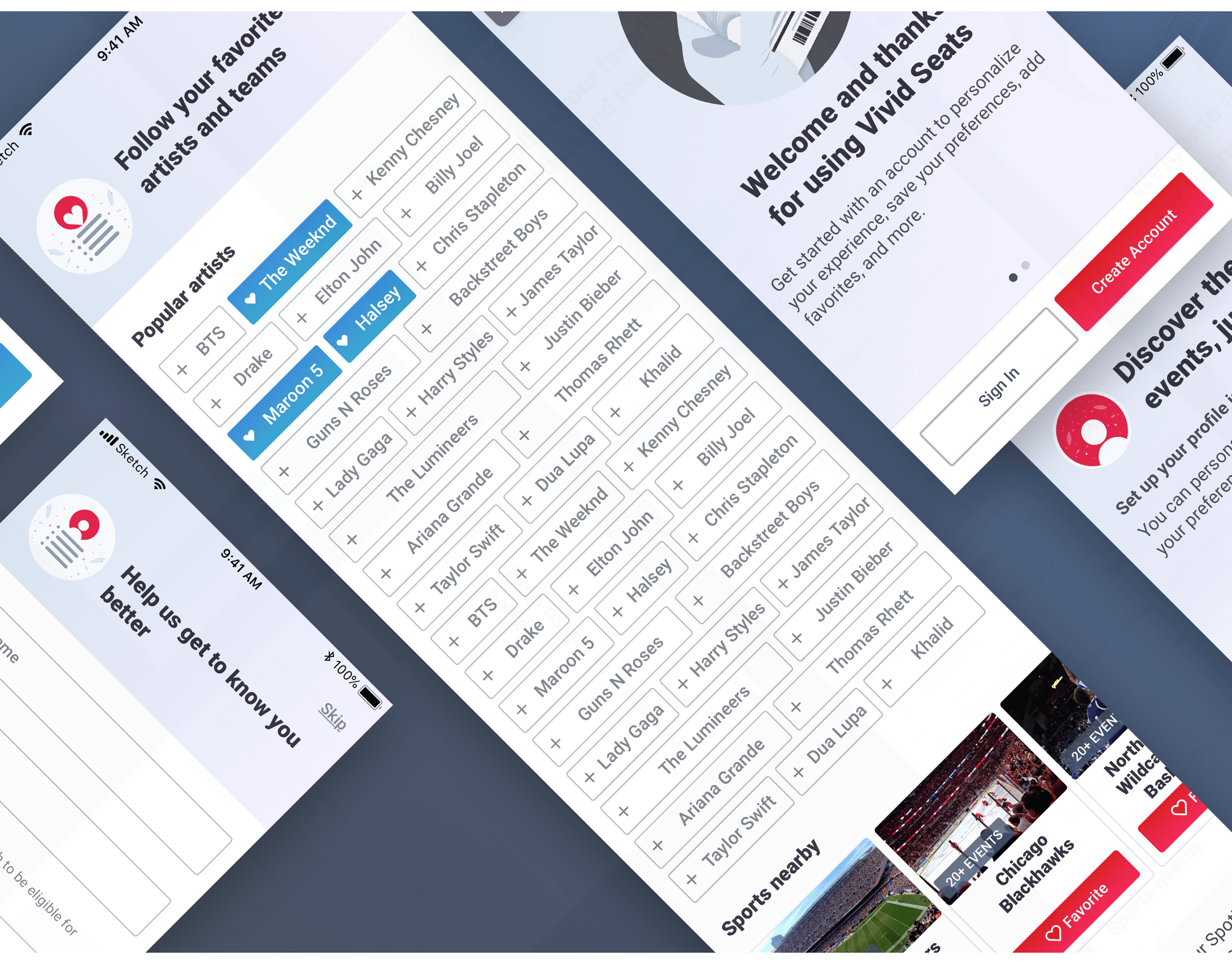
Favoriting is a functionality that allows users to save artists, teams and shows that they like to their account. We can use that information to personalize their experience, notify them when their favorites are performing nearby and suggest other performers to them that they may like.
Up to this point, when users were viewing an artist or team, they could favorite that performer. We wanted to add a management section in the app for a centralized place for users to view, add and remove favorite performers. By investing in this management section, we hoped to support ways to recommend favorites and increase the ease of finding and adding favorites.
Goals
Create a centralized section for Favorites management in the app.
More specifically
-Organize Favorites in one place
-Add functionality for finding new Favorites faster and easier
-Support a search to add from a list of performers
-Organize Favorites in one place
-Add functionality for finding new Favorites faster and easier
-Support a search to add from a list of performers
The Solution
Manage Favorites View (No Favorites)
The new Manage Favorites section lives on the account tab. Its separated into two tabs: Performers and Sports with Performers encompassing artists, bands, comedians, and, theater while Sports shows teams and sports events. The empty states have prominent actions to start adding Favorites including scanning a music service, using search and serving up recommendations in a carousel.
Manage Favorites (Viewing Favorites Lists)
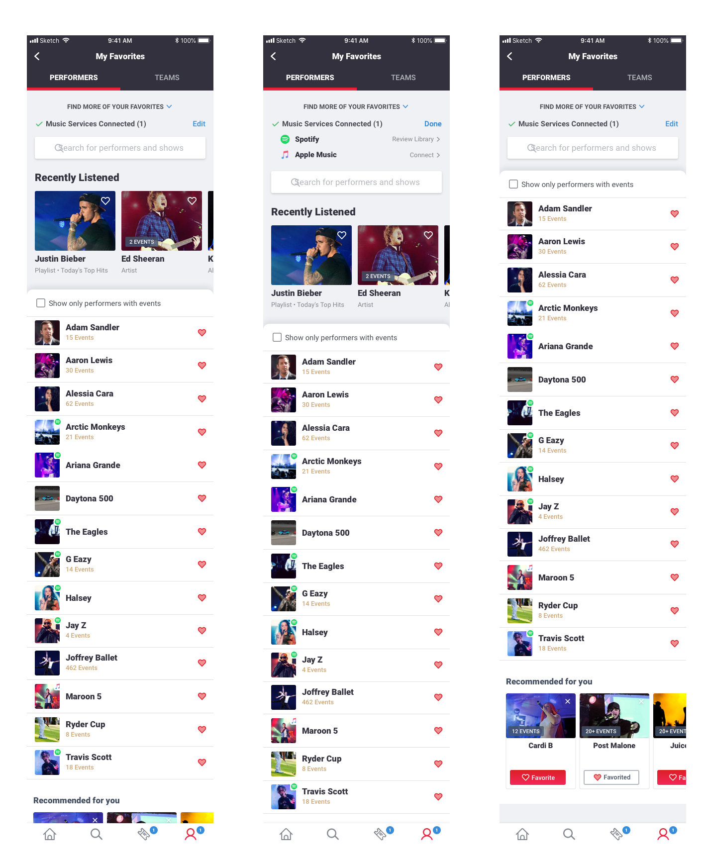
Once populated, the section displays Favorites in a list that is sorted alphabetically but still split into those two categories of Performers and Sports. We show a small icon to indicate if a performer was added from a music scan. Users can use the checkbox to filter the list down to performers with events (e.g. on tour/in season). Tapping on the row will navigate to the performer page to view events. Tapping on the heart will allow the user to easily "unfavorite" a performer.
The "Find More Favorites" section is designed to be collapsible so the real estate can be focused on viewing and managing Favorites after the list is populated.
Search For More Favorites
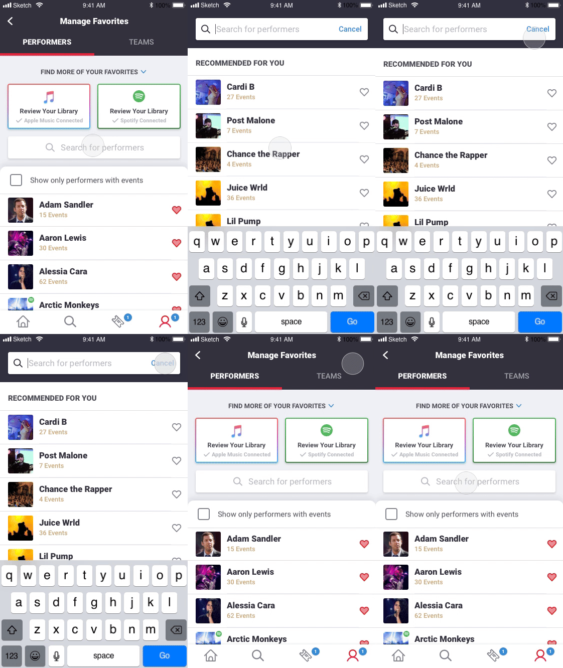
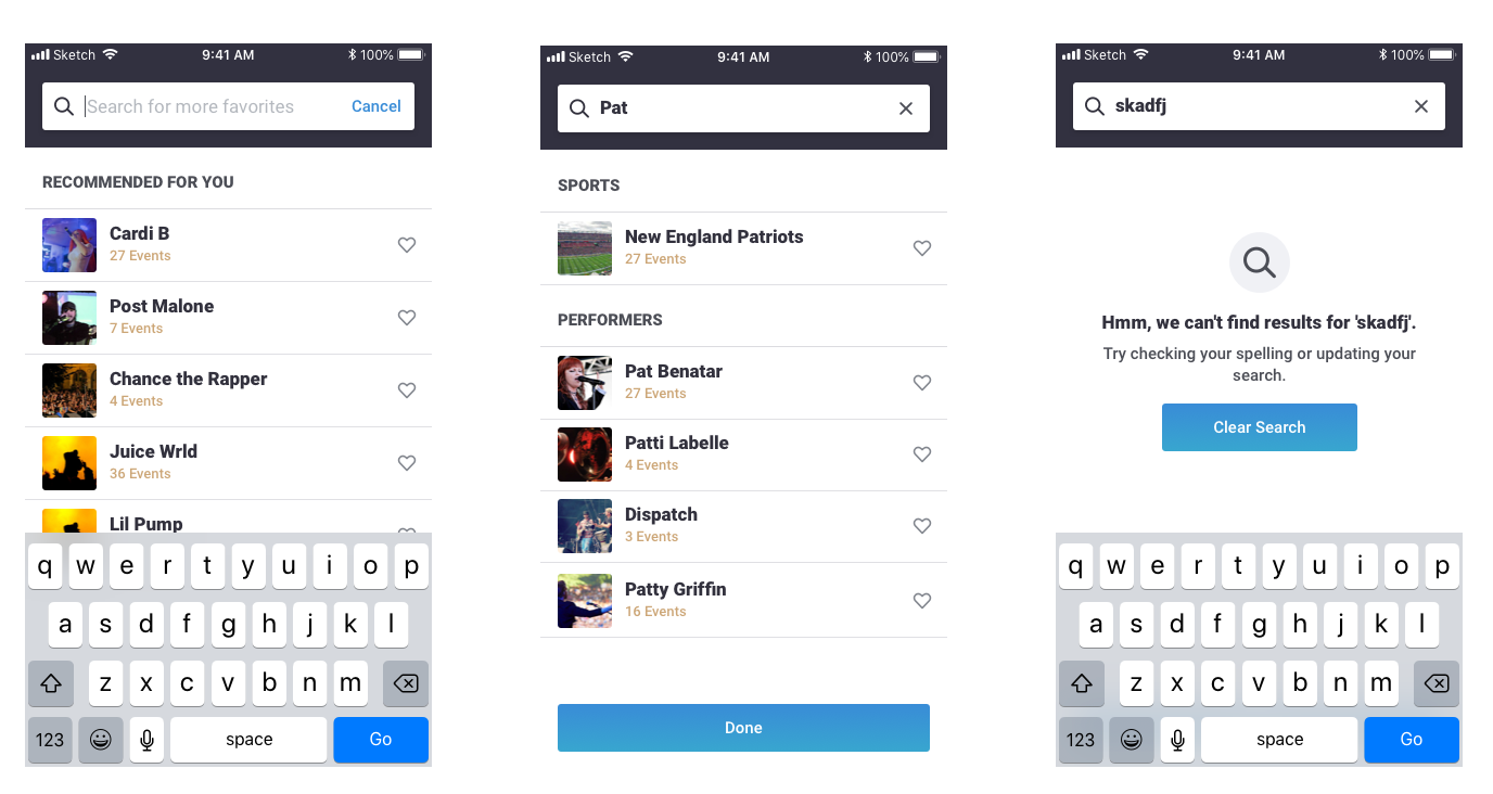
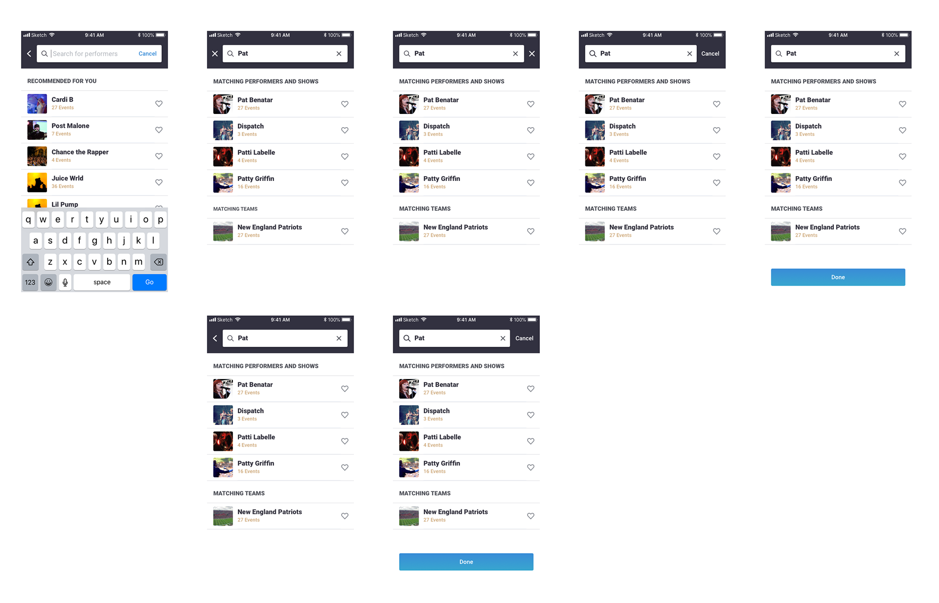
Tapping into the search bar on either tab will open up a single search header. We show recommendations to get the user started before anything is typed. We use an instant typeahead search that populates results as the user types. Although all matching performer results will be returned, we separate by the top level sports/performer categories in two lists so it's easier to find results. As the core action is adding a Favorite, I used a large hit state where tapping anywhere on the row will add that performer as a favorite. Users can use the "Cancel" button in the empty search bar or the "Done" button under the results to exit the Search view back to the Manage view.
Using a Music Scan Service to Identify Favorites
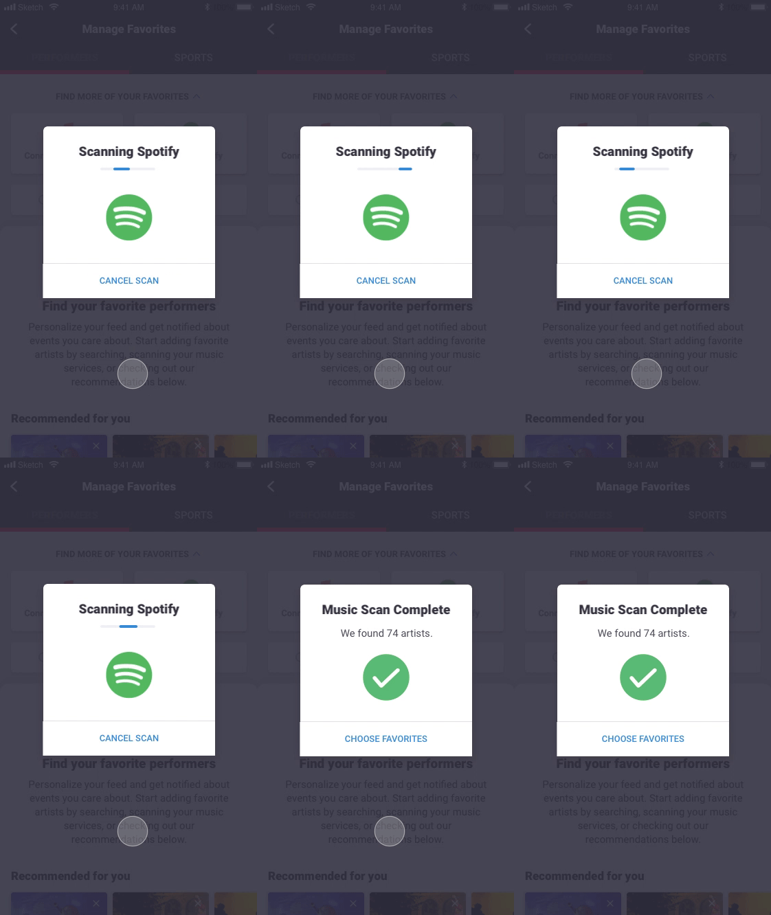
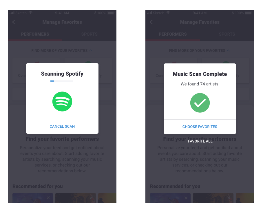
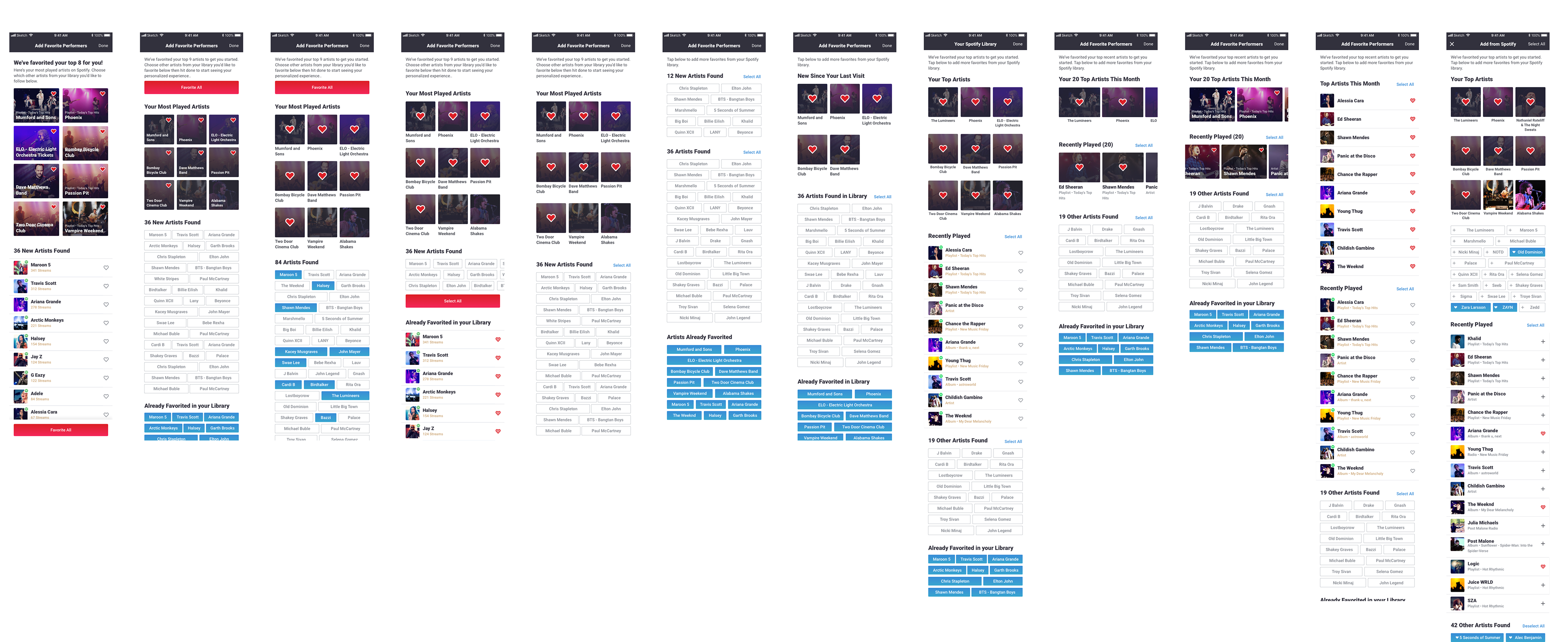
We added a music service scan to help easily identify your favorite artists and bands. After authenticating with Spotify, I designed this animation during the scanning time and then identifies how many unique artists were found with the scan. The user is able to "Favorite all" without viewing or they can select "Choose Favorites" to view the results of the scan on the next view and manually make selections.
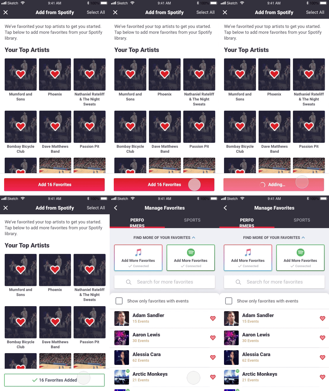
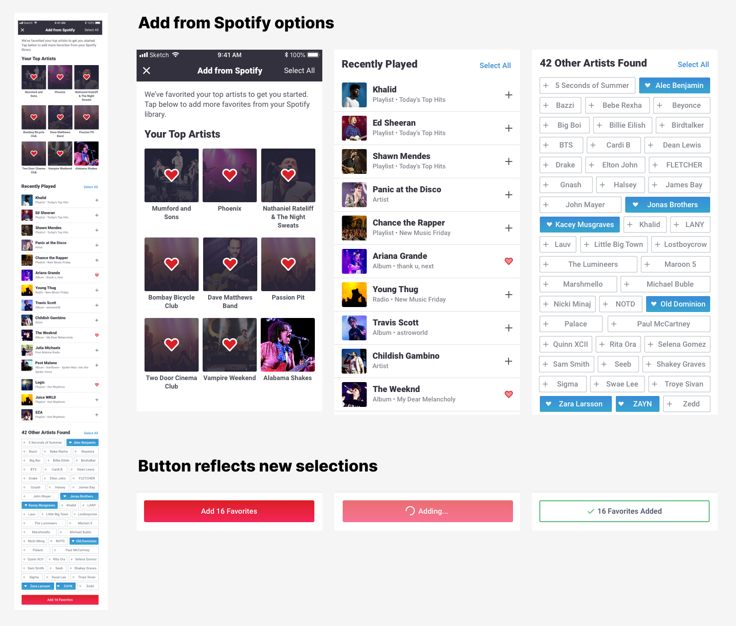
The Spotify scan shows results in three sections to help the information be easily digestible. The top section reflects the user's most played artists from the past couple months. These are Favorited by default to get the user started as they are most likely accurately reflective of being a Favorite.
The second section is a list of most recently played. A sub-line lets the user know where they listened to this artist to help them connect the dots, especially if it was on a playlist.
The third section will list any other artists that have been listened to in a defined time period in easy to tap pills.
The user can easily go through these sections and make selections or use the "Select All" button if they want to make quick bulk selections for a section. We'll show a count of the number of new Favorites selected on the button and use an animation to confirm that the Favorites were successfully added before dismissing this view back to the Manage screen.
Favoriting Animation
One additional piece that I had to design for was how to handle the lag between tapping a favorite heart in the UI and it actually being added on the backend. Visually, the Favorite heart could fill immediately but there was a risk that the Favorite did not go through successfully in which case, we would remove the fill on the heart but if the user had already scrolled away, they may not notice that it wasn't successful.
I thought this might be a good opportunity to use a fun animation that could account for that loading time. We landed on a pulsing animation that began immediately after tapping and then the heart "exploding" with the fill when the Favorite was complete. This animation was use in our new management section and extended to everywhere else on the app where Favoriting was available.
Informational Dialogs
I designed a series of modals that would give an introduction to Favoriting for new users and help push them to our new screen. We would show this modal the first time a user went to the Manage screen, or the first time they added a Favorite from anywhere in the experience, and lastly if they tried to add a Favorite but was not signed in.
The Process
Research
I took a look at competitors and other apps that allow you to save products as favorites or to a wishlist. I brainstormed with product what elements and features we wanted on this screen and went over business requirements. From this research, I was able to take away some best practices for this type action and come up with functionality that we should include in this section:
- List of favorited performers
- separated into teams and artists
- links to the respective performer page
- ability to unfavorite easily
- Filter to highlight performers with events (in season/on tour)
- Search to add favorites
- Music library scan for quick bulk favorite artist add
- Recommended carousel
Ideation
I created a user journey map to help visualize the user experience and layout what views needed to be designed.
Design Exploration
Explored different layouts, UI elements, informational structure and visual treatments for the various pages of the Favorites Management flow.

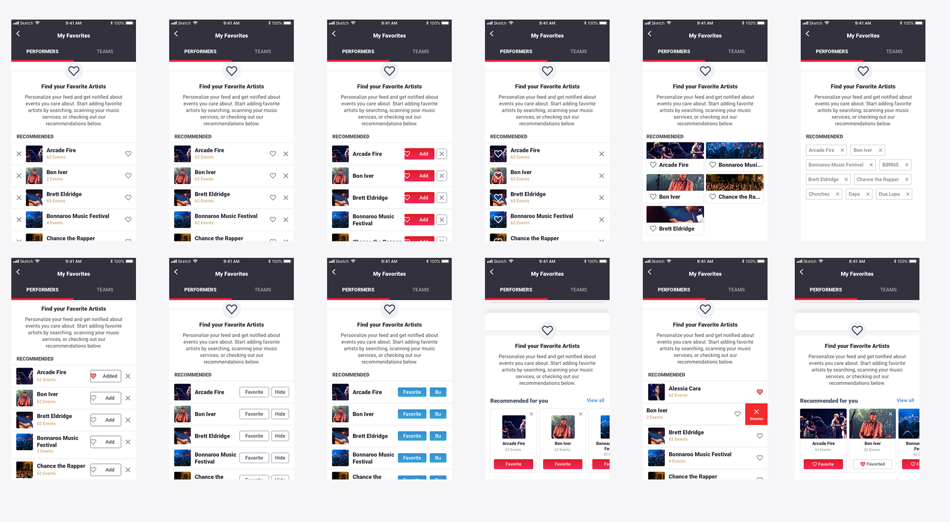
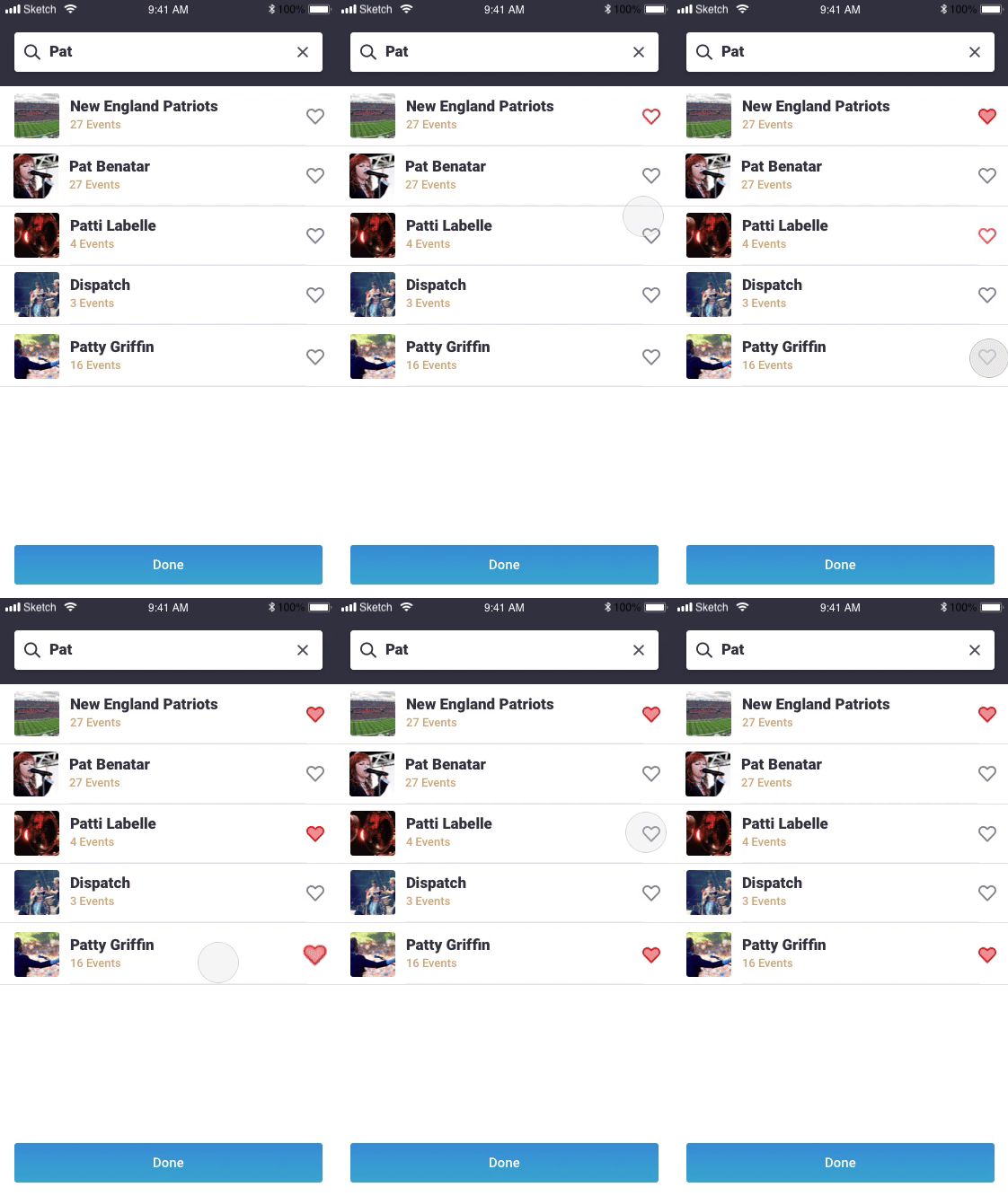

For the Favorite loading, we ultimately went with the pulsing heart but these are some other animations I explored that we could use to portray the backend lag.
Choosing a Direction
We went through various design reviews with the design team and product to narrow down on best directions to move forward with. Some of those designs were ran through light user to tests to get user reaction and observe difficulties in using these layouts and UI elements.
Some key decisions made at this point:
1. "Find more favorites" section should be collapsible to remove focus on adding more if user wants to view and interact with current list of favorites
2. Differentiate list of favorites from a list of recommendation with different UI (list versus carousel cards)
3. Favoriting action should be consistent with an on/off state whether its in a button or using the heart icon (Don't use separate Add/Hide buttons)
4. Favorites are organized so that they are easy to find. They are categorized between two tabs (performers and sports), sorted alphabetically and can be filtered by events/no events.
Designs Ready for Development
Once design direction was finalized, I created designs for all the various possible states, accounting for scenarios like a Spotify disconnection, a user trying to view this screen when not signed in, some various loading states, etc. These designs were created in Sketch and handed off to engineering via Zeplin. I designed these views for iOS, android, and our tablet app.
Outcomes and Reflections
The management view was successful in increasing these two KPIs we were tracking: number of users with Favorites and number of Favorites per user.
We released the Spotify scan first because it was the most used music service for our users. Then, we had to design similar scans for Apple Music and Google Music. The scan designed for Spotify was specific to what we were able to pull from Spotify but only needed minor changes to work for the other services. The music scan was a unique idea to easily find artists that a user listens to, but overall it did not have the utilization we were hoping for. The next product idea is to add an onboarding to set-up a profile for new users in which case we can surface Favorites and the music scan to more users.
Ideas for future iterations for this view:
1. Personalized recommendations: The v1 of recommendations in the carousels are based on location for sports and top trending for performers. It'd be great to make recommendations based on events attended, or in the same genre as current favorites, etc.
2. A quick add Favorite functionality: The carousel and the search can both surface performers for the user to add Favorites but without doing the Spotify scan, the user can't go through a list and select a bunch quickly. If the music scan doesn't have better utilization, it'd be great to add something like the pill select in a flow that would surface a lot of options to a user, especially someone with no Favorites or very few.
3. More organization of Favorites: By understanding more about how users are using this view, we could get smarter with how we organize their Favorites. Possibly, separating performers into music and theater would be helpful. More sorting or viewing options could also be helpful. For example, maybe a grid of images instead of a list or sorting by something related to their events versus just alphabetically.


