

Project Goals
The main project objectives were to enable a profile to be stored as part of a Vivid Seats account and to create an onboarding flow in the app to guide users through this profile setup.
Why now?
1. Foundation for creating user preferences. We're planning more personalization features in the future and so, creating a base profile to store future preferences is foundational work.
2. Too many actions for new users without a flow. When users download our app, they're prompted to allow location permissions and push notifications without context. Now we'd also like to prompt account creation, collect their name, and encourage them begin building out their favorites, so an onboarding flow is needed to guide new users through these steps.
3. Goal to increase signed in users and/or account creation. Being signed in is not required for browsing on the app but creates a more personalized experience where we can show events from Favorites or recently viewed across devices, etc. It also enables us to give more personalized Rewards info during browsing to influence conversion. Thus, a goal for this project is finding appropriate times to prompt account creation and kick off profile setup.
4. Business goal to increase qualified app customers. With a populated profile, we're able to offer better recommendations, increase notification enablement, and engage customers with personalized events.
5. Capturing data about our users. Having more information about our customers and their preferences can help inform future personalization and recommendation features and power our CRM team with more accurate information.
User Research
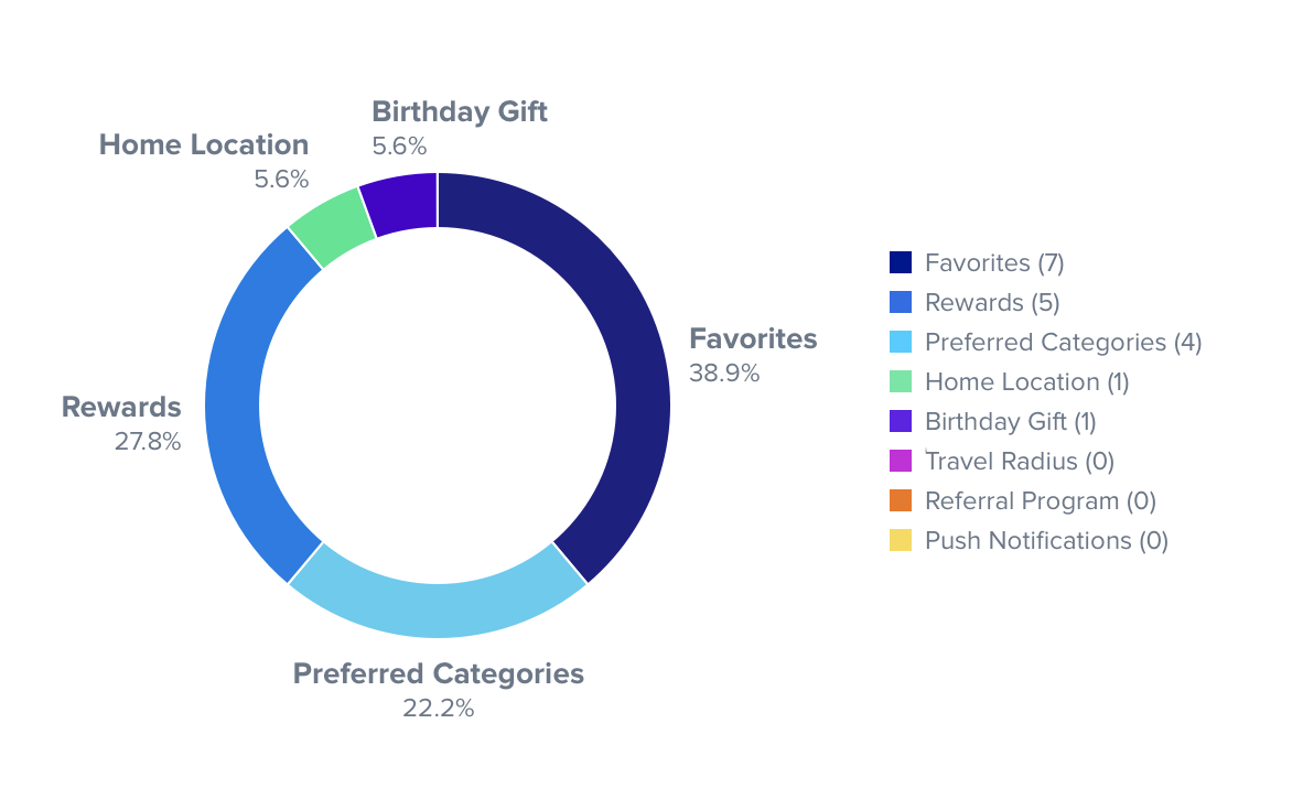
I wanted to evaluate some onboarding concepts and pulse check what users would be interested in providing us. I surveyed 20 users to evaluate 8 different app features including location, travel radius, preferred categories, favorites, rewards, referrals, birthday gift and push notifications. For each feature, I evaluated familiarity, likeliness to use and willingness to enable push notifications to use, and willingness to create an account to use.
Our research found that users are open to an onboarding flow and would actively create an account in order to provide certain data points in order to personalize their experience or get special offers. The graph below summarizes what users chose as the feature they would be most excited about: Favorites was a clear winner for high intent use, as well for both push enablement and account creation.
Discovery
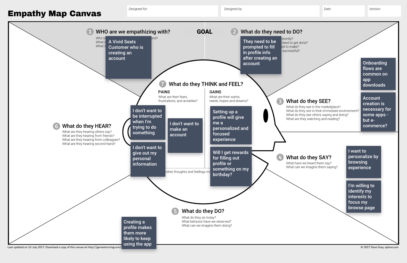
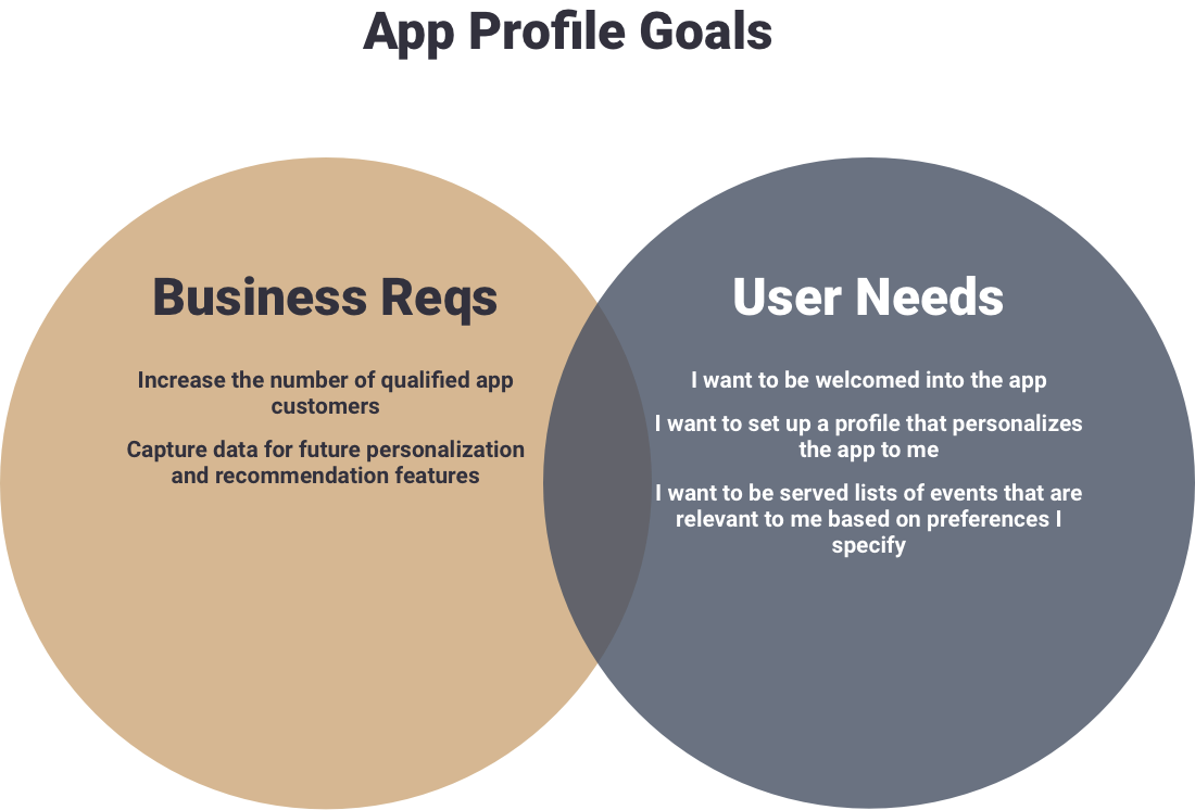
I laid out our business requirements versus user needs after making an empathy map. With clear goals defined, we defined our target users as existing app users, users downloading the app from a web purchase and new app download users.
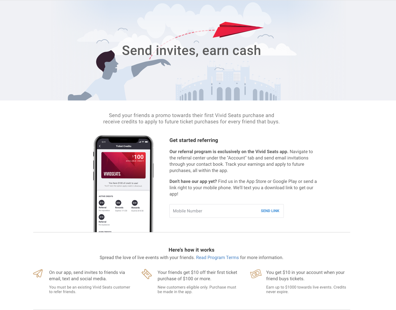
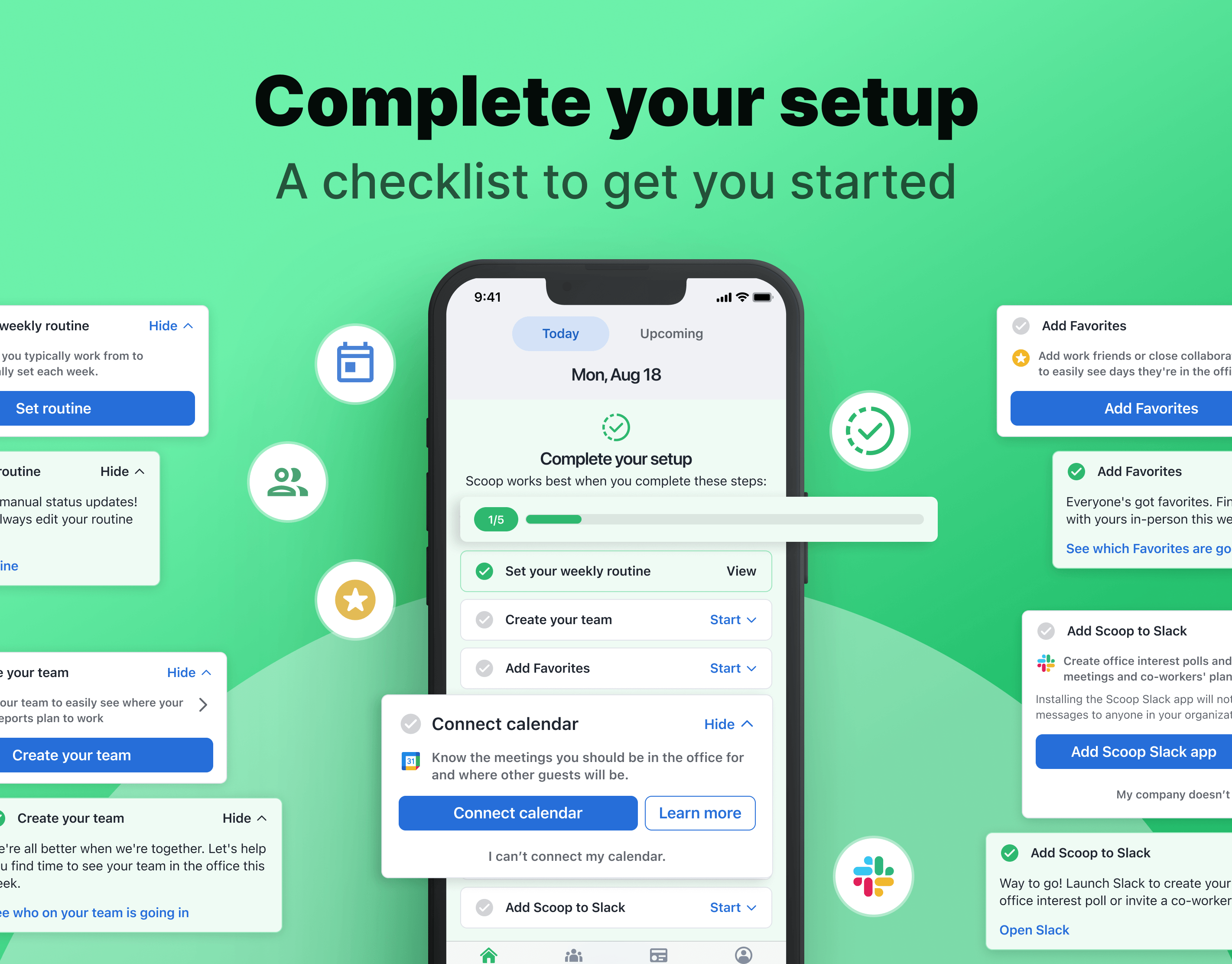
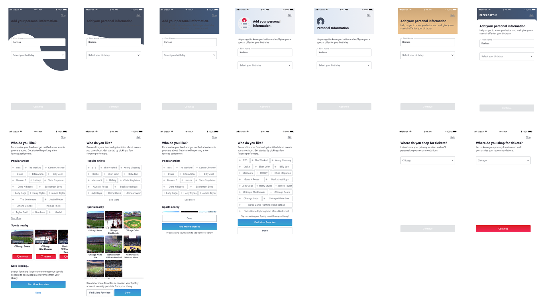
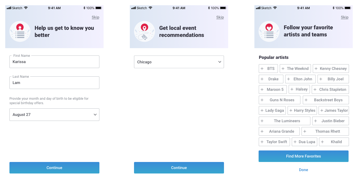
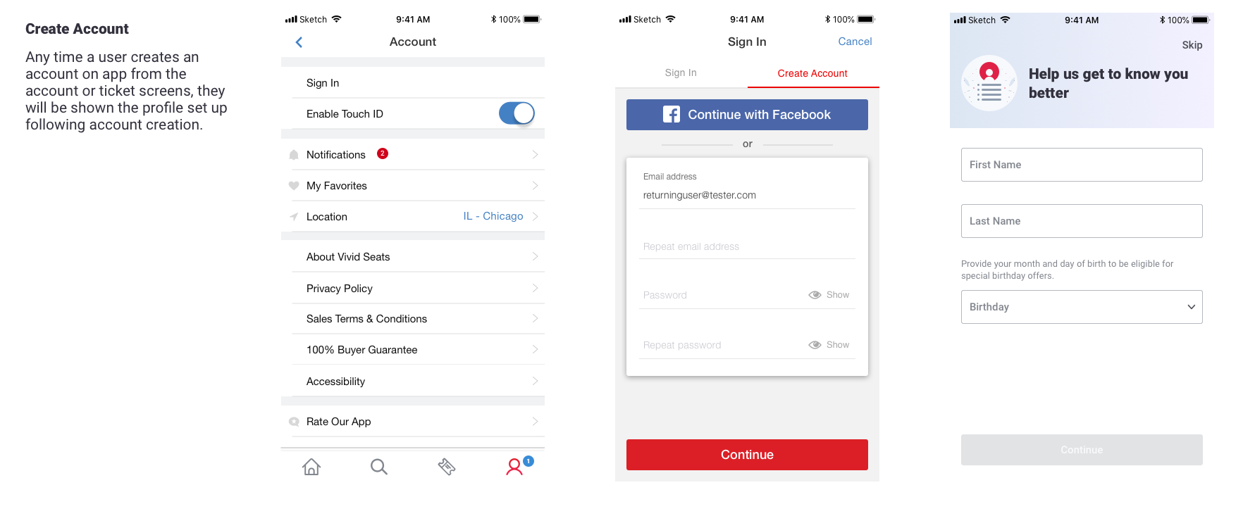
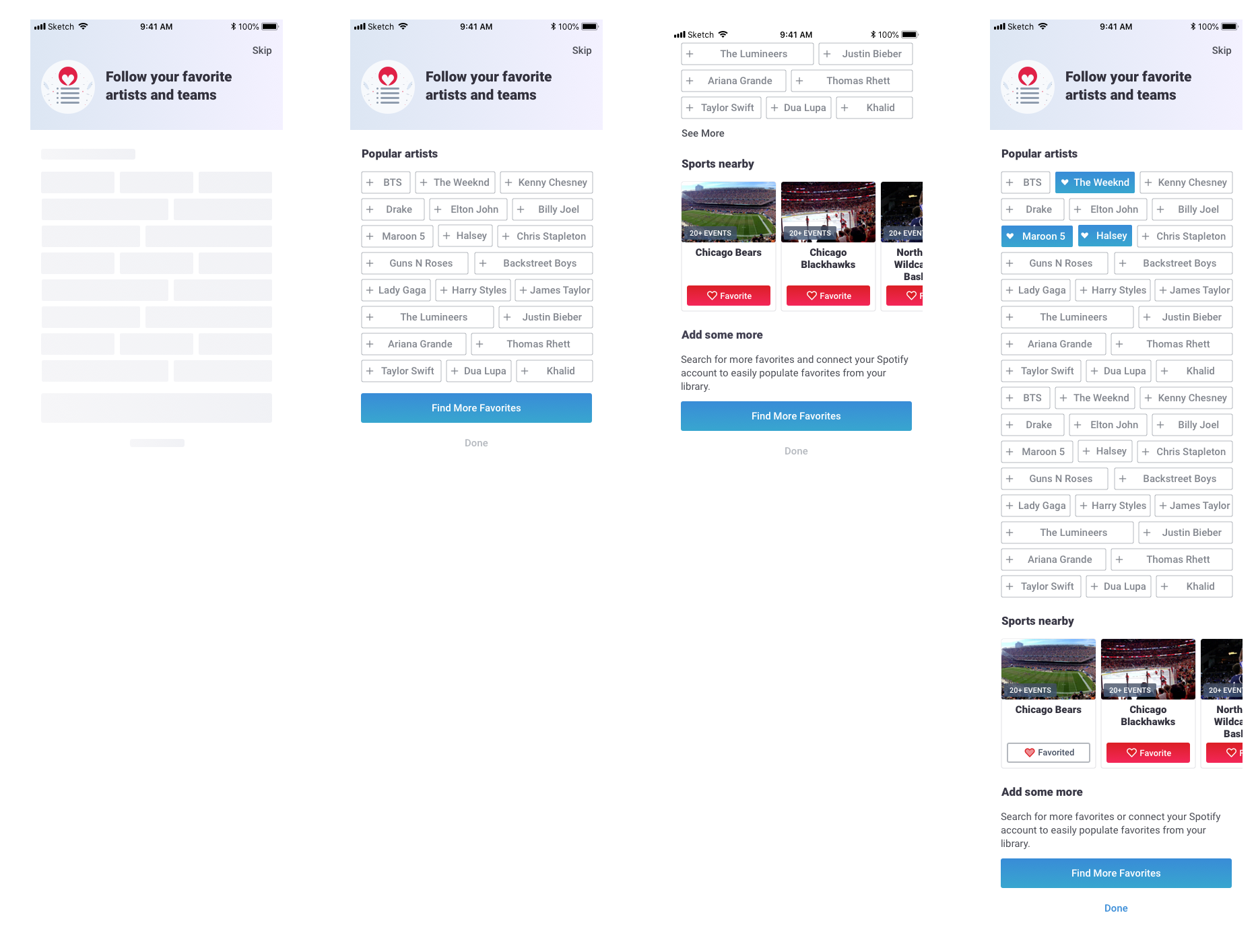
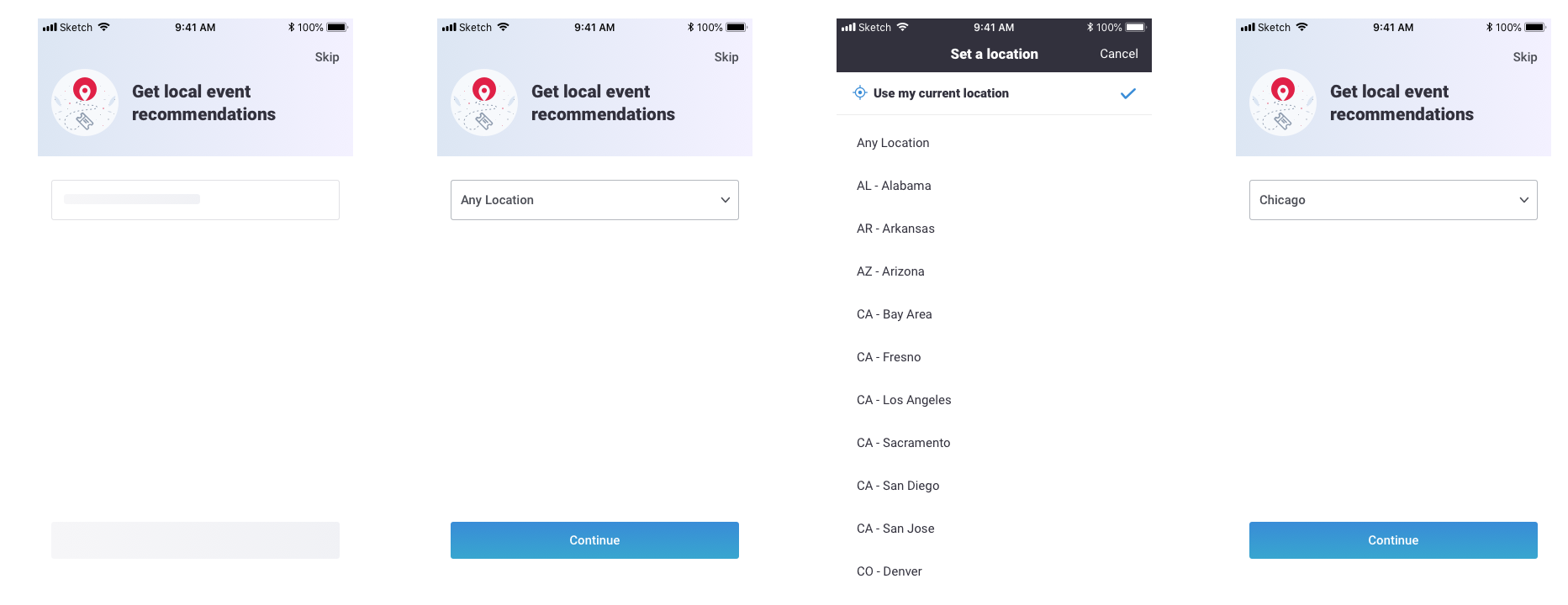
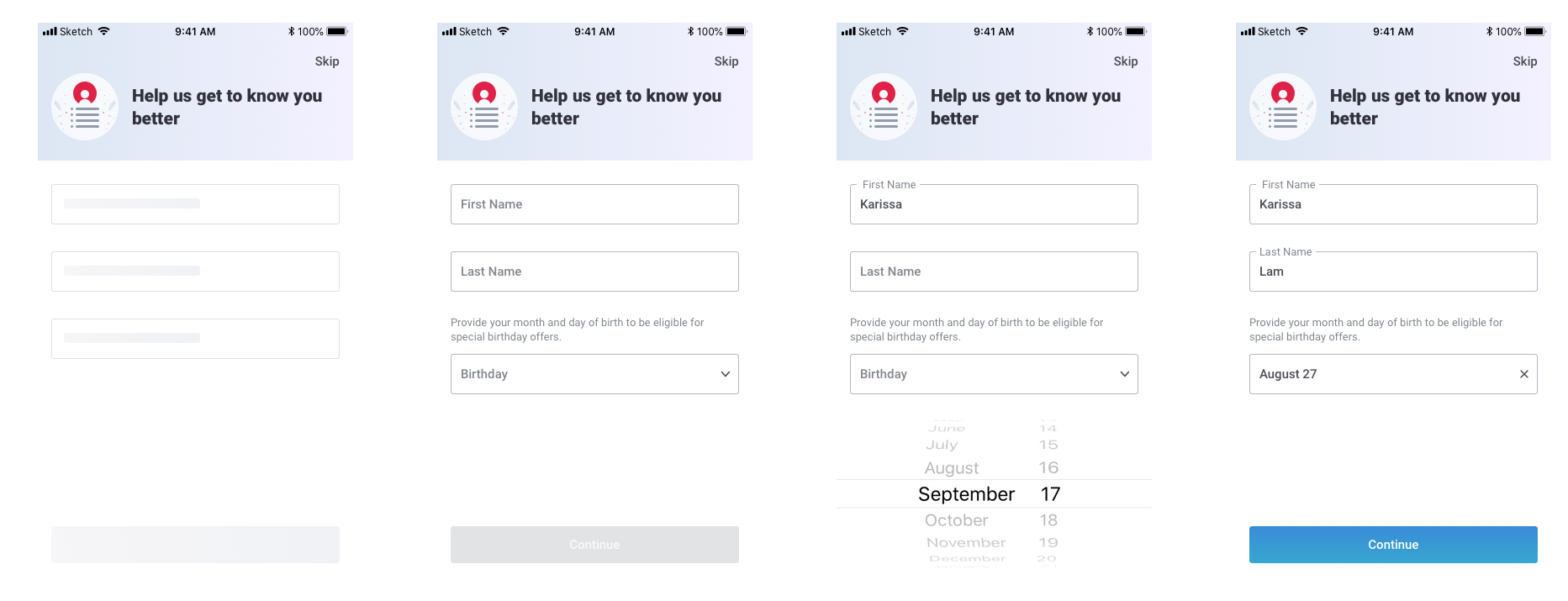
We brainstormed with the larger team what information we would like to collect in this flow. With all the ideas collected, we decided to narrow the scope to collect first/last name, birthday, location, and favorites. All steps would be optional but you would have to create an account to start.
Ideation
There were two main things to think through:
a. what is the setup flow?
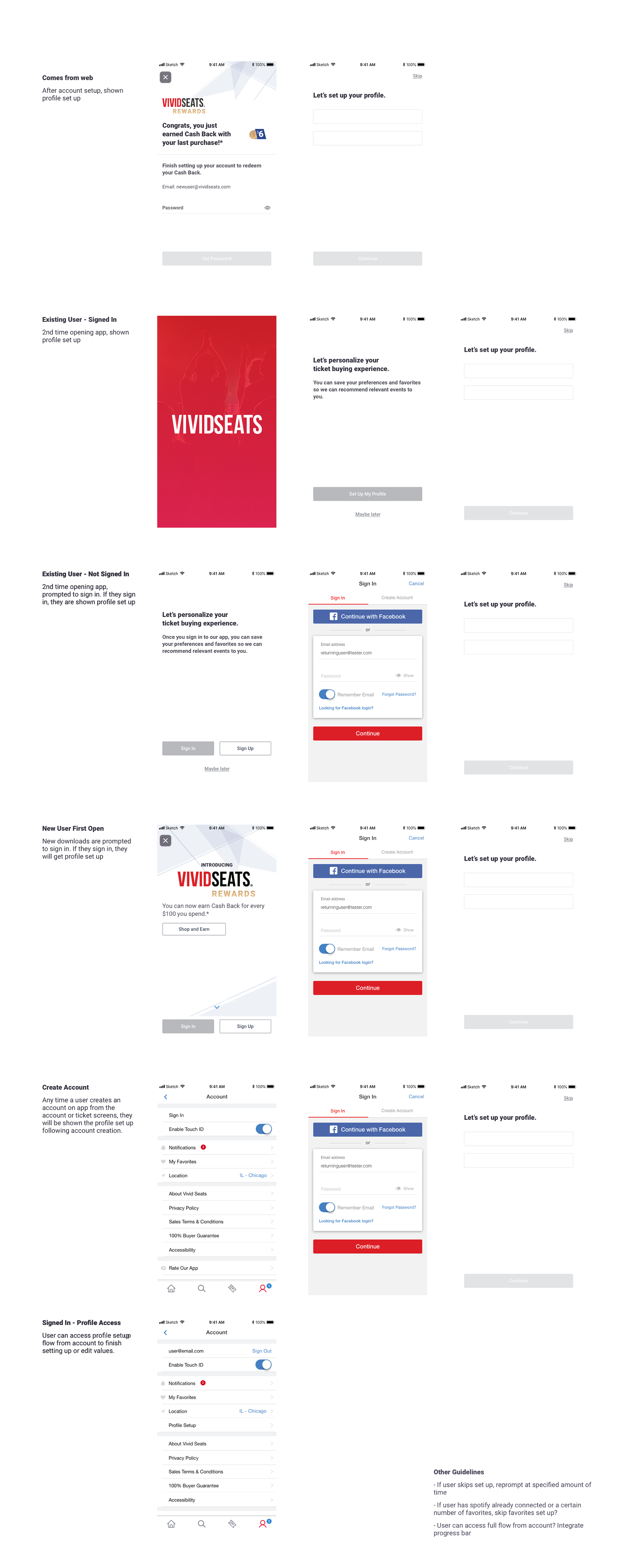
b. how do users getting into this flow?
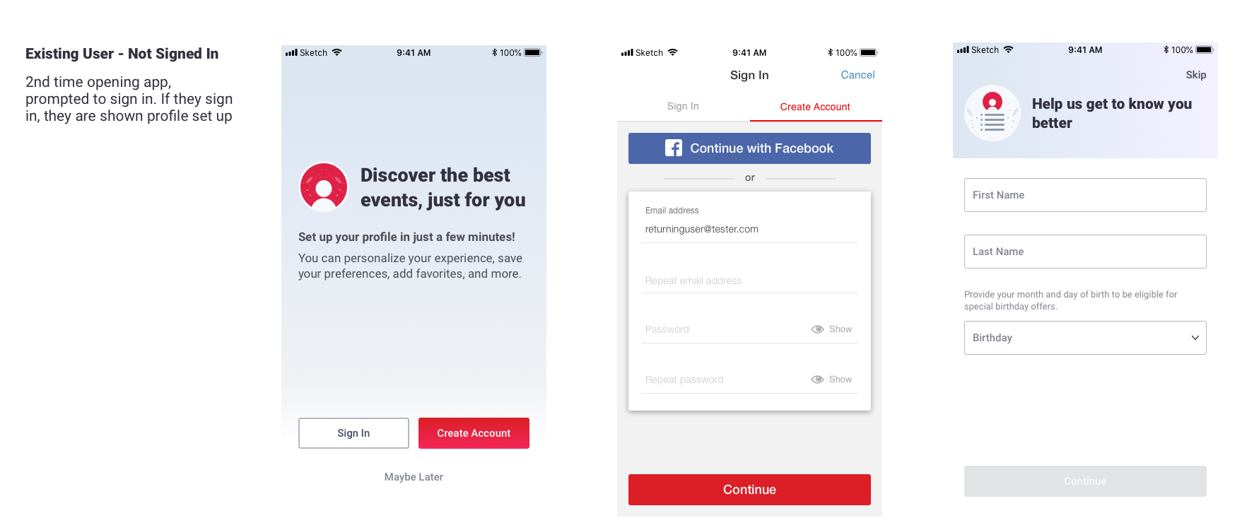
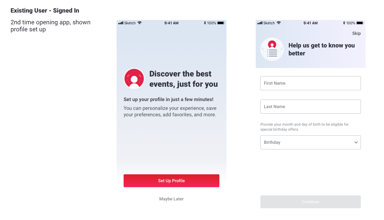
I set up a matrix of how different users would get to the flow whether they were new download, existing, signed in, etc. I also started stubbing out what we would include on each screen, what the copy should be and playing with some visual designs.
Design
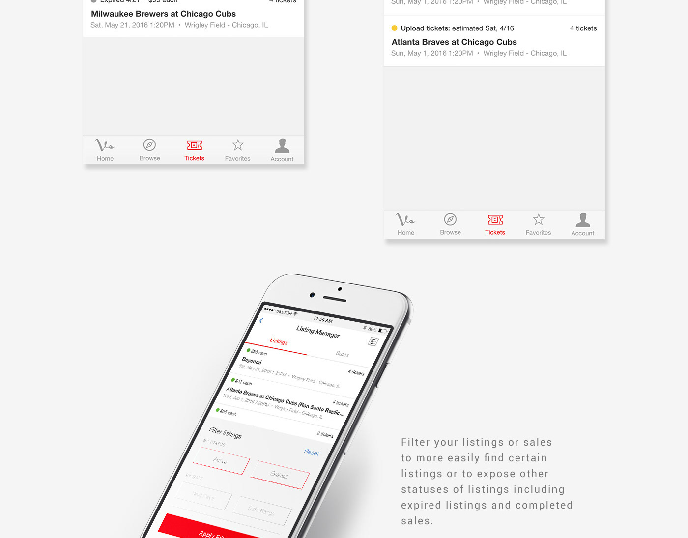
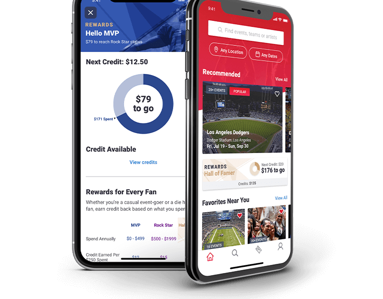
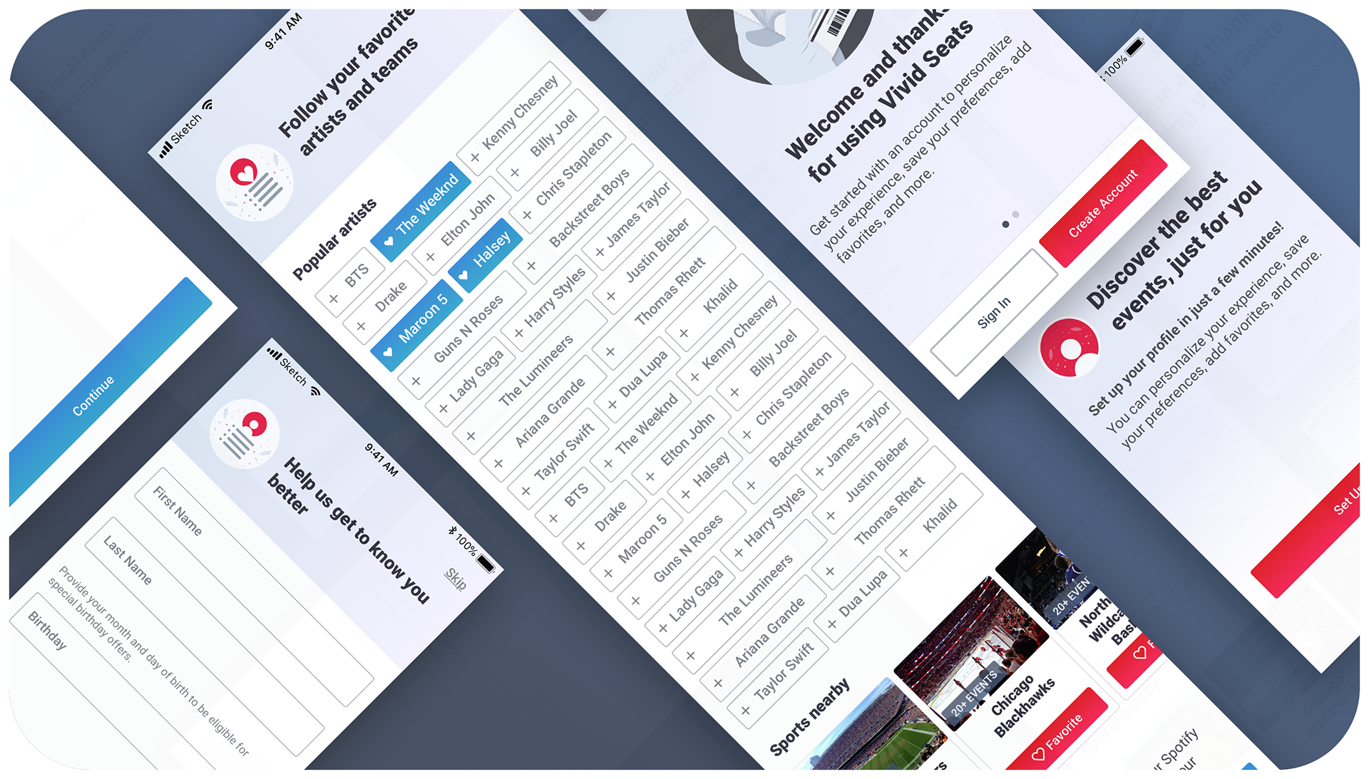
I designed a 3-step process that would collect personal information, location and then favorites. Adding a "skip" step was something our users said was important to them so I was sure to include. As mentioned before, all steps are optional but using disabled buttons encourages users to fill out information as they go through the flow. Our favorites screen presented users with the top 50 artists and all nearby sports teams as recommendations for them to 'favorite'.
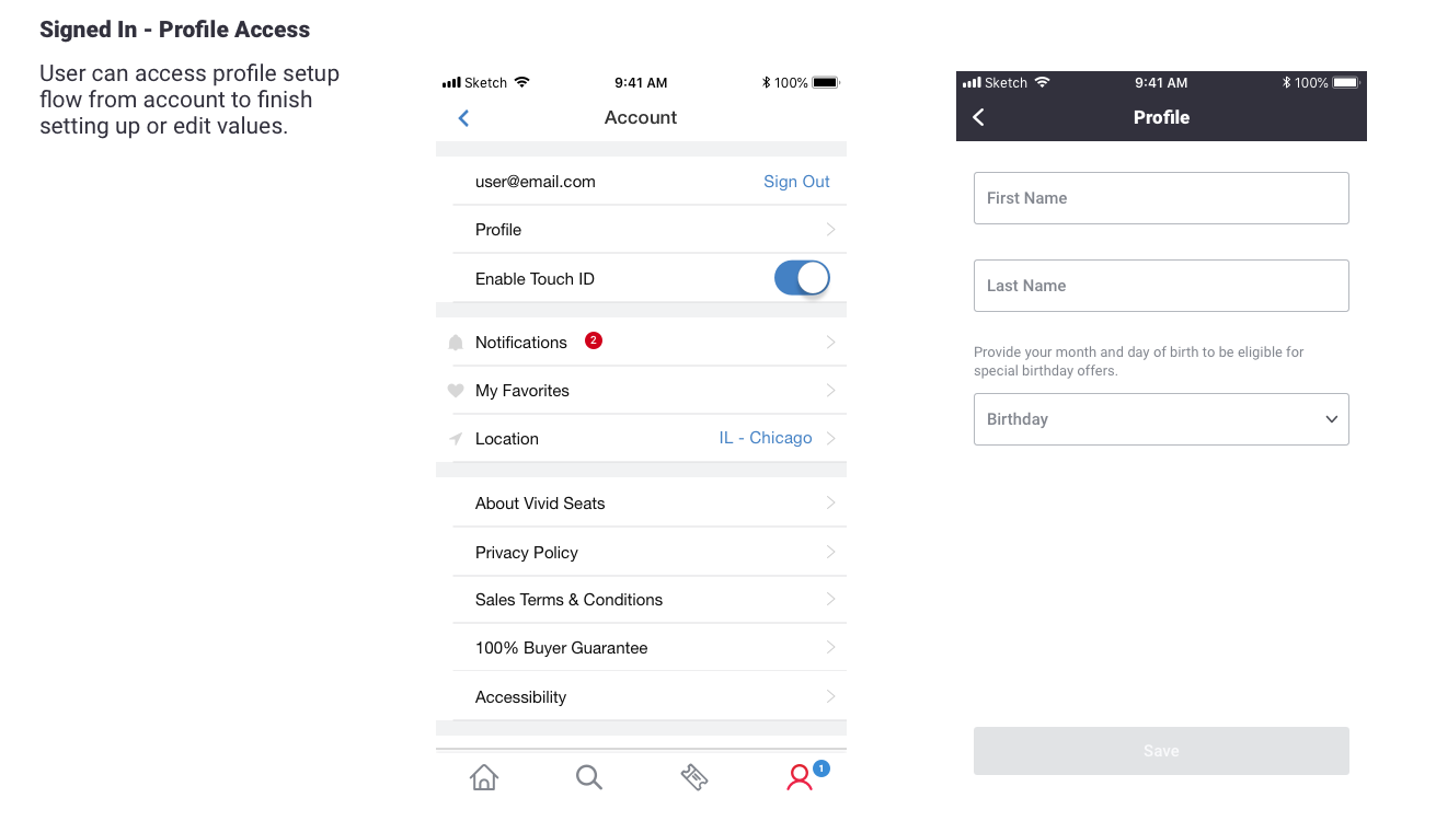
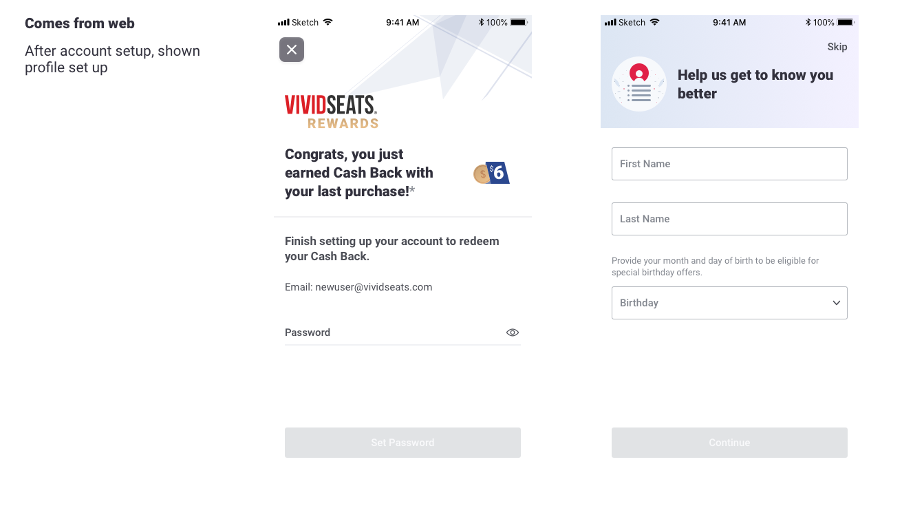
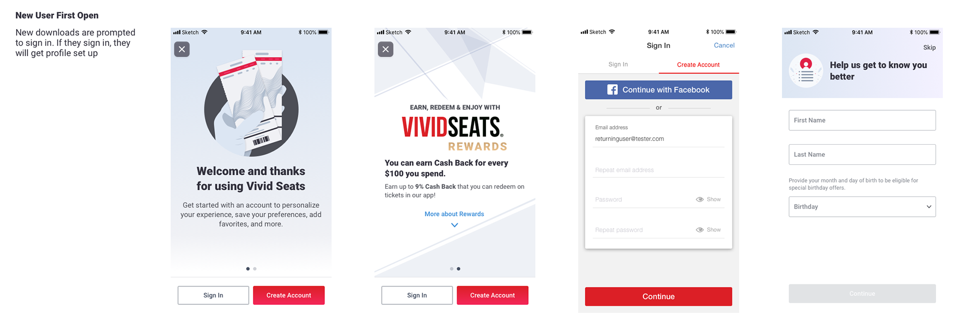
For some of our flows, I designed welcome modals to either a. welcome users to the app and prompt account creation or b. prompt profile setup (and/or account creation) from existing app users. For existing users, they are prompted on their 2nd app launch after the feature release to (create an account and) set up their profile. For any account creation besides going through checkout, users are prompted to set up their profile immediately after account creation.
We decided to introduce a new gradient for these screens to refresh our look and identify this flow as cohesive yet independent.
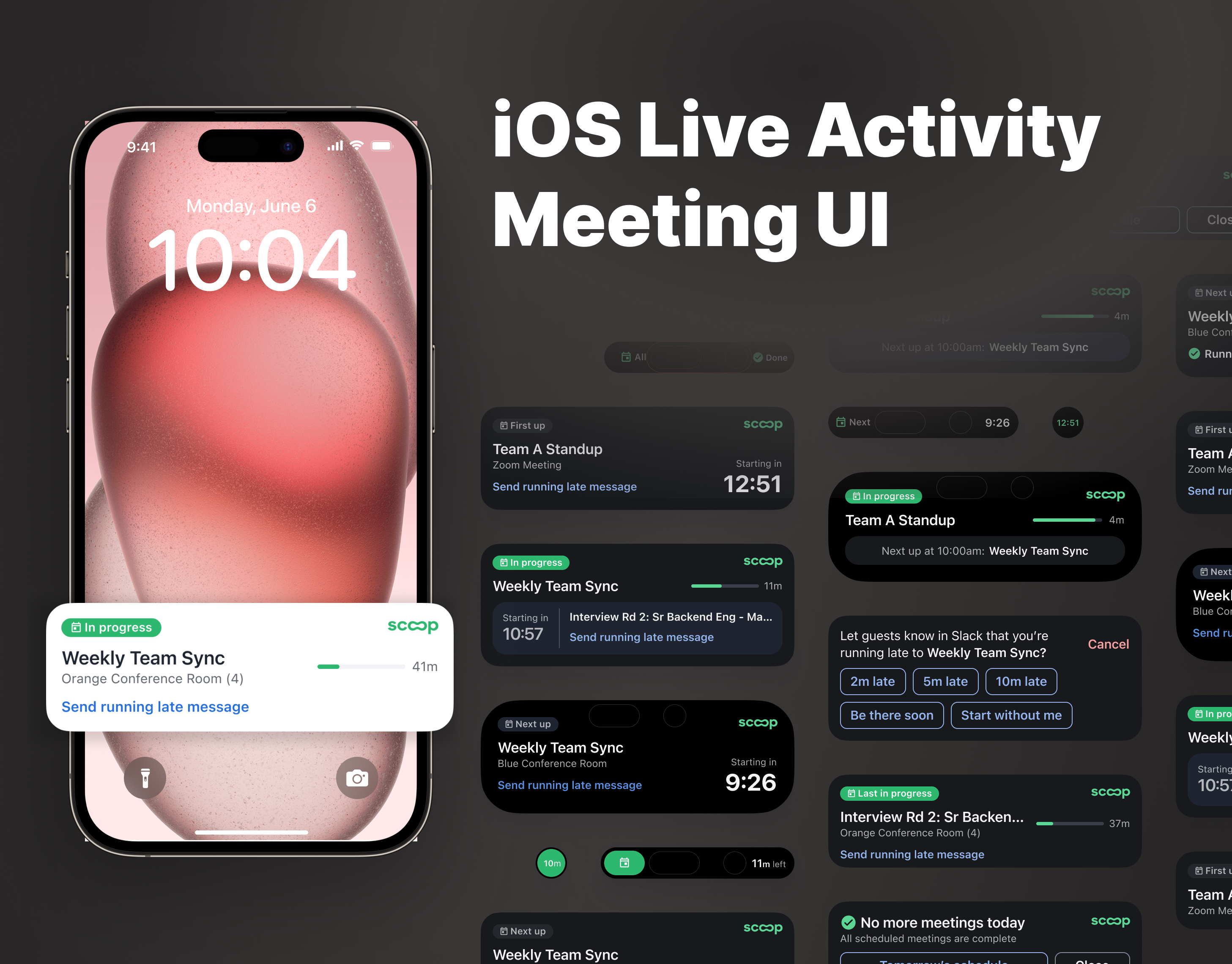
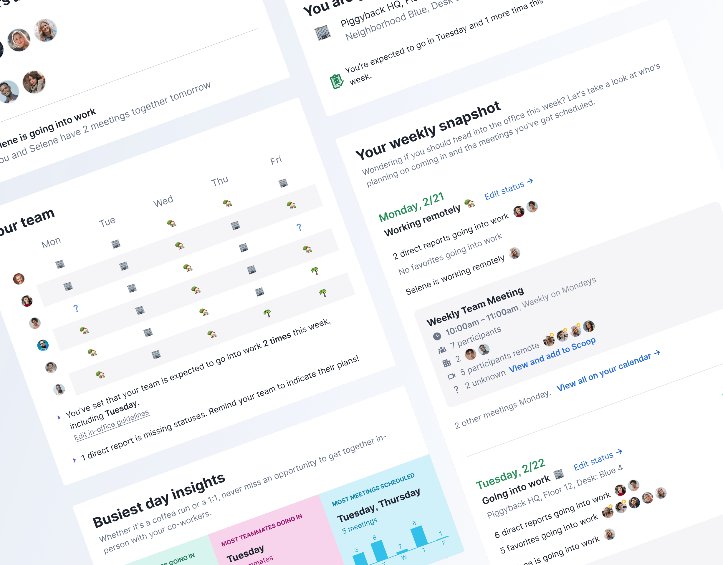
Below you can see all the core flow designed as well as the various states of the three steps (loading, empty, filled out, error, etc) and all the flows to the setup for different users.
Outcomes
After releasing this onboarding flow, the metrics we tracked for success were new accounts created, overall engagement, steps skipped, and various user events within the flow.
Some trends we noticed:
- With only a 3-step process, steps skipped were low. We can assume that the overall flow and the individual steps are approachable and manageable.
- Users are much more likely to create an account in purchase flow than before browsing, even when prompted. This may indicate that the timing of prompting users to sign in/create an account is not ideal or that the benefits of doing so are not apparent enough.
- For new app users that entered the profile setup flow, we were able to increase rates for using location, allowing push notifications and adding favorites. Location permissions were previously not asked for in a contextual manner and so we can assume that the added context led to better approval rates.
Future investments:
- Personalizing the profile further with some of the other ideas from the user testing, such as category preferences (Would need to take care to keep process manageable when adding in additional steps)
- More specific location: we're limited right now by our current location list which includes a list of regions. Users should be able to specify any city or zipcode to get more regionalized results (known work) which would enable us to add in a preference to profile on travel radius for recommended events
- Revisiting and optimizing when we prompt users to create a profile