

January 2023
Context & Problem
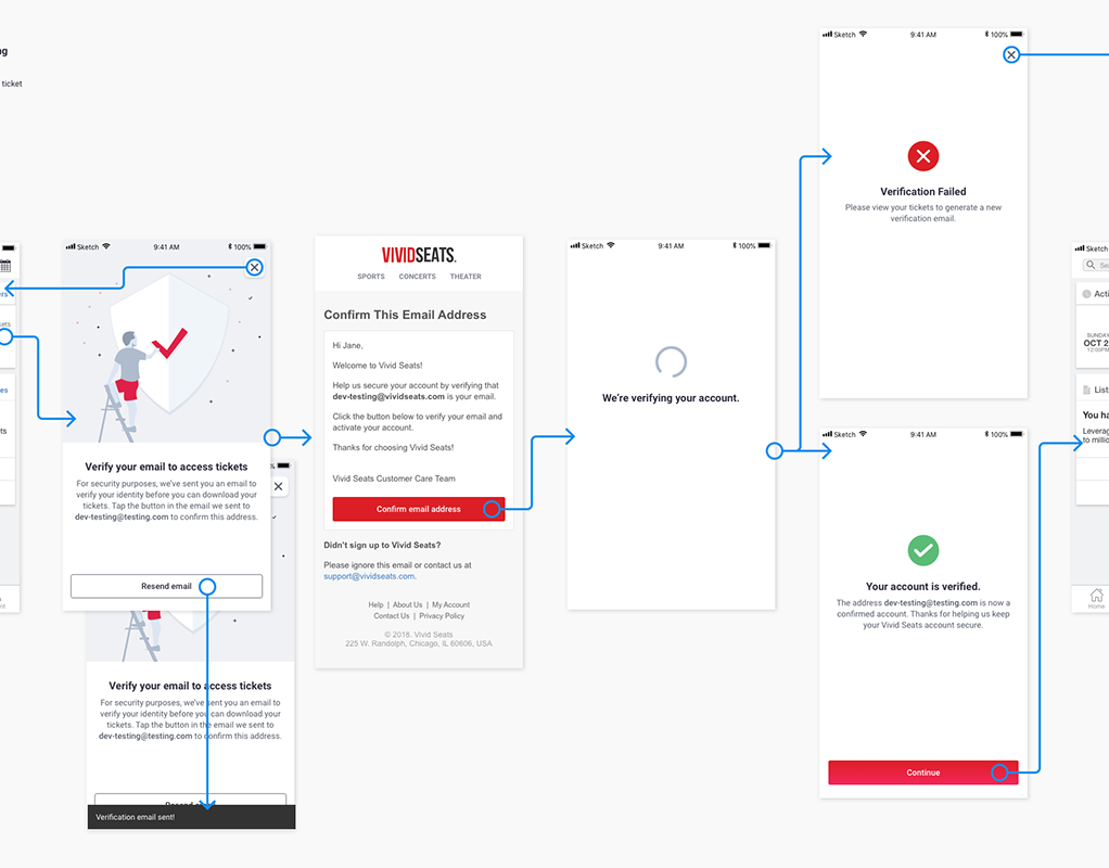
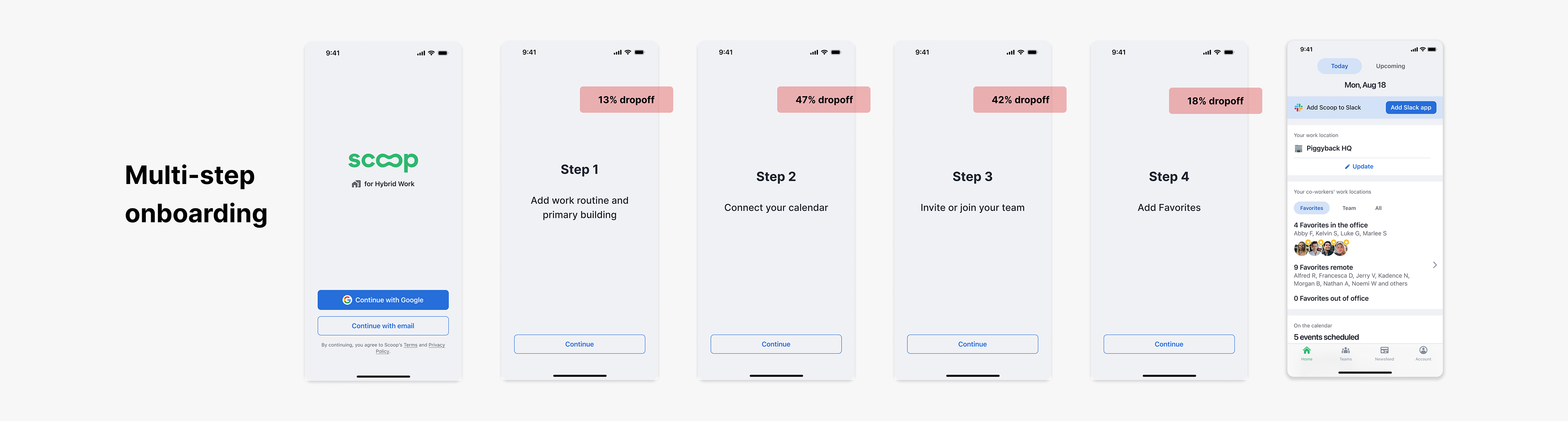
This project was completed for Scoop, an app that helps hybrid employees maximize productivity and collaboration by coordinating offices days. As our enterprise product expanded to serve a tiered market, we anticipated an influx of individual users at the 'basic' tier level. This transition necessitated the development of a structured onboarding process. Leadership and product teams believed certain steps were critical before the product could offer value. Research validated that completion of each step significantly improved user engagement over time and product value. Thus, we implemented a mandatory, sequential onboarding flow before they could access the product. Following release, our product adoption for basic users was very low and we started to dig into the data, finding pretty extreme drop-off rates throughout the flow. With 75% of users abandoning before completion, they never even saw the product.
User Research
Research Approach
We started with an analysis of engagement, and completion metrics to pinpoint where drop-off occurred in the originally onboarding. Then, we supplemented this with extensive user observation sessions, watching people navigate our onboarding flow. We thought we may identify some usability issues but instead discovered a pattern of concern and hesitation to complete steps. We conducted more moderated interviews to explore mental models around new app adoptions, key friction points and emotional reactions.
Findings
Users wanted more control, optionality and context. They weren’t ready to commit to things like calendar access or inviting teammates before seeing the product or knowing more. Many had privacy concerns about granting permissions or giving out others' emails. There were variations in setup priority (which step users would start with). Overall, users didn’t understand why these steps mattered because of a lack of understanding of the product before accessing it.
The core insight was that we needed to meet users where they were, where they could make progress on their terms and not forced through a rigid list of requirements
“I wasn’t ready to invite coworkers. I wanted to see the app first”
“I’m not comfortable granting calendar permissions without reviewing with our IT department”
“It’s not clear why I need to do each step to use this app”
A Pivot to our project
At this point, we tried one more incremental solution of adding product previews within existing onboarding steps, but in testing, users found these static images insufficient for truly understanding the product's value so it was not enough to move the needle.
We needed to reframe the problem from 'How do we get users to complete onboarding steps?' to 'How might we help users understand product value while gradually completing necessary setup?’
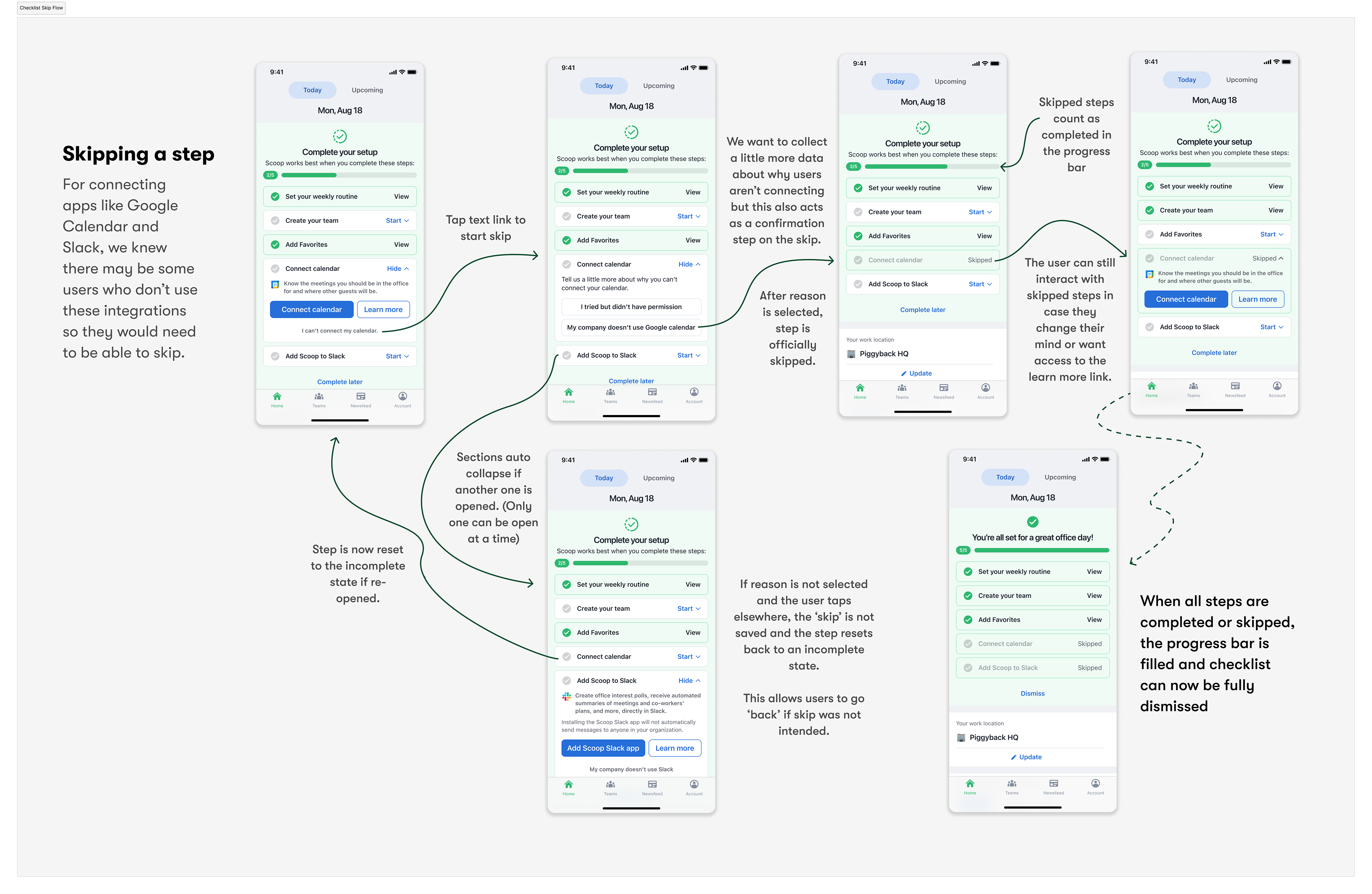
In order to support a more fundamental shift in our approach, we aligned on a cross-functional decision to allow users to skip steps and bypass onboarding. We needed to take on the risk of users not gaining that full setup experience in order to reduce the friction upfront and prioritize quick entry into the product.
From these conversations, we defined our project goal, identified business objectives and set design goals to drive the strategy.
Project Goal
Design a new onboarding experience that prioritizes quick entry into the product, provides guidance within context, and supports users in completing setup over time
Business Goals
• Increase product adoption among new basic users
• Achieve high completion rates of critical setup actions
• Accelerate time to user activation
Design Goals
• Encourage product exploration
• Drive setup by surfacing value early
• Support flexible, self-paced activation
• Maintain a helpful, lightweight tone
Early Concepts
Initial Ideation
I did an exercise of mapping the user journey to identify natural moments for each setup action. This mapping, along with our design goals to support flexible activation during product exploration led me to explore using alert banners as a central location to surface incomplete tasks from onboarding. I also examined how we could use empty states to contextually prompt users to complete actions they had skipped in onboarding with better visualizations and stronger call-to-actions.
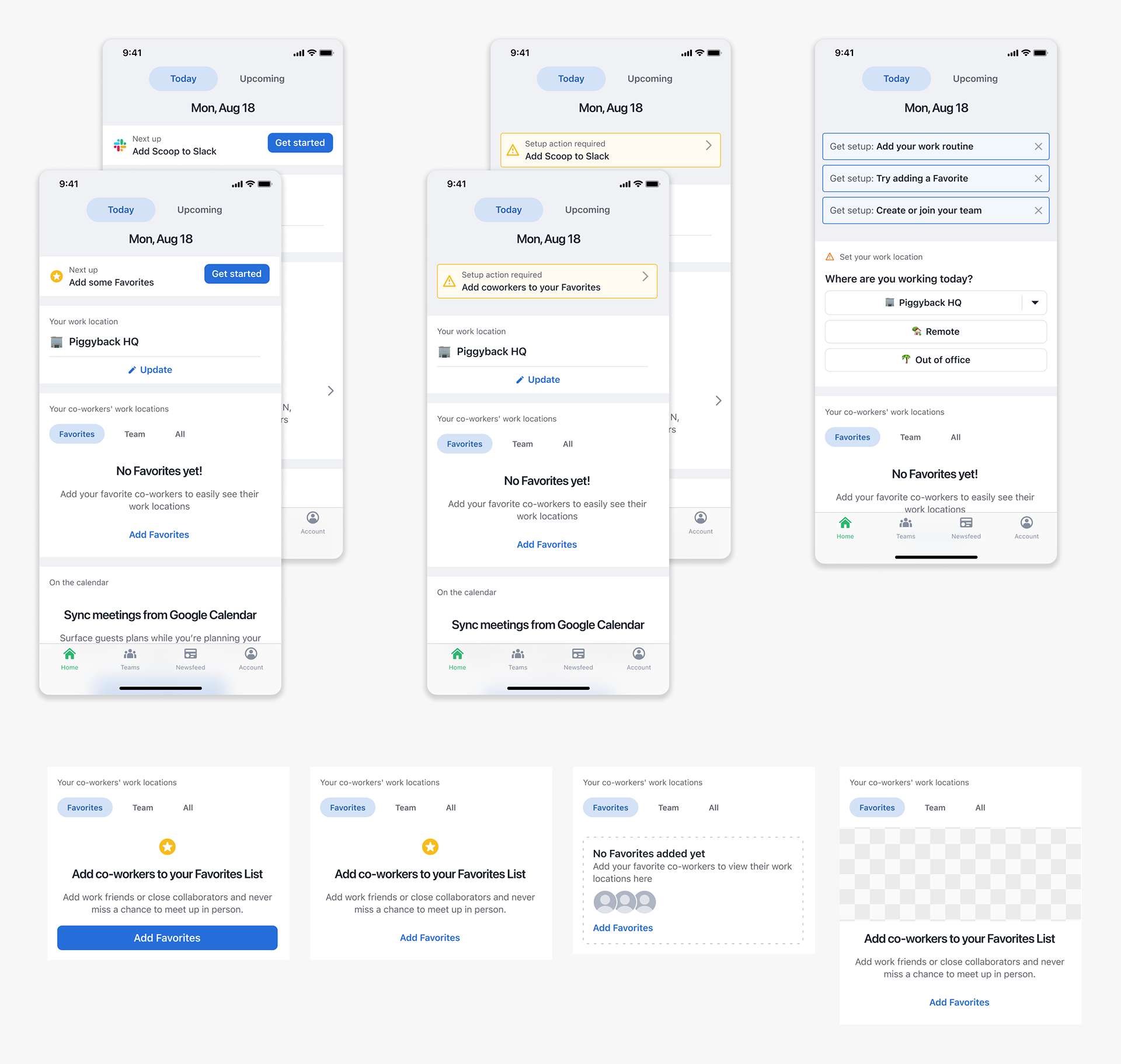
Feedback on these initial concepts highlighted two key issues: empty state prompts felt too dispersed, while home page alerts competed for attention and risked becoming unwieldy as they multiplied. This critique led me to the concept of a unified component that could house all incomplete onboarding steps in one cohesive, manageable interface.
Working closely with the product team, we defined the five essential setup steps and established key principles to layer onto the design goals: the checklist needed to clearly show progress, allow users to complete items at their own pace, and remain present until all steps were either completed or explicitly skipped. Crucially, we wanted users to understand the value they would gain from completing each step.
Early Concepts
With clear requirements in hand, I conducted competitive research across various tools and platforms for inspiration and understanding of common patterns. Then, I developed several initial concepts to share with the team.
These ranged from:
• a Floating Action Button entry point to a multi-step pager, optimizing for minimal UI interruption
• an alert style pager, prioritizing step-by-step guidance
• a Floating Action Button entry point to a multi-step pager, optimizing for minimal UI interruption
• an alert style pager, prioritizing step-by-step guidance
• an accordion-style checklist, balancing visibility with space efficiency
• a banner to launch a full-screen experience reminiscent of our original onboarding, maintaining consistency with existing patterns
• a system of contextual prompts integrated with empty states, maximizing relevance to user context
• a banner to launch a full-screen experience reminiscent of our original onboarding, maintaining consistency with existing patterns
• a system of contextual prompts integrated with empty states, maximizing relevance to user context
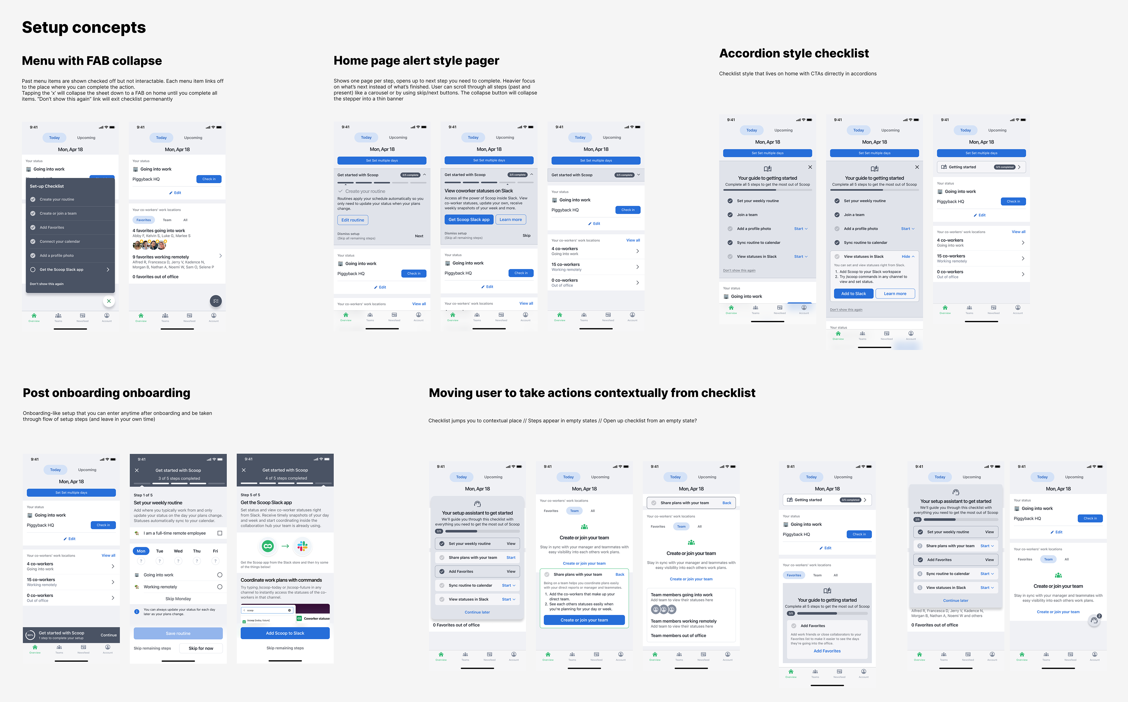
While stakeholders were drawn to the contextual prompts for their tight integration with features, there were concerns about abruptly showing the checklist in different locations throughout the app.
The accordion style checklist struck the right balance of being a familiar mental model, being centralized without being intrusive, and for it’s simplicity and modularity. We validated this concept with users to confirm discoverability, flexibility and helpfulness of this approach, and with engineering to confirm feasibility and scope.
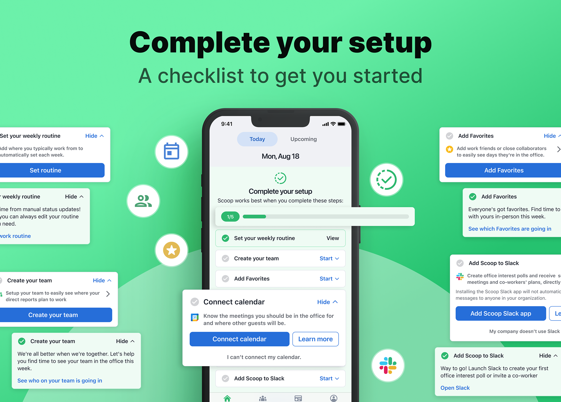
Designing Clear Progress Tracking
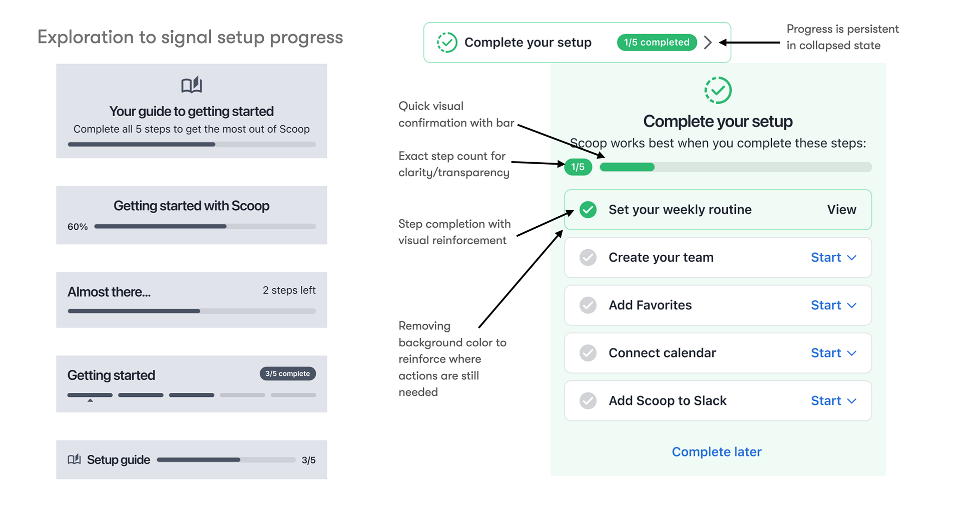
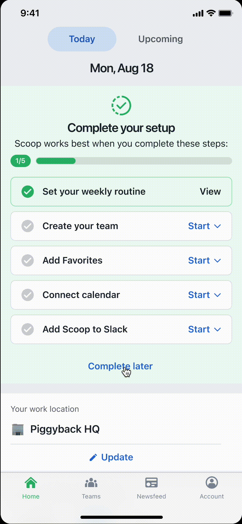
One of our key principles for this experience was to provide clear, motivating feedback on progress. To bring that to life, I explored different options for visualizing setup progress — including variations of progress bars, step checkmarks, and states for both expanded and collapsed views.
Ultimately, I landed on a combined approach: step-by-step indicators, a progress bar, and completion badging that was visible at a glance in both checklist states. We chose to show completed steps not just for clarity, but to reinforce the value users had already unlocked. This was especially important because many users might have completed one or two steps in the original onboarding. Seeing that progress reflected helped turn the checklist into a positive, motivating experience.
These decisions were informed by our qualitative research as well: users shared that it was important to know how many steps were left, and that seeing progress helped them feel a sense of accomplishment. With progress indictors, they felt like they were making headway and that feeling kept them going.
Logic and Behavior of Step Completion
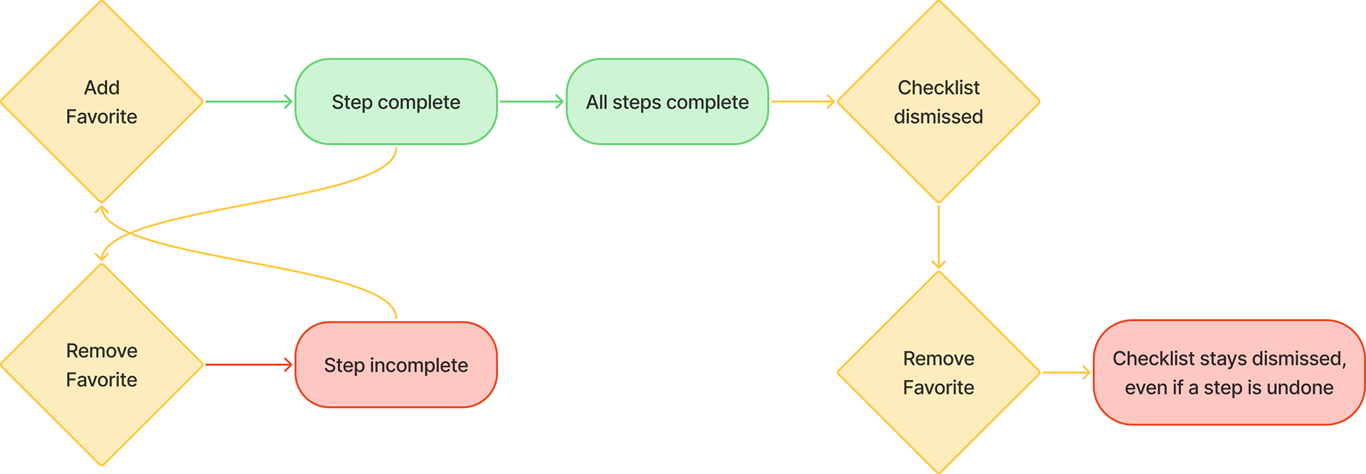
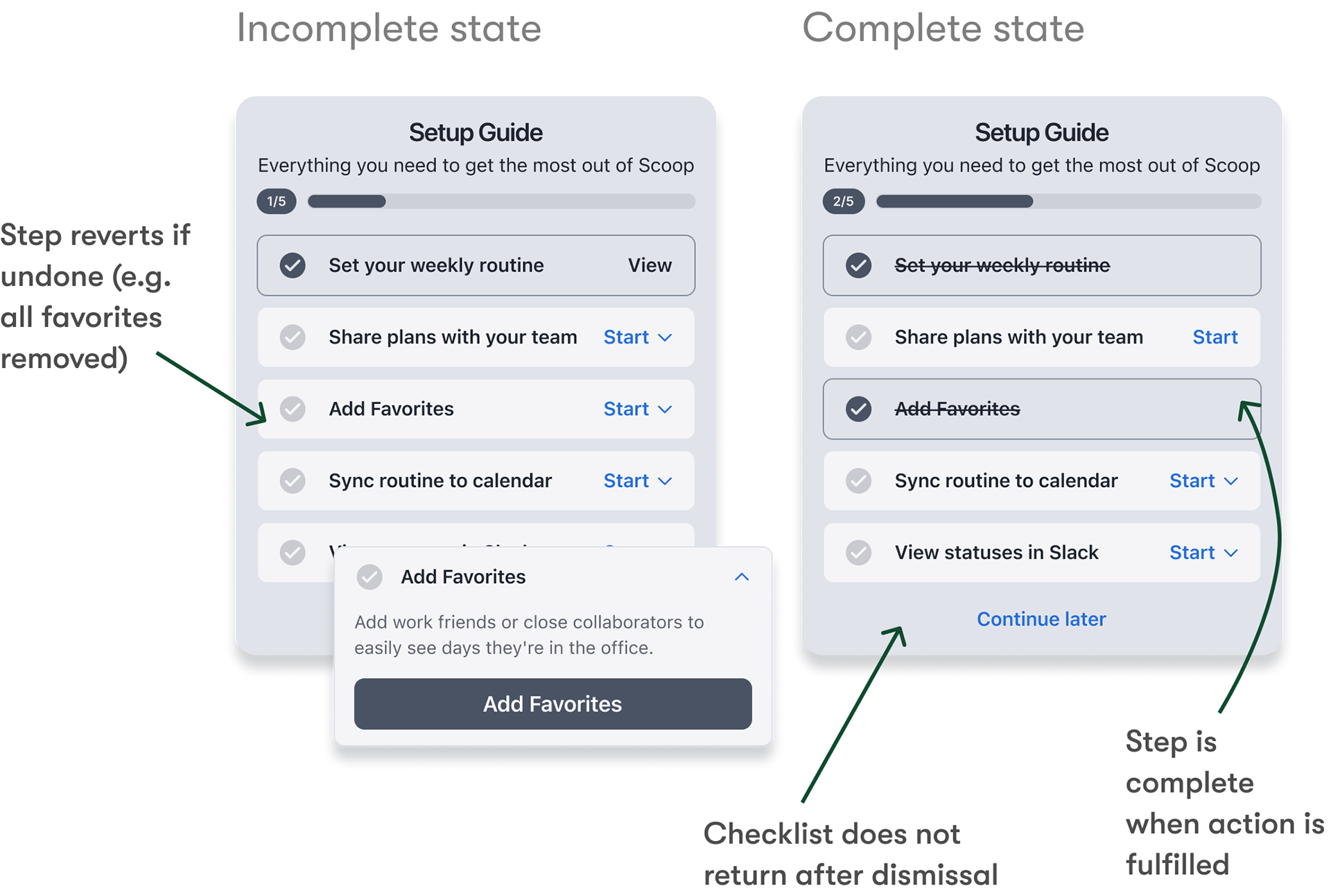
One of the more interesting collaboration moments was around the backend logic that determined whether a checklist step was considered 'complete.' We worked closely with engineering to ensure that completion wasn't just a one-time event. For example, if a user added a favorite location, we’d mark that step complete. But if they removed their only favorite later, we’d revert that step back to incomplete.
This decision wasn’t arbitrary — it reflected our shared belief across design, product, and engineering that the checklist wasn’t just a tour; it was meant to drive true activation. We wanted users to actually set up their accounts in a durable way, not just check a box.
We also collaborated with engineering on what happens post-dismissal. We aligned that once a user actively dismisses the checklist, we consider them fully activated — the checklist won’t return, even if they undo something or we add new steps later. This would avoid undermining a user’s sense of progress. These backend decisions helped create a setup experience that was flexible when needed, still goal-driven and intentional, and set up for long-term use.
Key Decisions
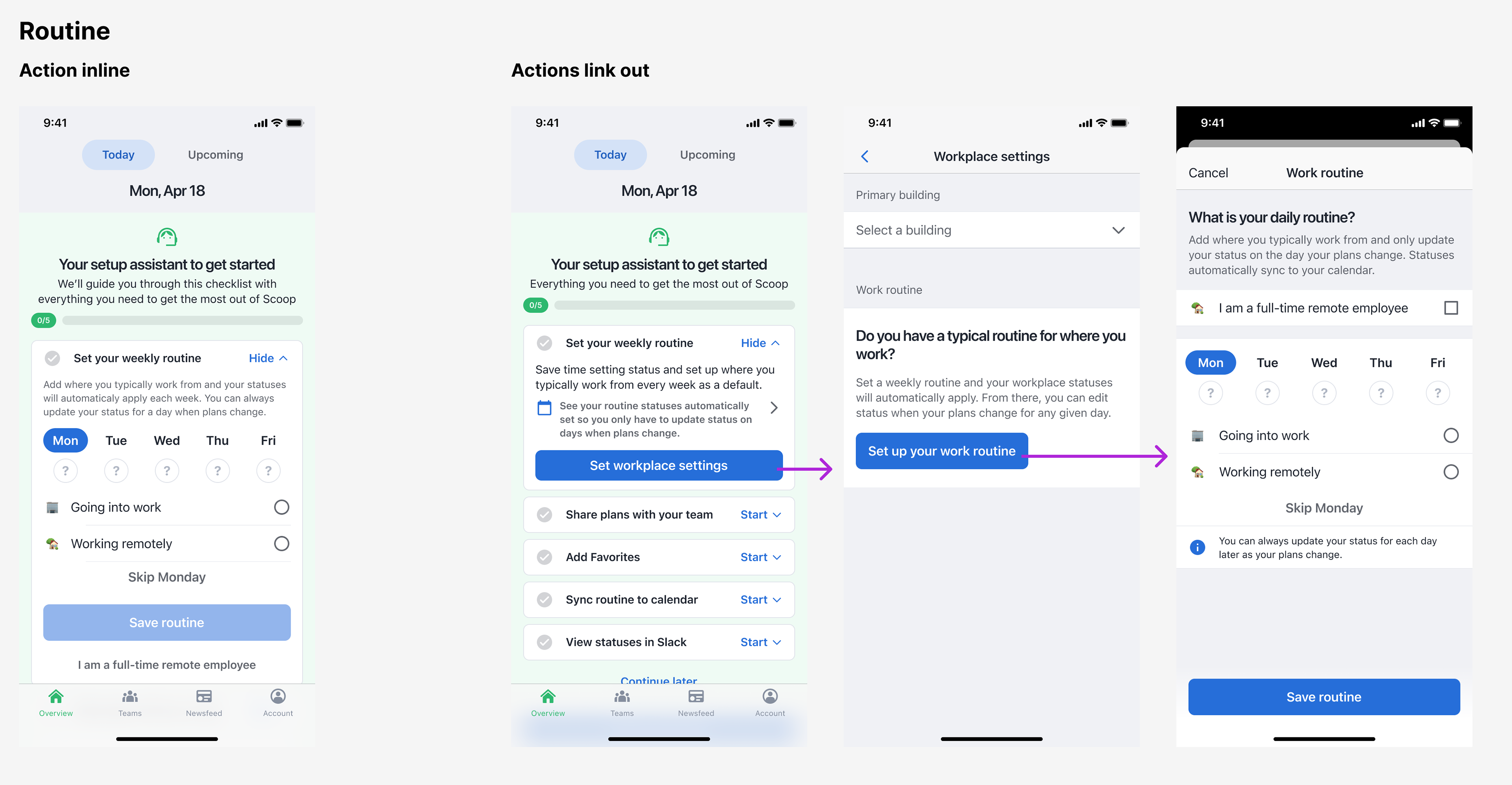
One key decision revolved around where steps would be completed. I explored two main options: expanding checklist items to show inline completion forms, versus linking out to existing areas of the app. The latter approach won out for several reasons. It reduced engineering complexity, accommodated more complex forms without spatial constraints, and, importantly, familiarized users with the permanent locations of these features within the app.
Another key decision was an design choice that was directly tied to one of our core goals: surfacing value before asking for commitment. I designed lightweight preview links within each step description that would scroll users down to the corresponding empty state on the page. This allowed users to explore what a feature would unlock — without requiring them to commit first.I also enhanced those empty states to clearly communicate purpose and added visual cues to preview the completed experience, helping users connect the dots between taking action and the value they'd receive.
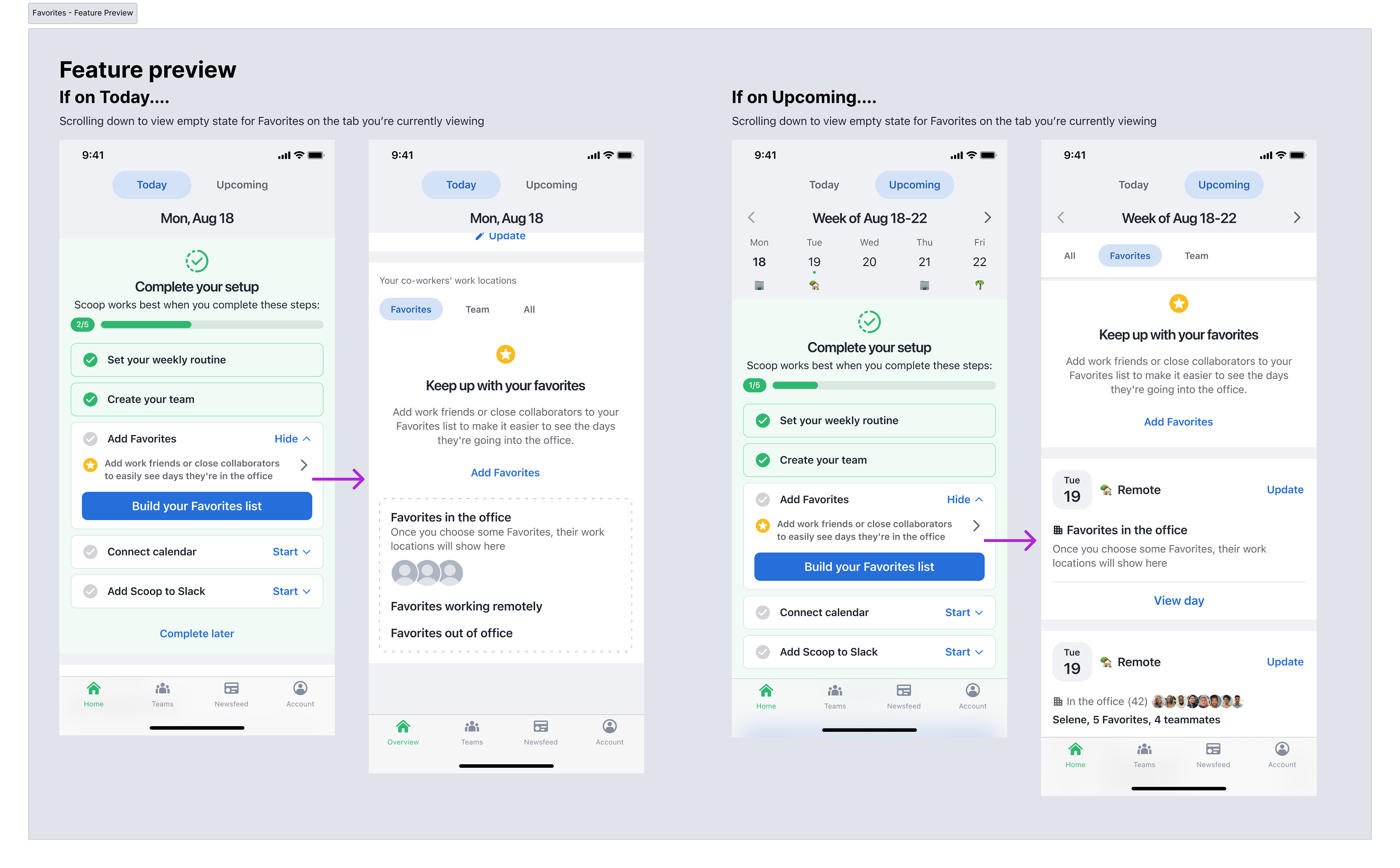
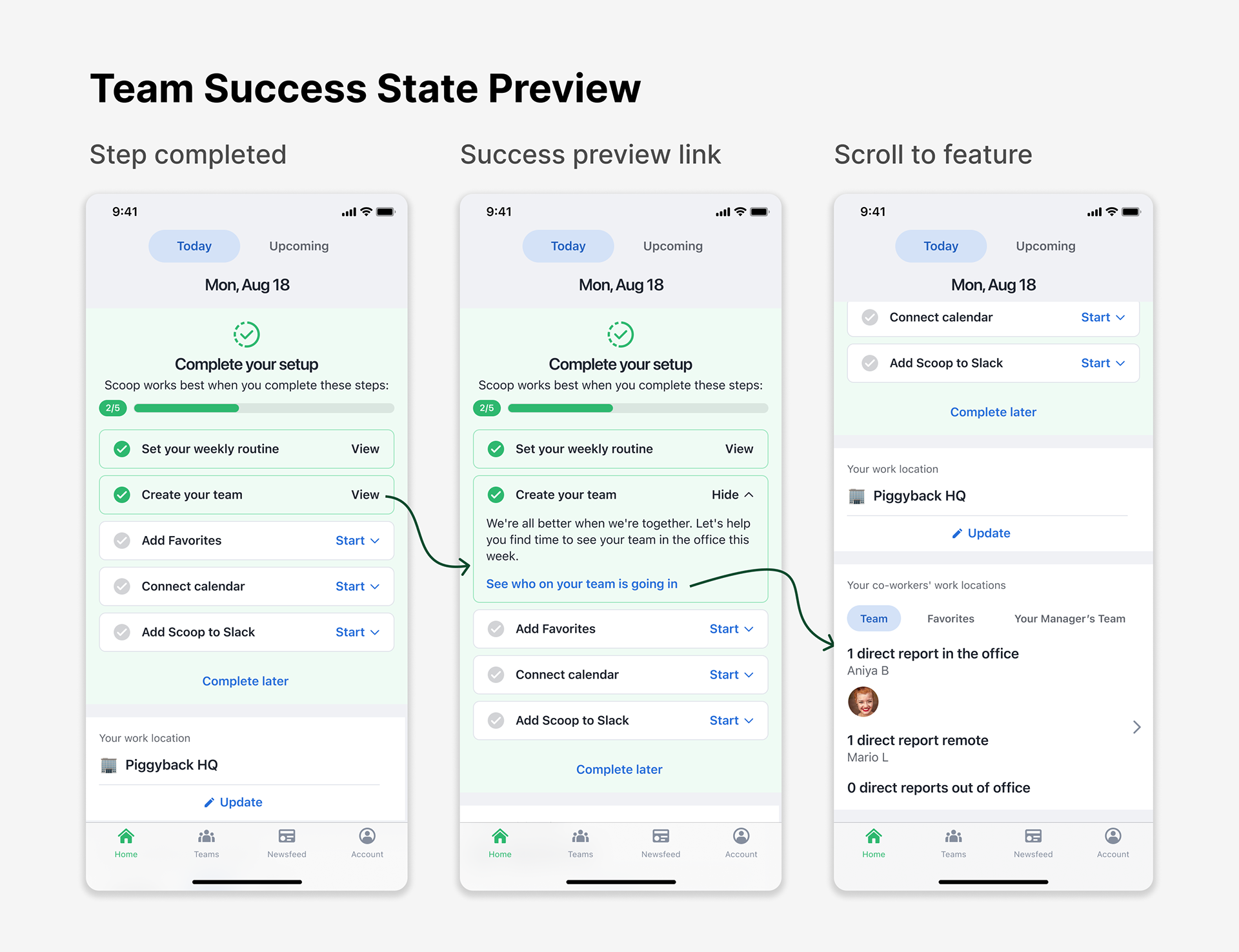
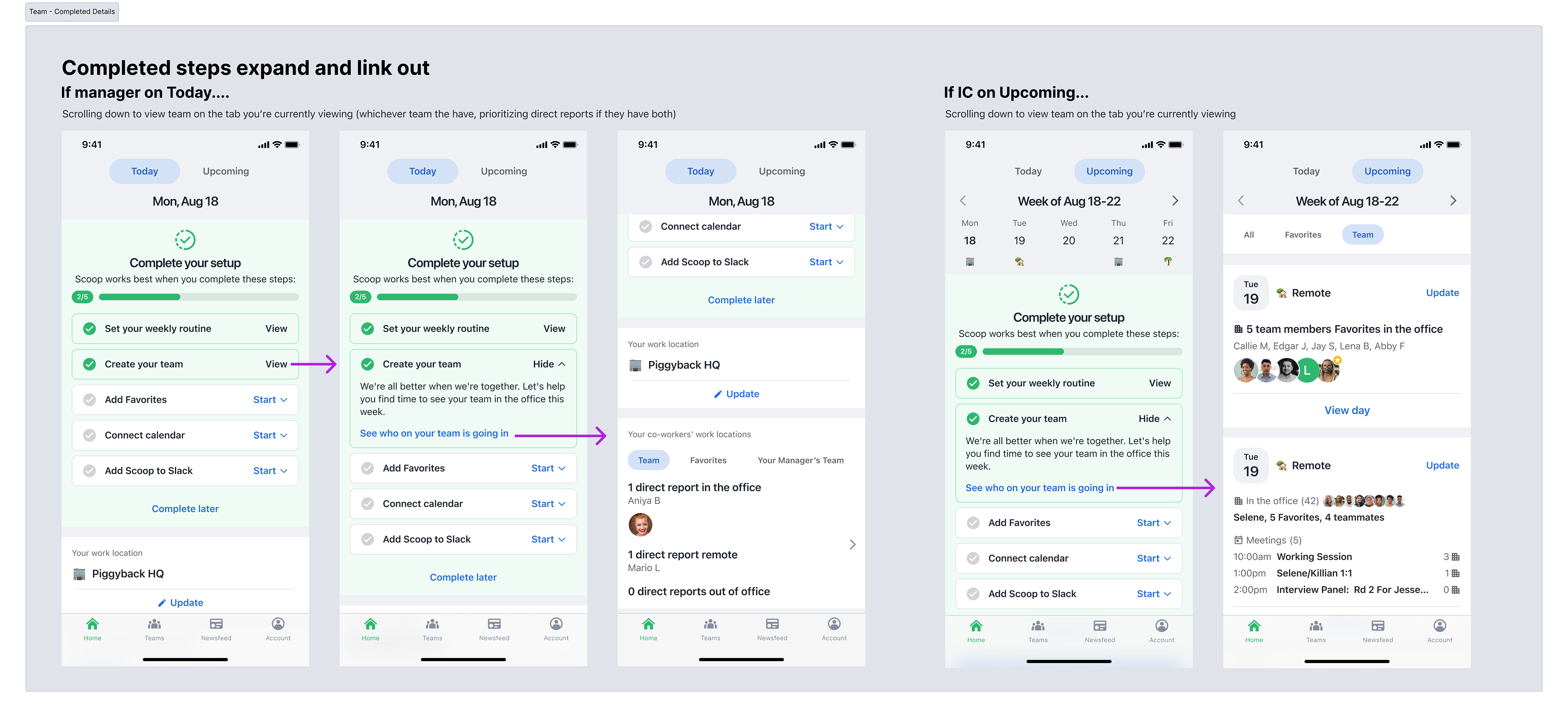
On the flip side, for steps that were already completed, the checklist expanded to include a link that deep-linked users to the newly activated features. This reinforced the value they’d just unlocked, making the payoff immediately visible and accessible.
Refining the Experience
As the design took shape, several critical aspects required careful consideration.
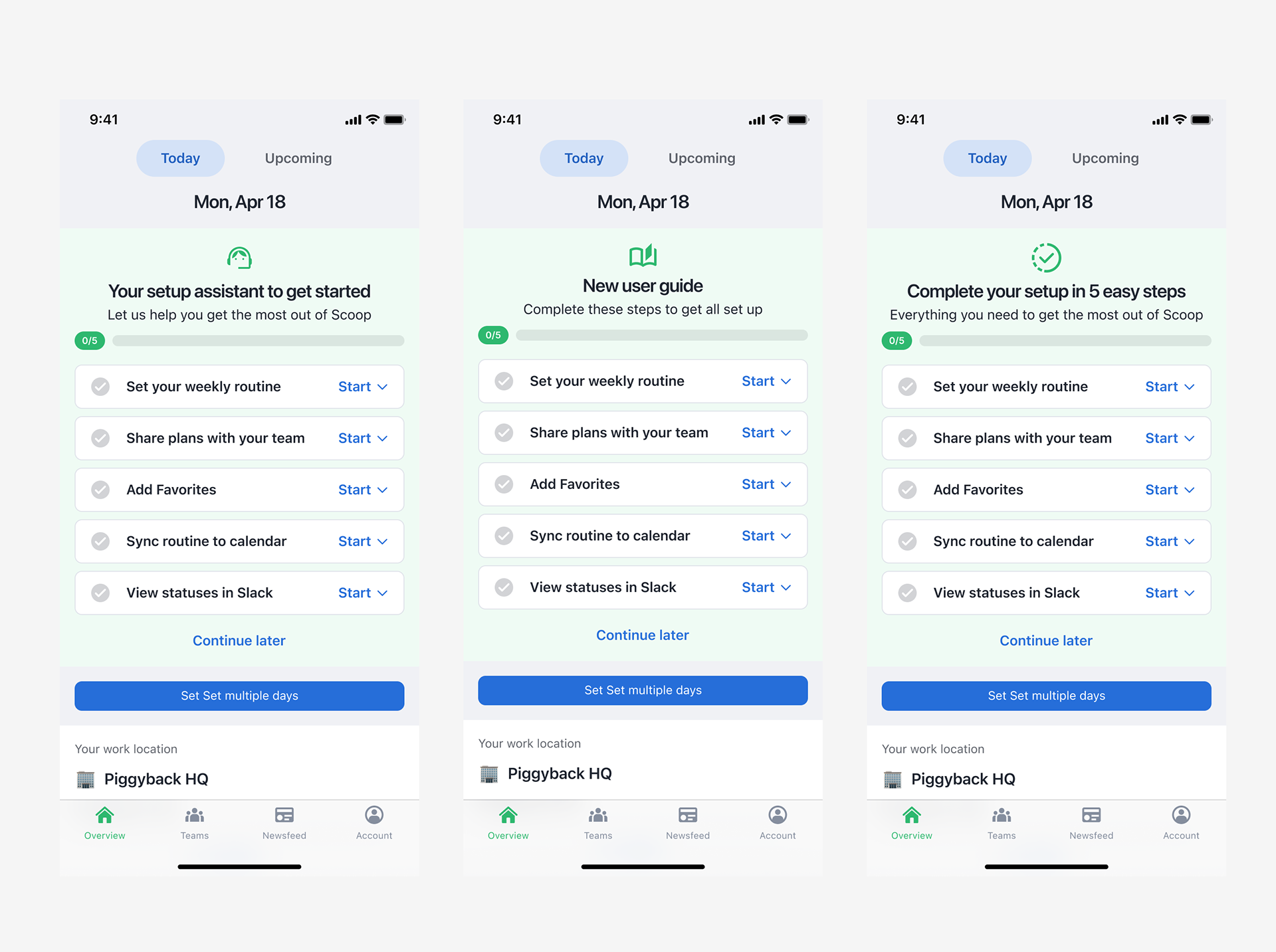
The messaging and positioning of the checklist—whether to frame it as a setup assistant, new user guide, or something else—needed to strike the right tone. I worked with marketing to define this positioning, adjust UX copy, and create success messages that reinforce value and create an emotional connection to completed actions.
Beyond language, I refined micro-interactions to create smooth transitions between collapsed and expanded states, and intuitive touch targets/animations to reduce interaction friction.
The final pieces of the design included covering various states for our core user flows and adapting the overall design for the 3 platforms it was released on: iOS and Android apps as well as our browser extension.
Final Implementation
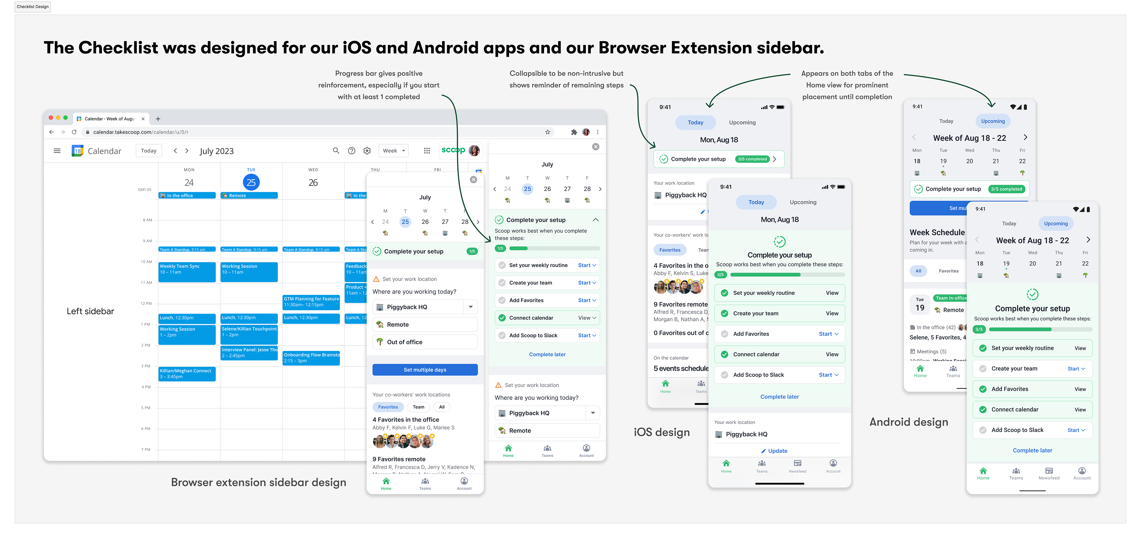
Our final solution was implemented across iOS, Android, and the browser extension sidebar, living their respective home screens as a non-invasive guide until completion.
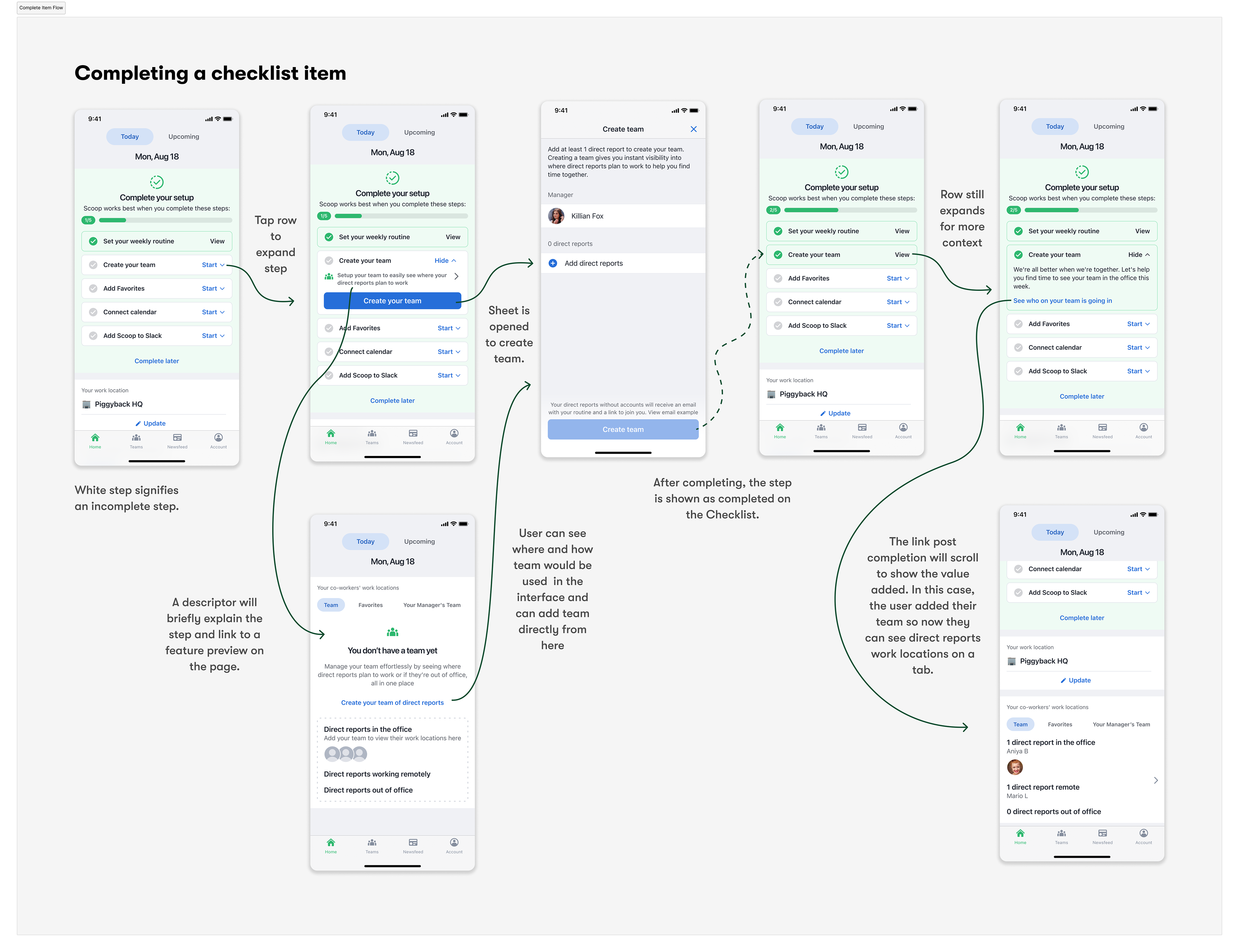
Each step is independently collapsible, reflecting our user-centered approach that allows the user to see all steps upfront, focus on one task at a time, and complete steps in any order.
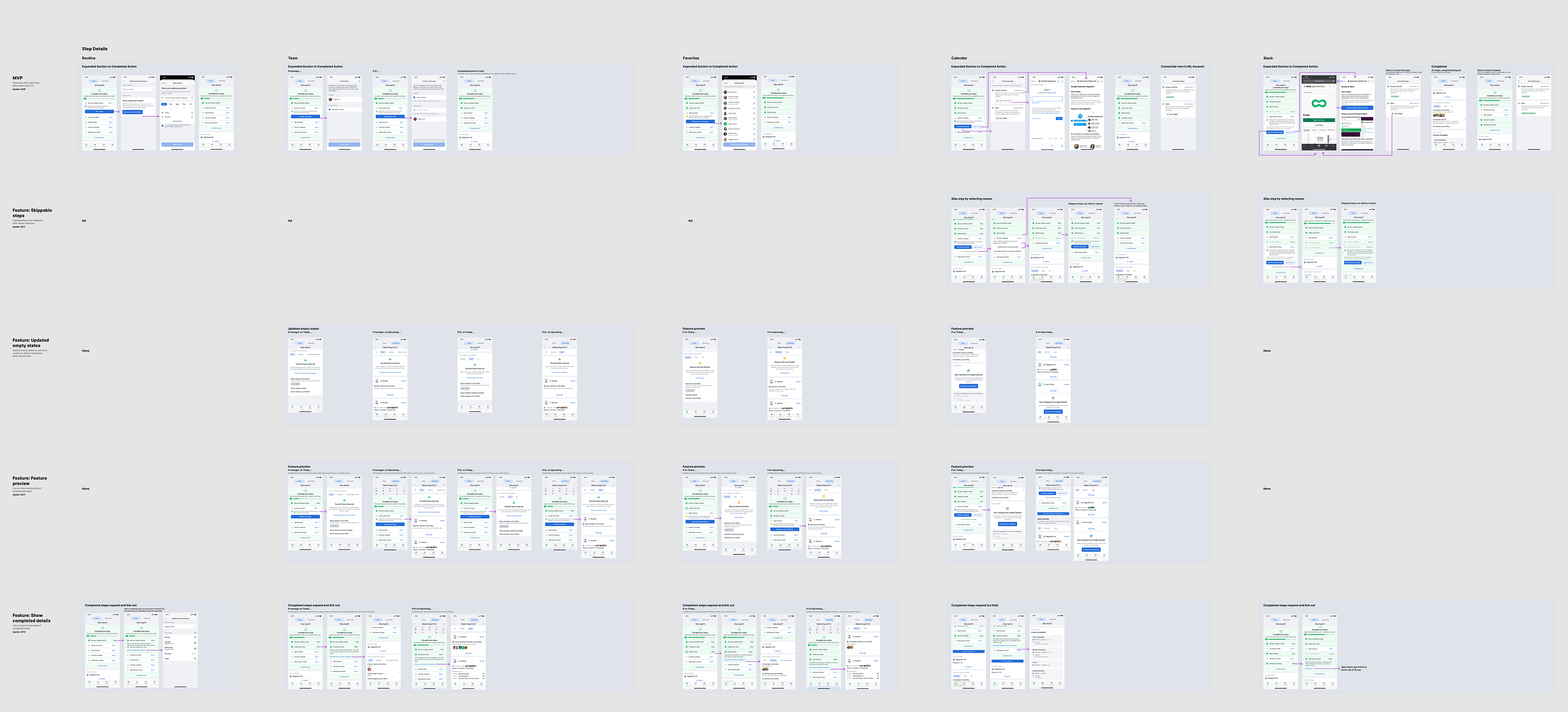
Implementation and Release Strategy
Given the complexity and scope of the feature, we developed a phased release strategy. Starting with a basic MVP, we planned incremental rollouts to add skippable steps, enhance empty states with value previews, and finally introduce detailed completion states. To facilitate development, I created a comprehensive matrix mapping each checklist step to these feature phases, allowing engineering to tackle discrete pieces systematically.
This methodical approach to implementation ensured we could gather feedback and make adjustments as needed while steadily progressing toward our full vision for the feature. The matrix also served as a valuable tool for stakeholder alignment, providing a clear roadmap of our release strategy.
Outcomes
The checklist was transformative to our onboarding by allowing quick entry into the product, reducing friction and supporting flexible, self-paced activation.
Our adoption rate tripled compared to our previous approach and we achieved an 84% setup completion rate by removing the barrier to product exploration. Average time to completion was under a week which represented a quick new user activation. User satisfaction on the onboarding experience was at 92%, reflecting the alignment between our solution and user needs.
The checklist proved so successful that we eventually dissolved our traditional onboarding flow completely, leaning purely on this more flexible approach to guide users through setup. It also created a scalable architecture that easily could accommodate new features or setup steps as the product evolved.
This project reinforced that changing user behavior relies on empowerment over enforcement and that research driven design decisions can transform pieces of your product to support business needs.