
Objective
With high level goals to holistically rethink our products and increase engagement in the mobile app, I tackled a redesign of our core search and browse functionality in the app. Search and browse are key functions of the consumer journey for both: users who came to buy tickets to a specific event and also, more open-ended users who are browsing what events are upcoming.
Explore Overview
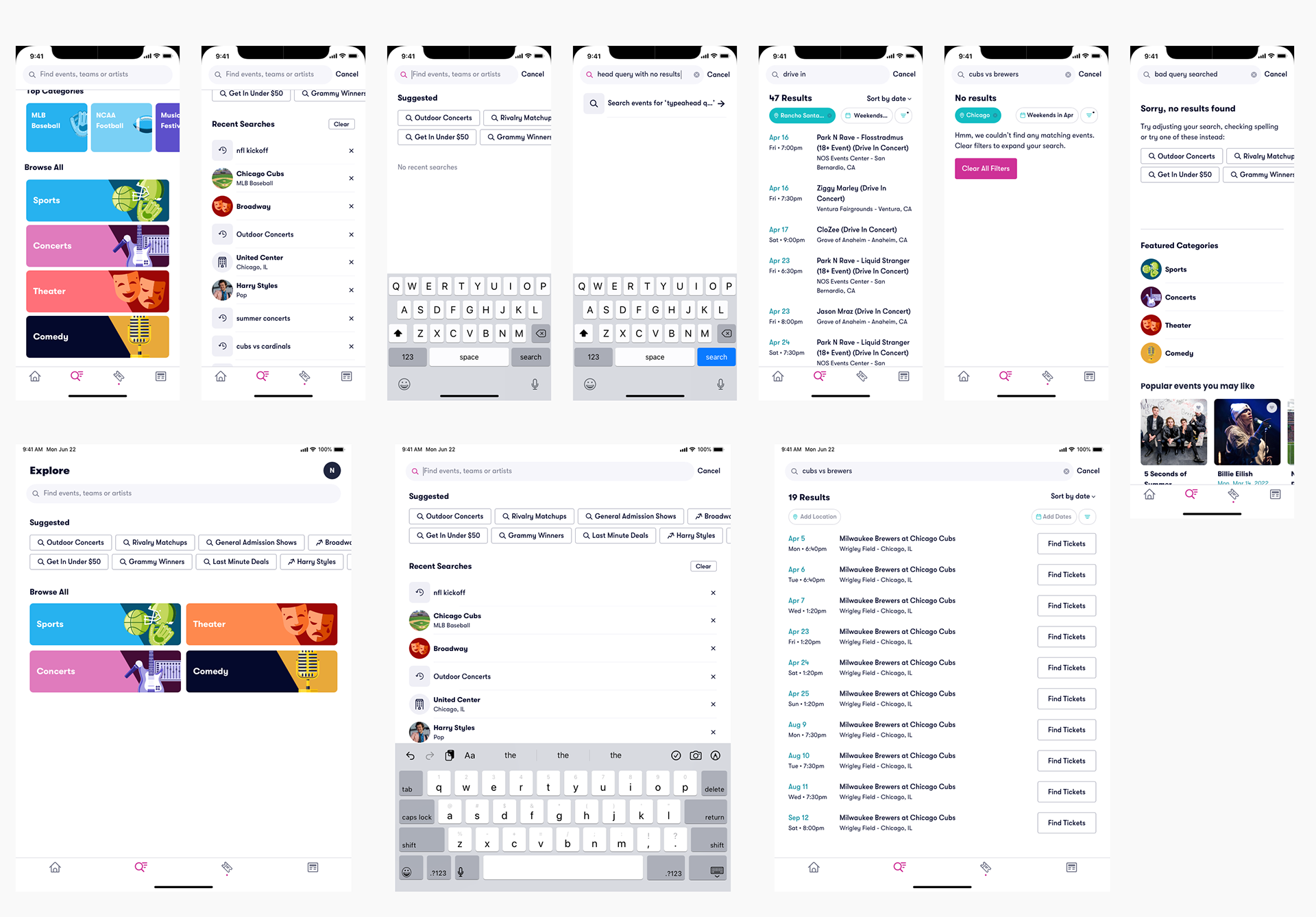
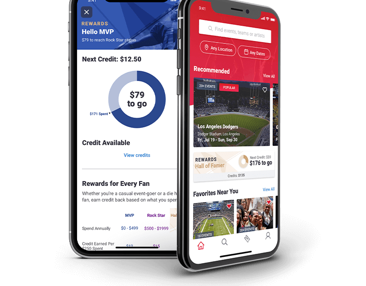
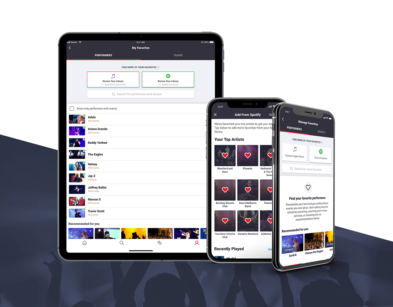
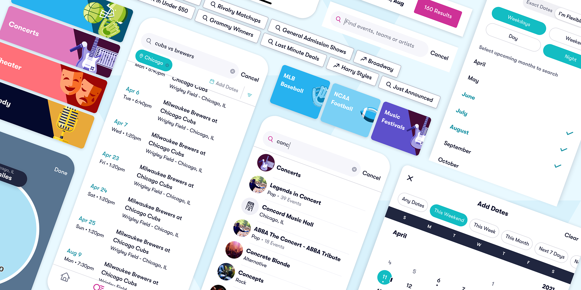
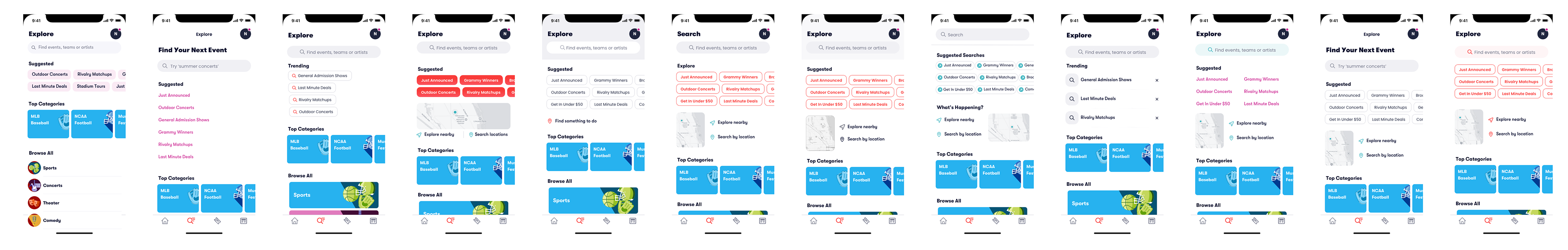
I created a new section of the app which we called "Explore" to combine general discovery and search into one central place. When landing on the Explore tab, users are given various options of exploration to find an event. This was created with two specific user types in mind: (1) someone who knows exactly what they are looking for and (2) someone who is seeking recommendations.
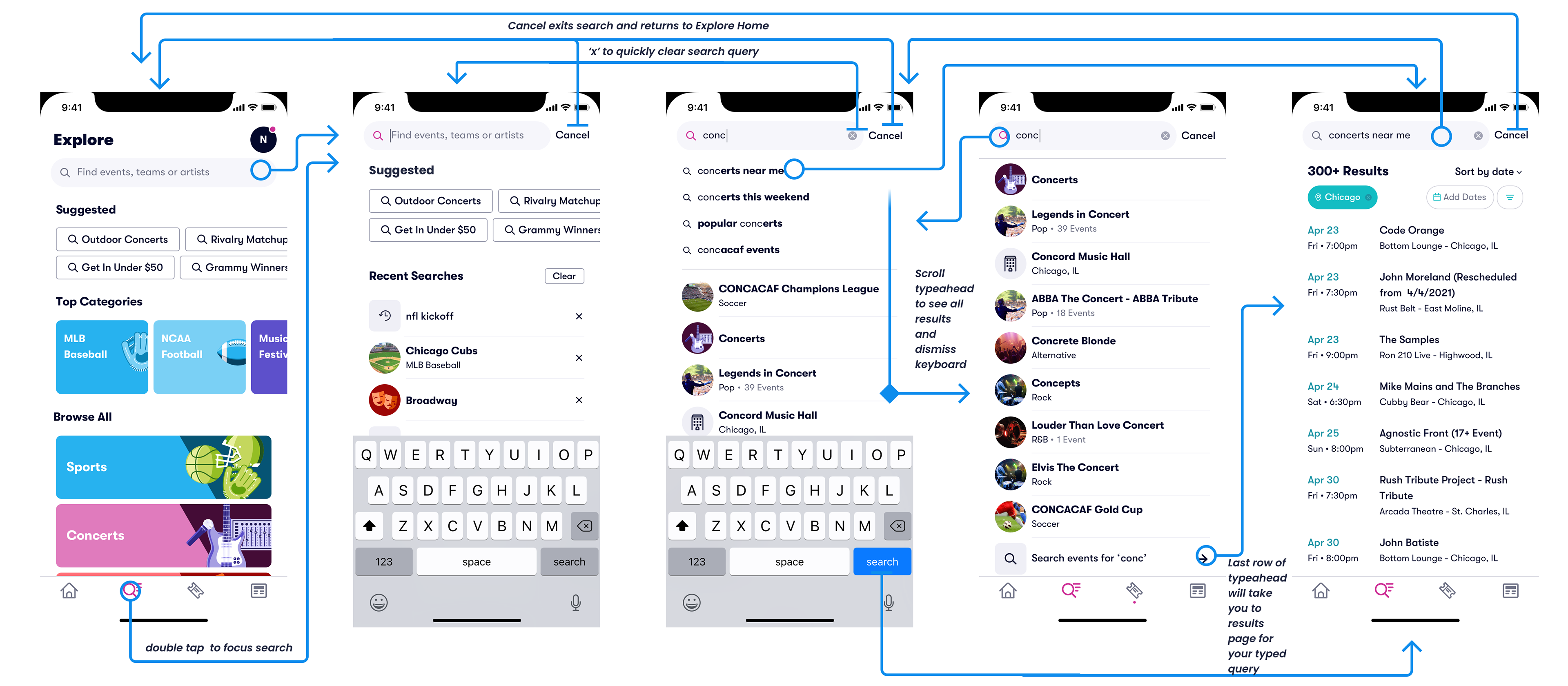
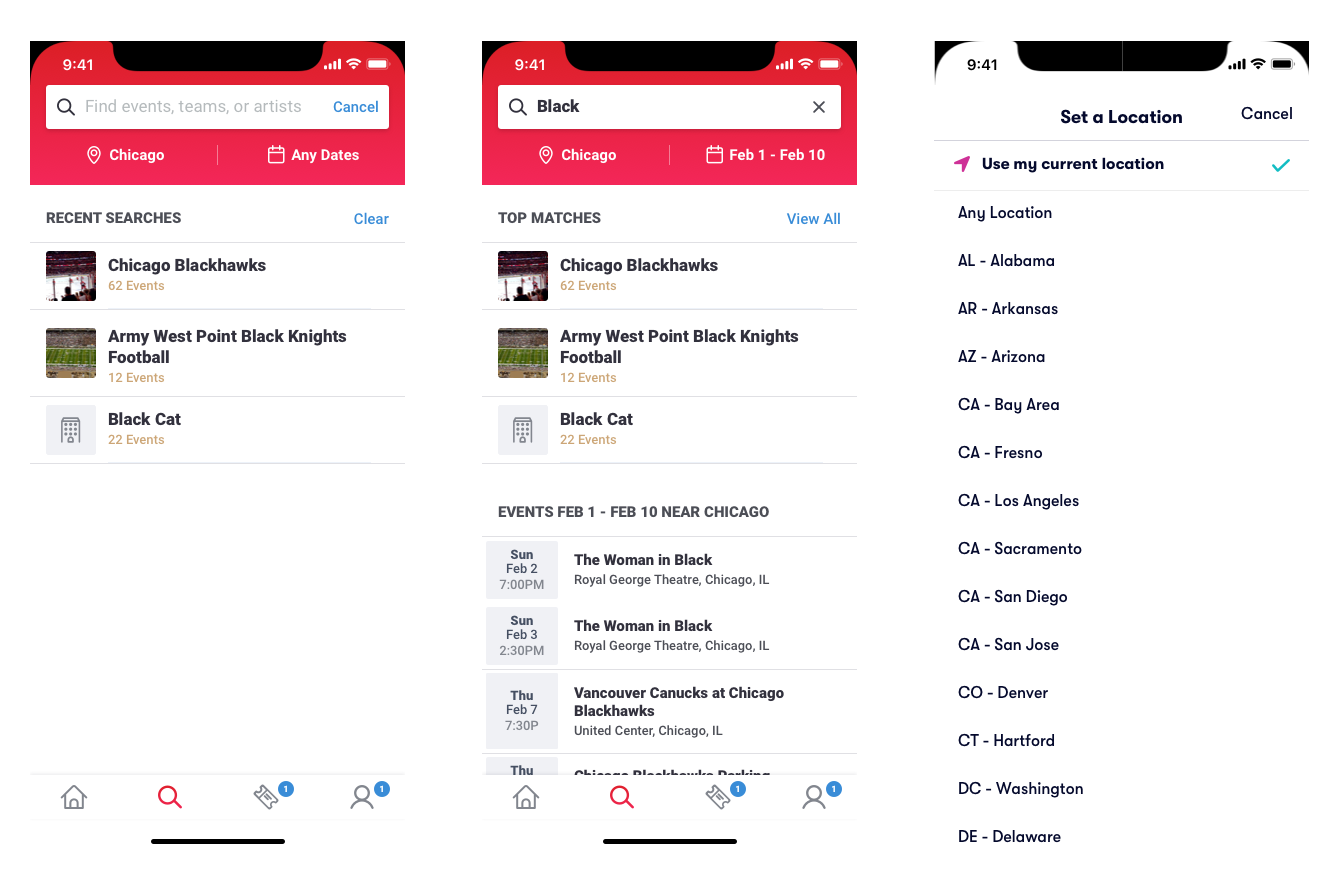
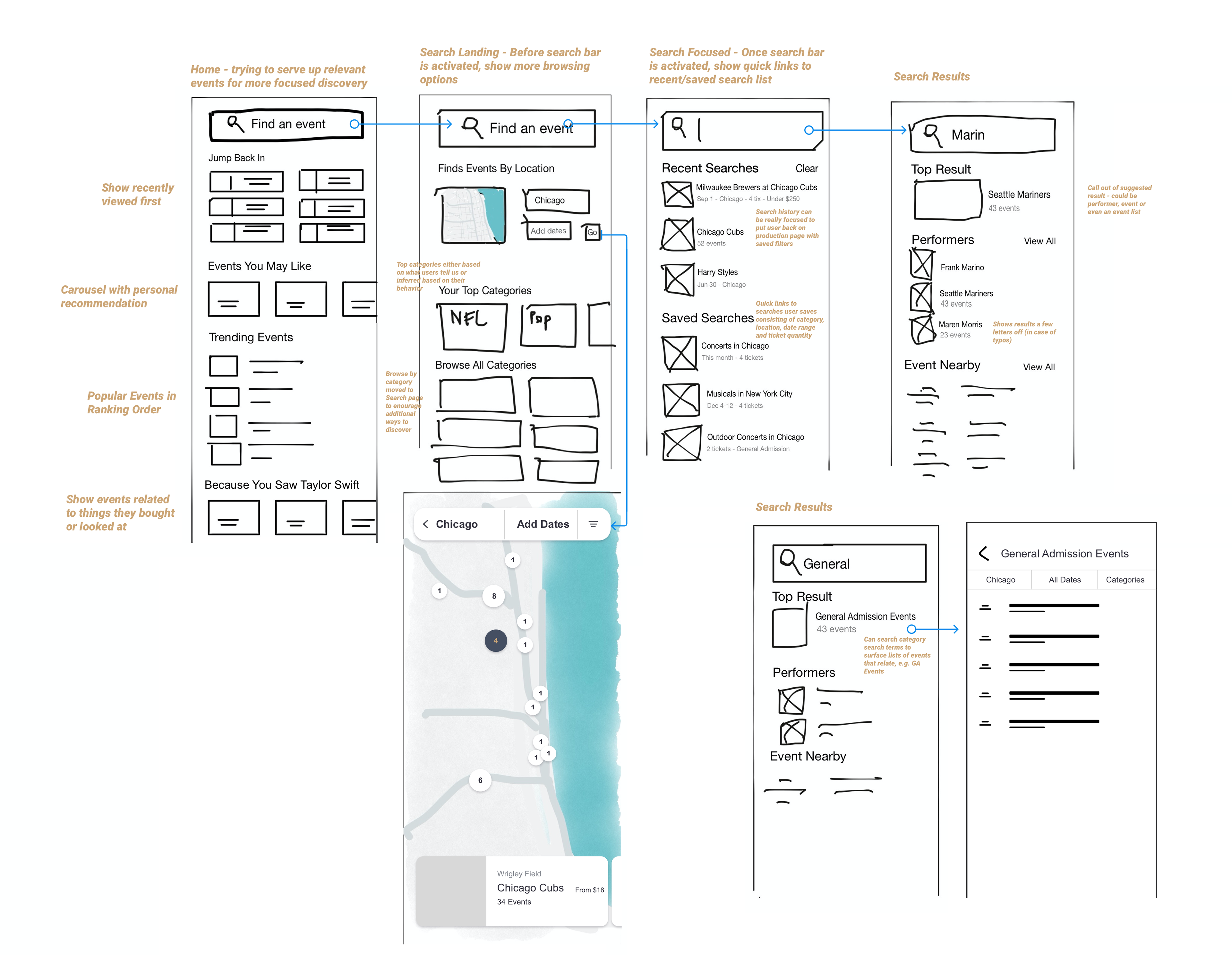
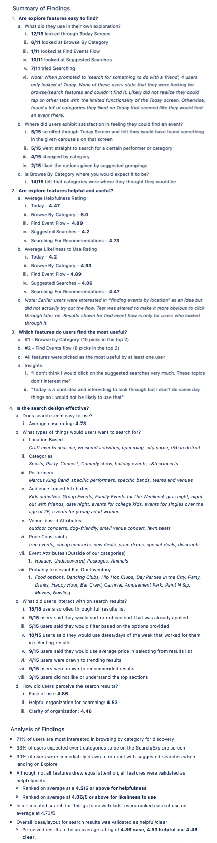
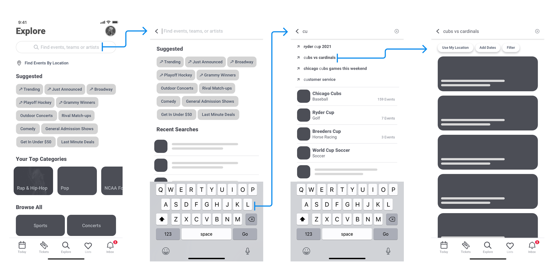
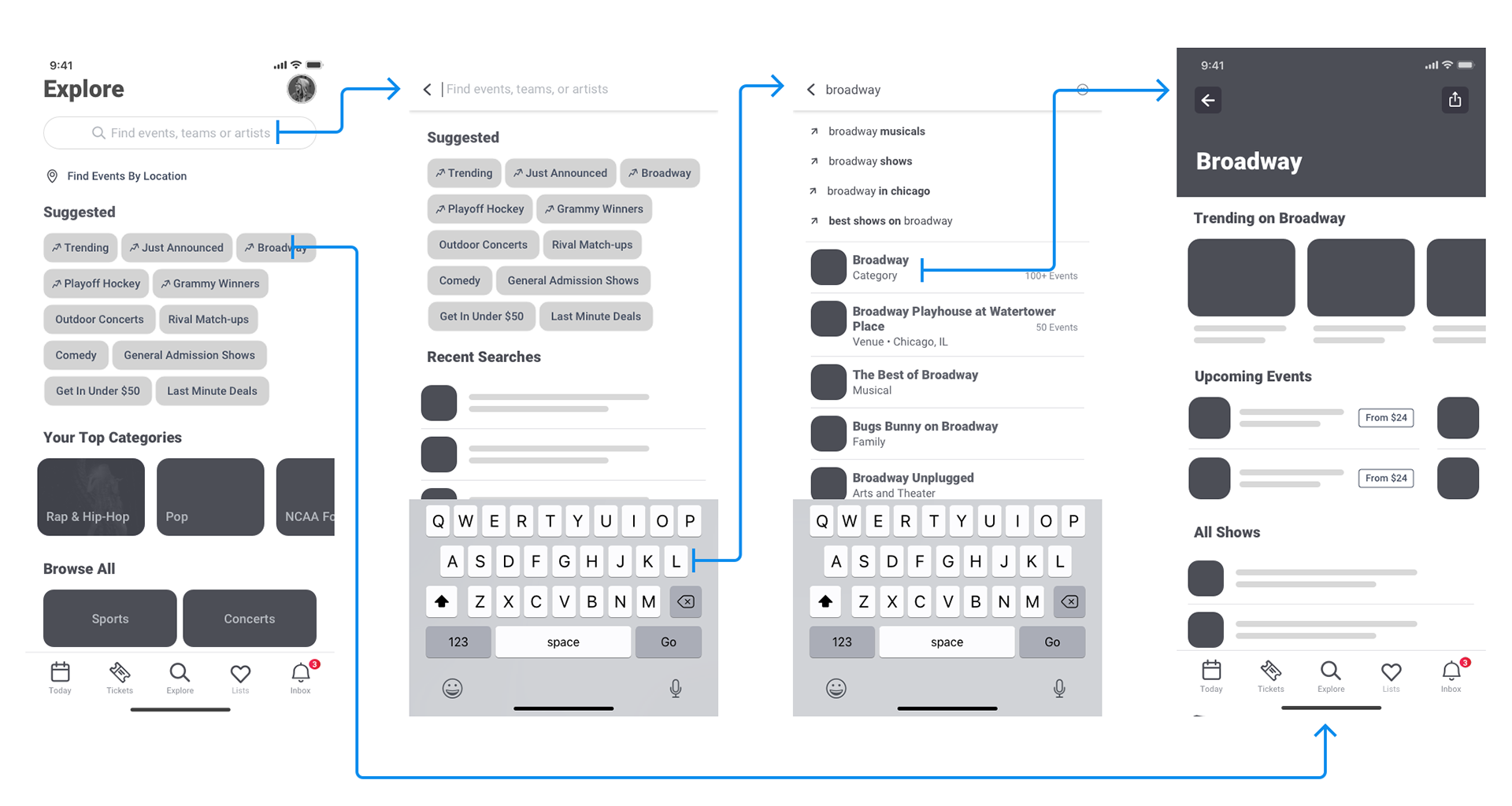
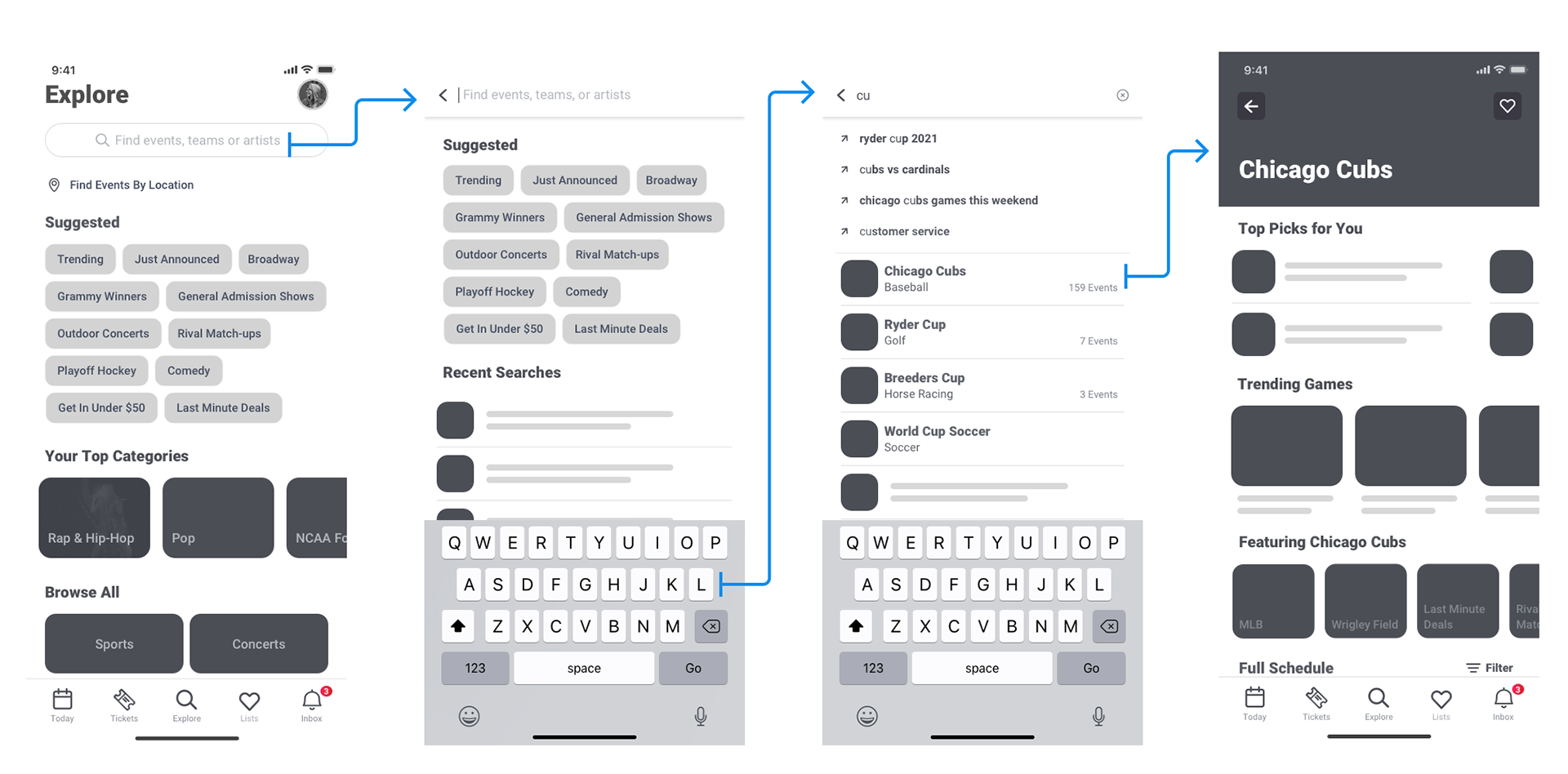
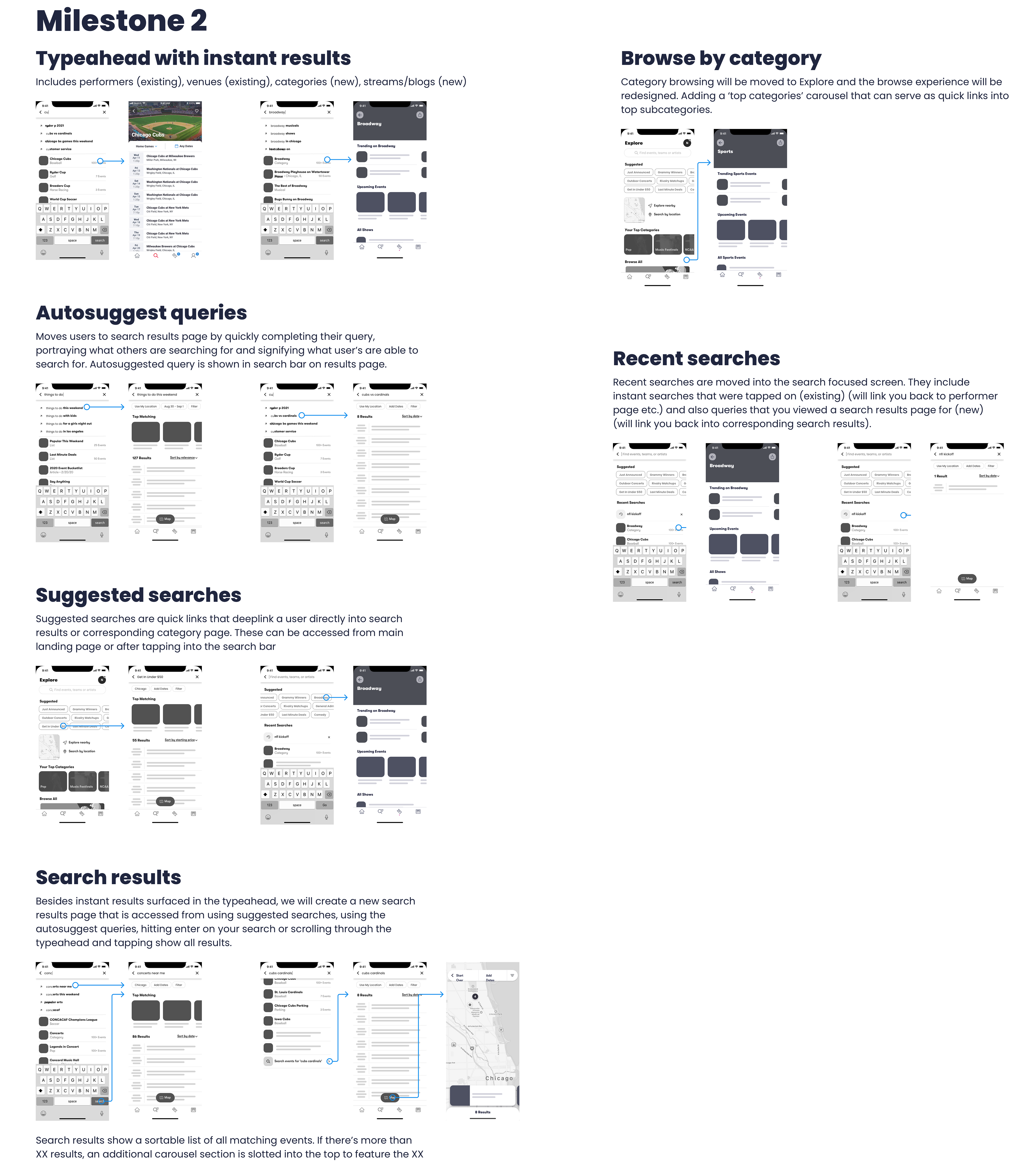
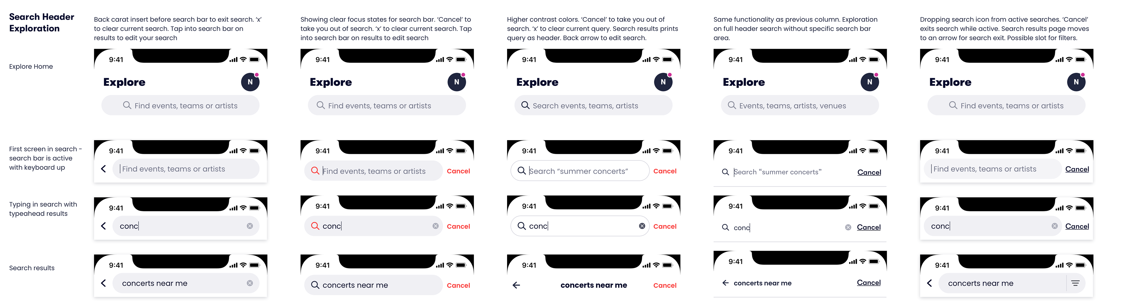
One main component to this new experience was an improved and powerful search flow. The search flow was designed to give a user jumping off points in terms of suggested categories and quick searches such as "outdoor concerts". The new search had instant results matches in the typeahead that would link users to matching performers, categories or venues to their search query. It also has autosuggestions in the typeahead to help the search become much more powerful than just string matching to be able to truly recommend events to users and create a resulting list of events for many different scenarios.
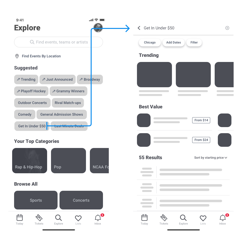
Moving event results to its own view allowed us to create a list of events for something specifically matching like a finite list of matchups between two teams, e.g. 'cubs vs brewers' as well as an open-ended list of recommendations based all any number of attributes such as event categorization, audience categorization, ticket attributes and venue attributes, e.g. 'concerts near me', 'date night ideas', 'lawn concerts', 'get in under $50'. A large list of results would show a 'top matching' carousel to further help users find the best results. Users could also use enhanced sorting and filtering options to narrow in on a desired event. I introduced sort options like starting price and distance from you and introduced filter options like flexible dates (months, weekdays/weekends, day/night), category and starting price.
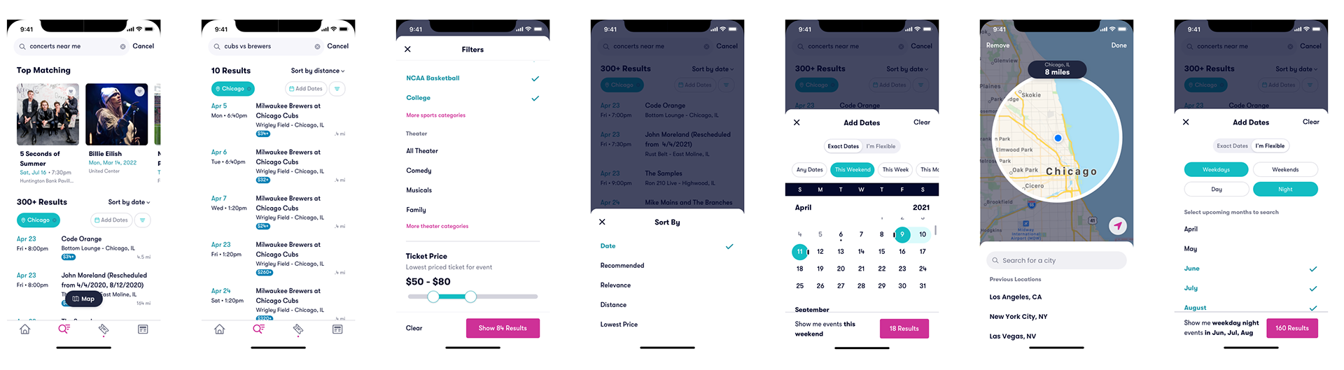
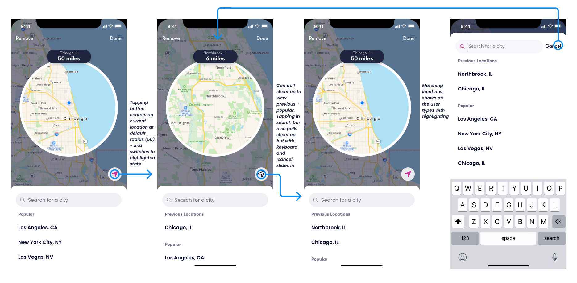
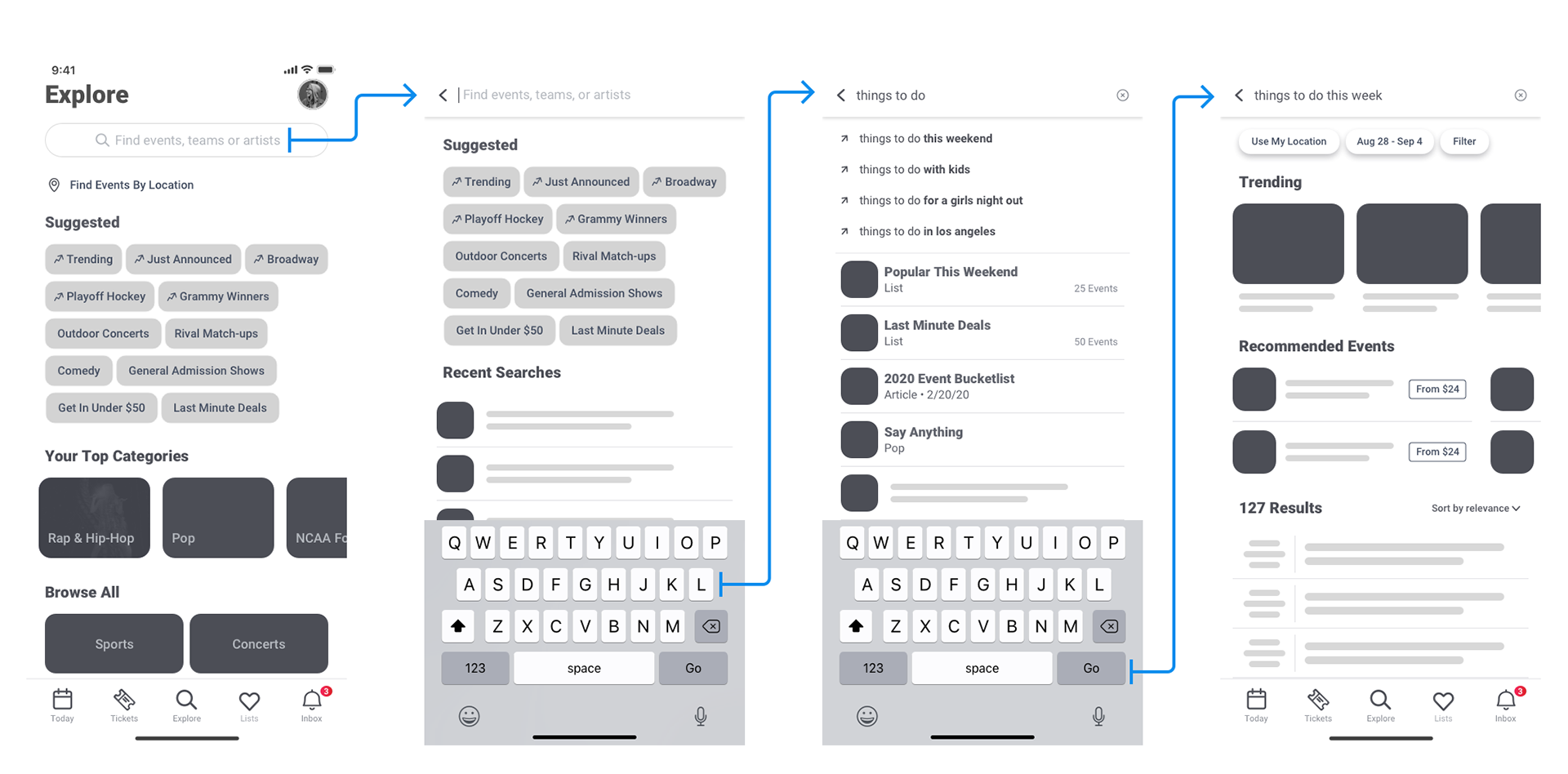
Another key component to improved search was using a map-based location and showing search results in a smart way that added location when it makes sense, and removes location when it doesn't.
A specific string search like 'cubs vs brewers' assumes that the user wants to see all matchups of these two teams by default, regardless of location. A quick tap on an 'Add Location' pill allows the user to toggle on location, with options to choose from nearby, popular cities or searching for one location. On the other hand, recommendation searches like 'concerts near me' would automatically apply a nearby location filter to the results with an easy 'x' to remove or a tap to change.
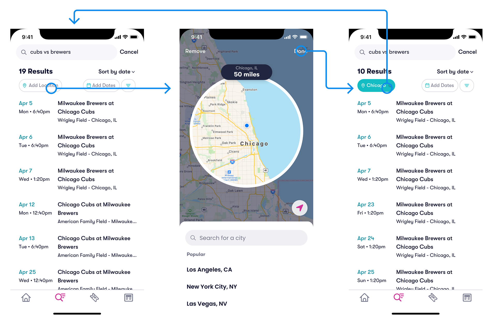
Location setting was imagined on a map with a default radius of 50 miles and the ability to change that radius with a pinch and zoom. Searching for a city would recenter the map on that location where the user could focus in on a specific radius of that location. If location services are allowed, the user can tap the 'current location' button to quickly center in on their exact location.
Starting Point
The previous search could only accommodate exact string matches. We utilized a typeahead only to show a combination of performer/venue results and event results in your location/dates and outside of those filters. Locations were set into regions and could not be very specific. Landing on search surfaced recent searches but didn't offer much else for discovery.
The Process
Discovery
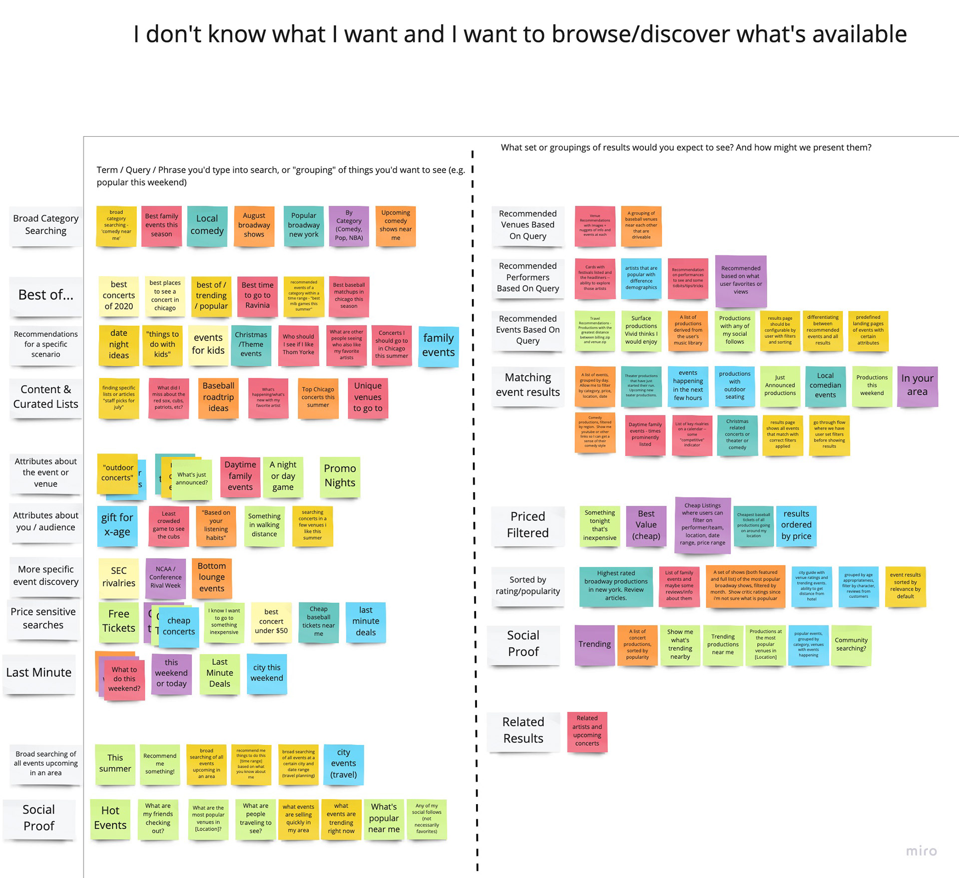
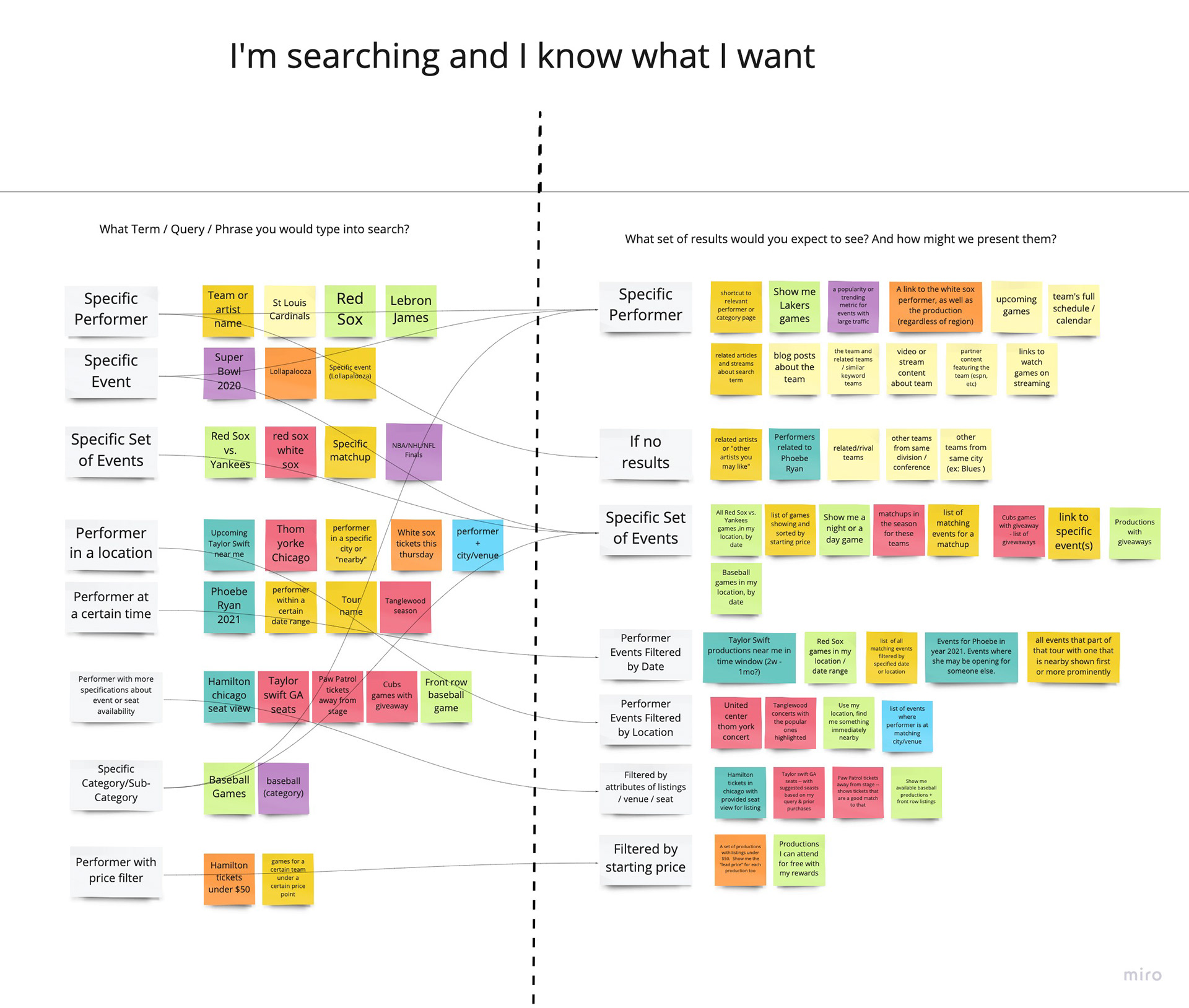
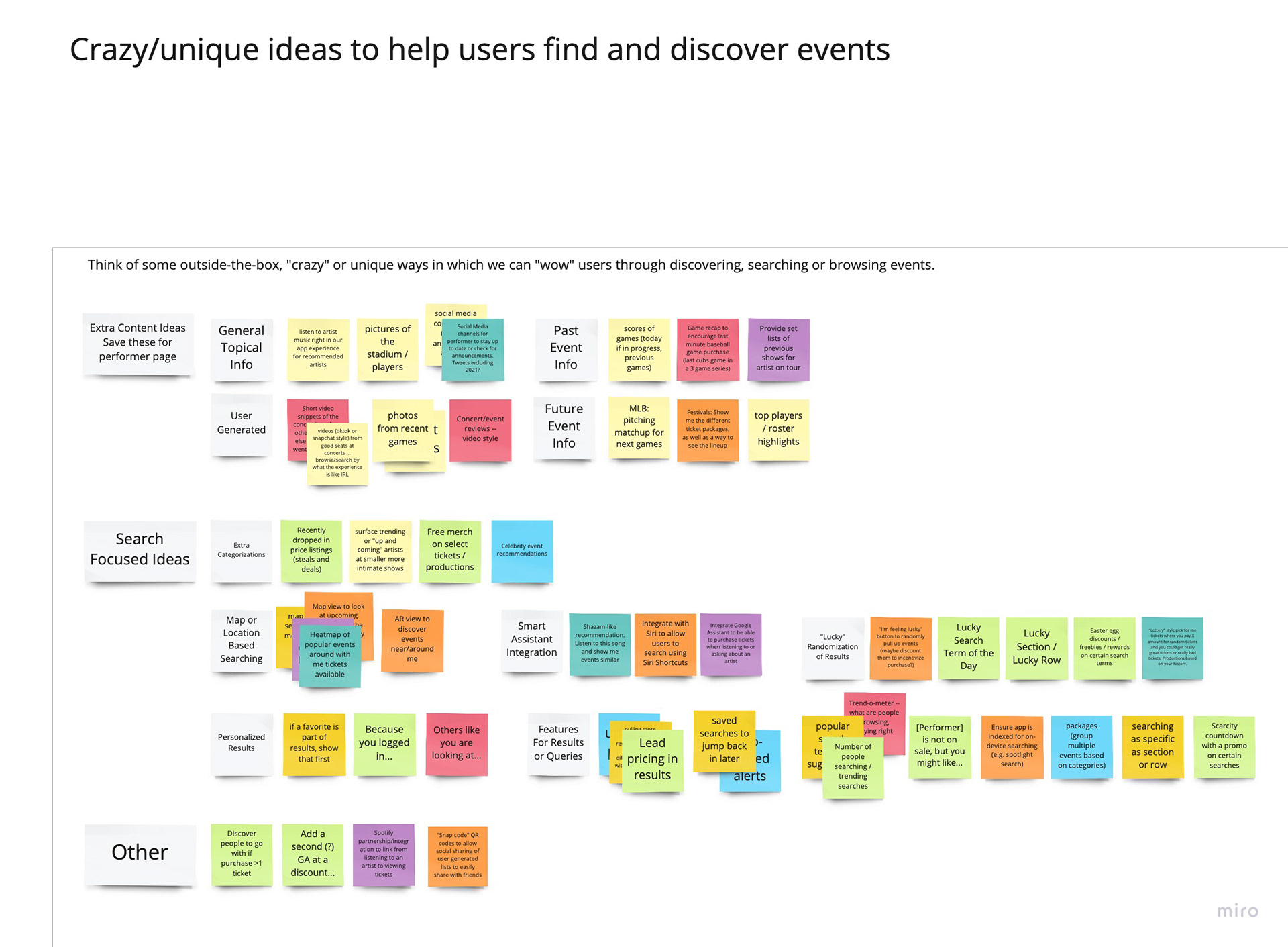
With ambiguous requirements, there was a lot of discovery and ideation to work through to narrow down scope on how we could improve the search and browse experience. A first step was identifying our target users and what their needs are. To get an idea of what people are currently searching for, I pulled lists of what our top searches in the app are and what we are returning most for in google searches. Both of these lists portrayed users that are searching for a specific performer or event but we knew we could create something much more powerful if we accommodated more discovery type searches.
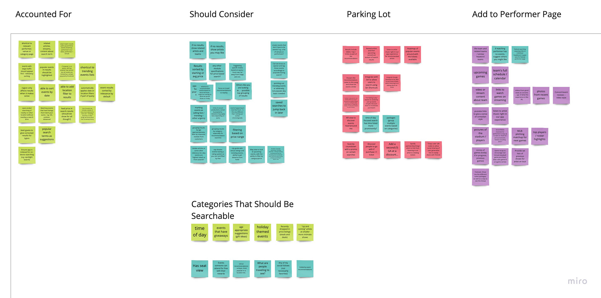
From this initial research, I identified two main user groups: those who are searching and know exactly what they want and those who are more generally looking to browse and discover what is available. I ran a brainstorm session with product, design and some engineering to help ideate search features that would be most beneficial for both of these types of users. Following the general ideation, I prioritized all the ideas and synthesized what would be the most effective features for search from a user perspective.
Visual research/Competitive analysis
I reviewed search and browse experiences from many different brands to help inform best practices, common features, information architecture and functionality. Some searches that were reviewed included varying tech and ecommerce products that I felt did search well such as Doordash, Ikea, Instagram, Pinterest, Ritual, Sephora, Sonos, Spotify, Target as well some of our industry competitors such as Ticketmaster, Stubhub and SeatGeek.
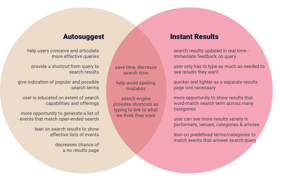
From competitive research, I found two main directions that most searches follow: autosuggesting queries to take you to a search results page vs. populating instant results in a typeahead. The instant results was the model we current followed and I weighed the pros and cons of each before ultimately exploring if we could use a combination of both approaches in our search.
Early Sketching
With all initial research conducted, I started with some rough sketches to imagine the improved interaction design of search as well as some of the enhanced features.
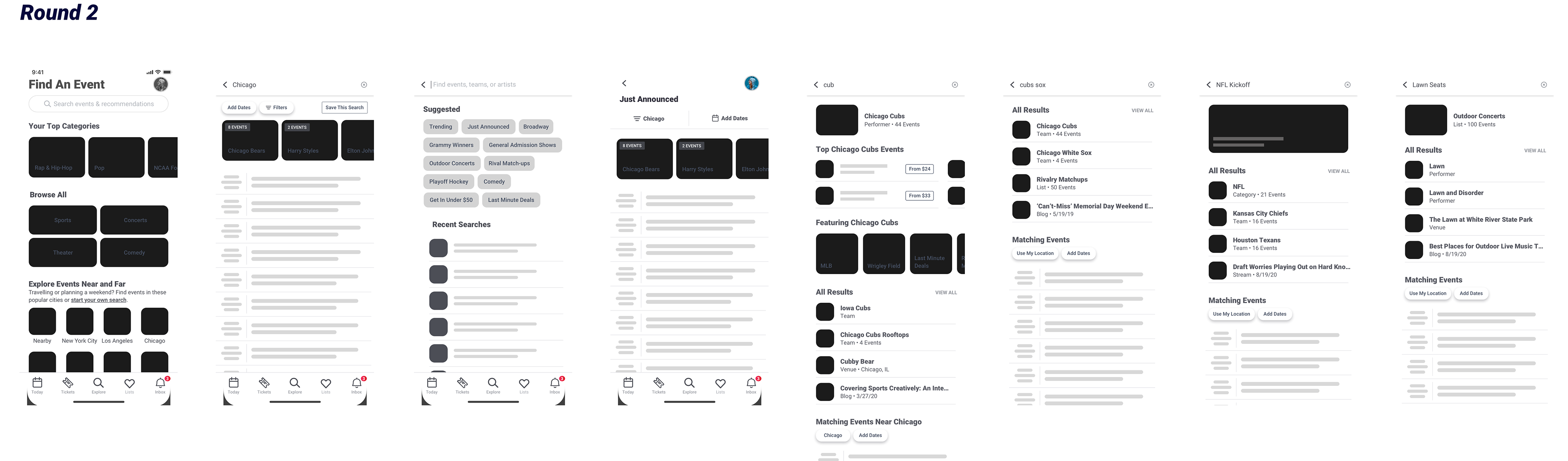
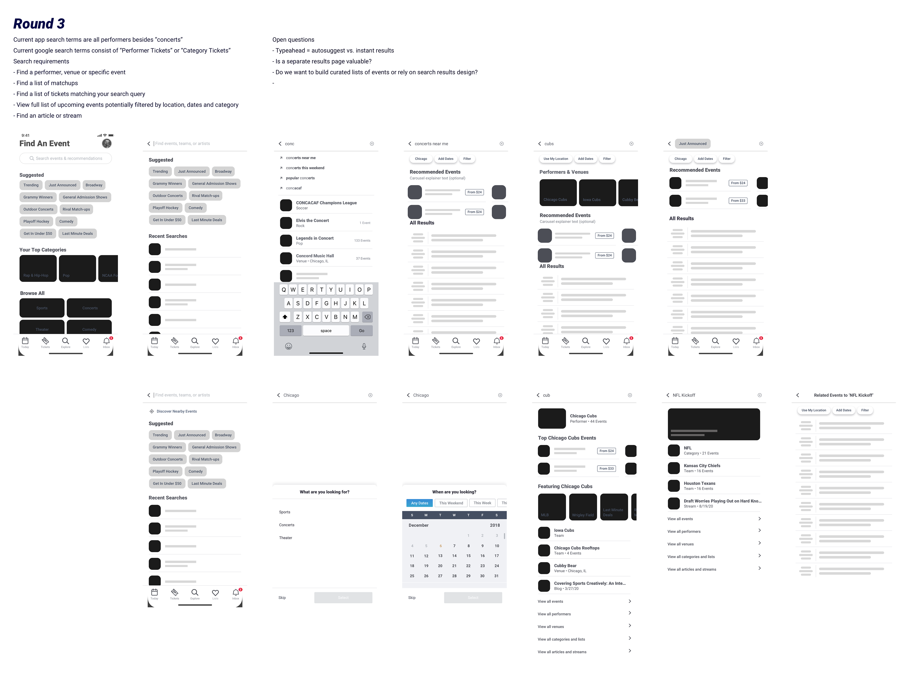
Lofi Design
Through a series of lofi design and flows, I was able to evolve my ideas for features and refine the flows and discovery paths that we wanted to develop. Each round of flows was reviewed by product and design for feedback and refinement to get it to a testable place.

User Testing
With the final round of lofi designs complete, I created a clickable prototype to show to users in order to validate some of our assumptions. I ran tests through usertesting.com in two iterations.
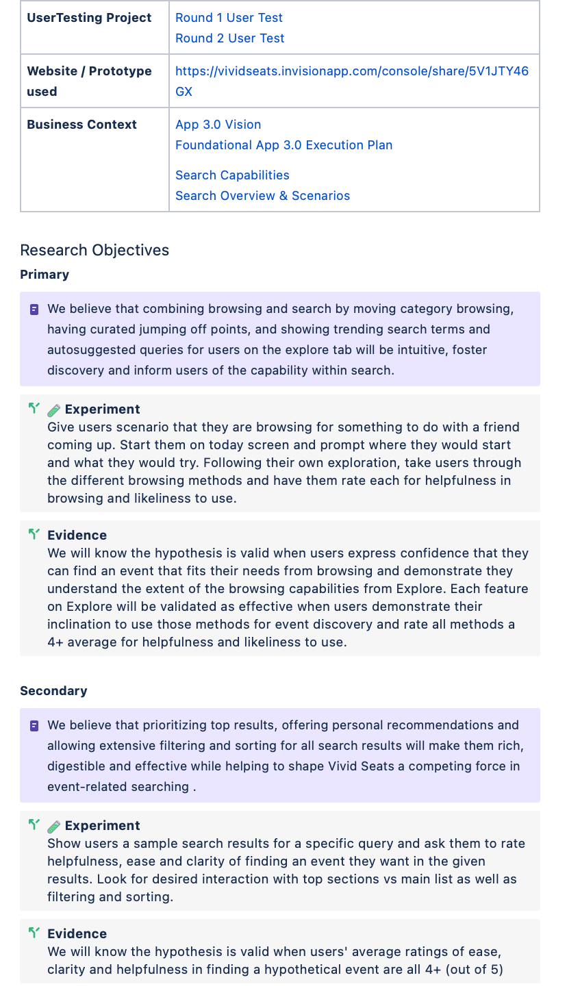
Testing Process
I identified a target audience for our test and create preliminary questions to reach the desired audience. I then took the users through a script and series of tasks in order to test if users are able to find search easily, are able to understand different discovery features, want to use those different features, and how effective search results are. I tested 15 users in North America, ages 19-53.
Analysis of Findings
- 71% of users are most interested in browsing by category for discovery
- 93% of users expected event categories to be on the Explore screen
- 90% of users were immediately drawn to interact with suggested searches when landing on explore
- Although not all the features drew equal attention, all features were validated as helpful/useful with an average ranking of 4.2/5 for helpfulness and 4.06/5 for likeliness of use.
- In a simulated search for 'things to do with kids' users ranked ease of use on average 4.73/5.
-Overall ideas/layout for search results was validated as helpful and clear with perceived results averaging at 4.86/5 ease, 4.53/5 helpful and 4.46/5 clear.
Full summary of findings shown below:
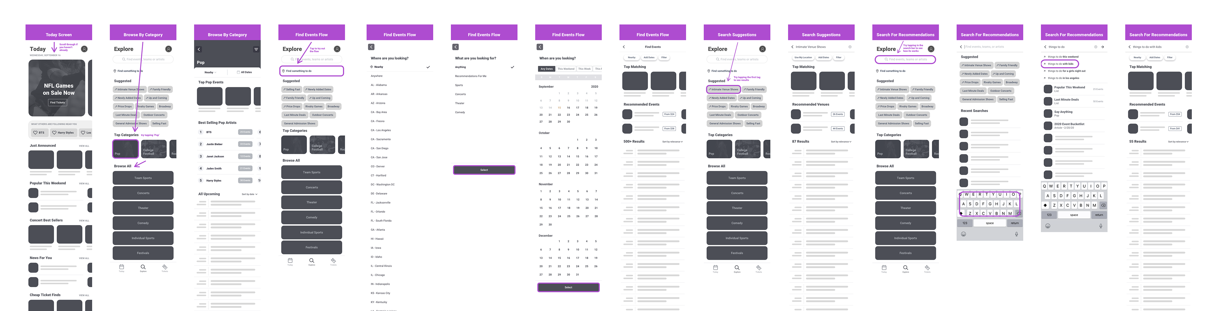
Finalizing Wires and Flows
The findings did validate the hypotheses I had for this section but I made some changes to the design and features based on recommendations I made from research. At this step, I refined the designs to encompass each new feature/flow that we wanted to include to create an overall vision for Explore.
These flows included the search using autosuggest with specific and nonspecific results, suggested searches, instant results, recent searches and map-based searching.
With the vision for explore and search nailed down, our backend team was able to find a new service to use for search that would accommodate all the enhancements we envisioned for a powerful search functionality.

Scope / Milestones
With a vast amount of changes wanted for this section, we needed to make more attainable milestones for a first and second release of this section. On the backend, we were completely changing the service we were using for search but the additional features were able to be developed iteratively. I determined vertical slices for iterative development that would deliver desired experiences and then reviewed with product and engineering to further cut scope and focus in on features for a milestone 1 release.
Interface Design
I went through a series of visual iterations to determine how we would treat certain pieces like the explore landing design, suggested searches, typeahead instant results, the search header and filter bar.
I gave a recommendation for each of these pieces and presented the full design to our design team for feedback in order to choose final directions for these pieces.
Otherwise, our brand and pattern libraries were applied to the UI to create the finished interface.
Delivery
We scaled back many features in order to release an MVP. It was a collaborative effort with product to figure out which pieces we could cut and still deliver a full vertical slice. Features we scaled back on were map-based searching, open-ended searching, enhanced category browsing and some of the richer filtering.
For delivery, I created screens for handoff covering mobile and tablet designs, happy path and also alternate and more edge case states such as loading, no results, no recent searches and nuances of filtering.
Designs were completed in Sketch and handed off to engineering through Abstract. I assist in the refinement of acceptance criteria on engineering stores with my product manager and then complete a UI review after development to ensure visual and interaction quality.
We track analytics for clicks, engagement and ultimately conversion through Google Analytics in order to track against KPIs, monitor performance after release and ultimately inform us of next iterations we should do for this section.