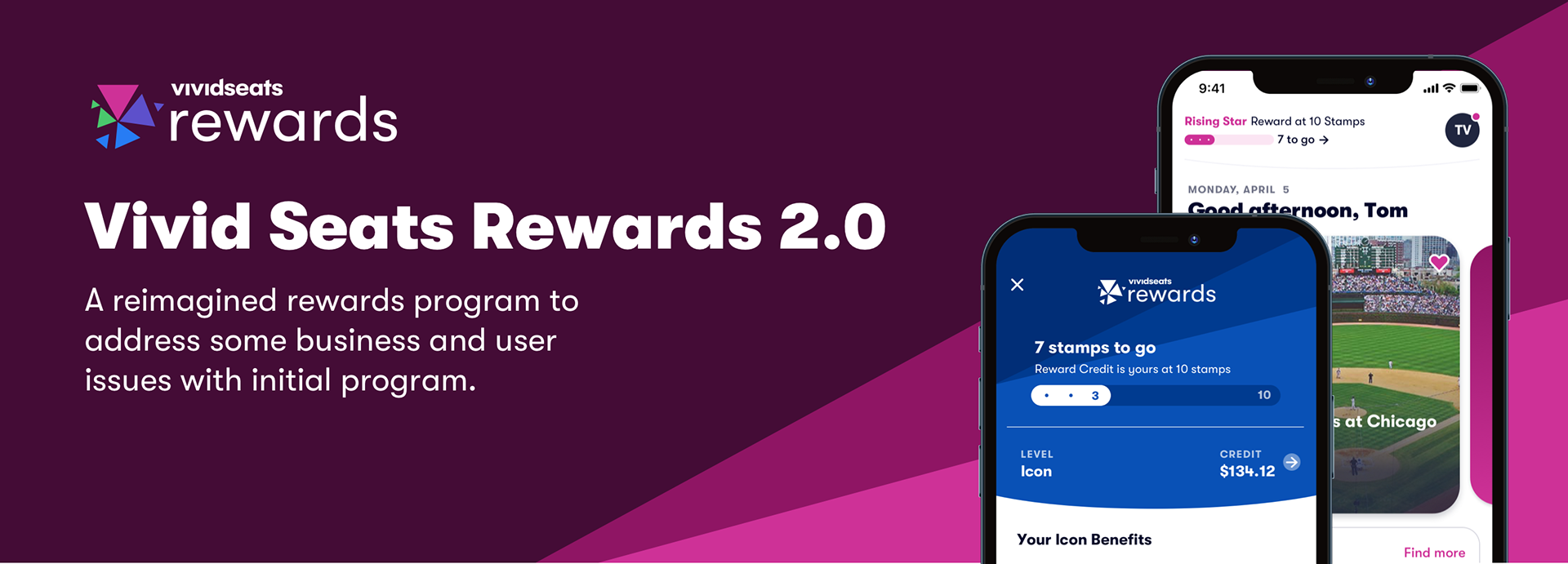
Background
Vivid Seats introduced a cashback structured app rewards program in 2019 with the goals of brand loyalty, customer retention, and growing mobile users. We continuously iterated on it over the next 2 years but as shortcomings became to pile up with long-term engagement, technical limitations, high customer service volume, financial stabilization, and lifetime customer value, we realized the need for a larger shift in the evolution. With the company preparing for a rebrand, we had the perfect opportunity to address both visual alignment and deeper functional issues with a complete overhaul of the program.
As the lead designer on this project, I worked with many members of product, design and leadership in the early phases of this project and then directly owned creating all consumer-facing UI for our web and app products.
Project Goals
Our challenge was to rebuild the loyalty program to create a more engaging and visually integrated experience while achieving business goals of financial stabilization, increased retention, higher engagement, and maintaining competitive advantage.
More specifically, we aimed to:
- Design a meaningful, sustainable rewards mechanic that would feel more substantial to users and their loyalty, while also achieving a more sustainable rewards payout model compared to the small and frequent rewards of the original program
- Design a meaningful, sustainable rewards mechanic that would feel more substantial to users and their loyalty, while also achieving a more sustainable rewards payout model compared to the small and frequent rewards of the original program
- Create a tier structure that recognize and rewards long-term loyalty and include experiential benefits as compared to the current benefits that are tied to increased cashback percentages
- Provide program transparency with clear, self-service tracking, and in-depth information about the program and tiers
- Integrate rewards contextually within the user journey, appearing at relevant moments rather than constantly throughout the experience and provides quick and easy understanding of standing in program, progress and how it works
- Maintain interest with engagement opportunities outside of normal earn
- Establish a distinctive visual identity that elevates the program above typical promotional messaging to feel less like a marketing tactic and more like a core part of the experience
Redesigned program
Our redesigned program introduced these changes:
- Mechanics were moved to a "Buy 10, Get 10% off", thus pushing a reward to be given after likely several purchases, and allowing for a more substantial reward amount which could amount to a free ticket.
- Tiers were now based on lifetime spend that would reward our long-time customers and introduce experiential benefits at higher tiers.
- We created small engagement/reward opportunities to encourage loyalty between purchases (and large credit rewards)
- The new rollout created a clear visual consistency and language with pulled-back funnel placements and a more integrated experience that combined rewards with the user profile.
- We added a self-service screen in-app to detail current earnings and the history of all related activity as well as a detailed about page that could be easily managed/updated
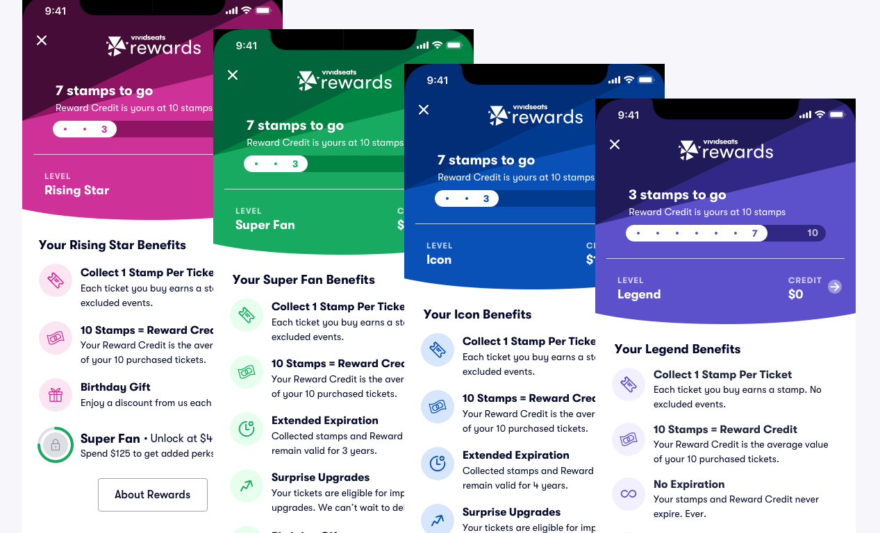
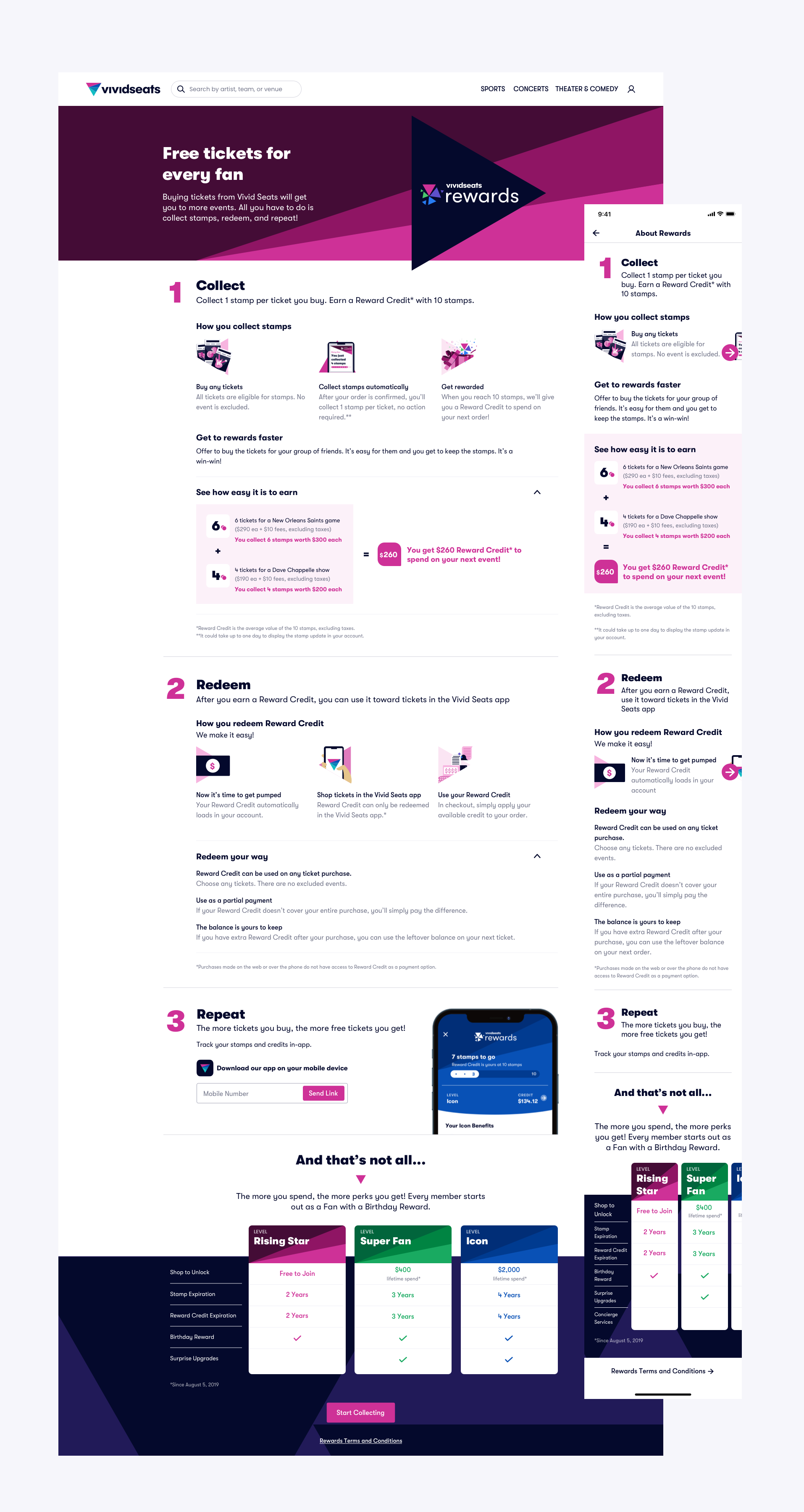
Program Levels
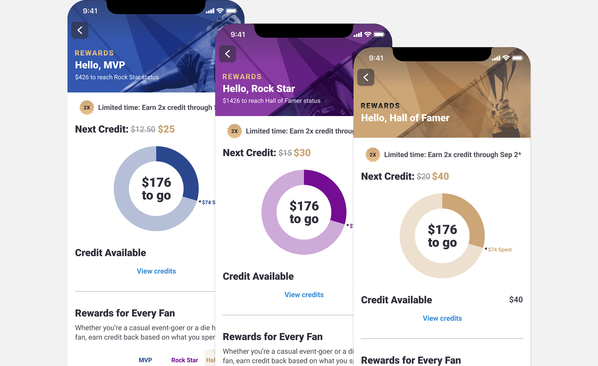
Before
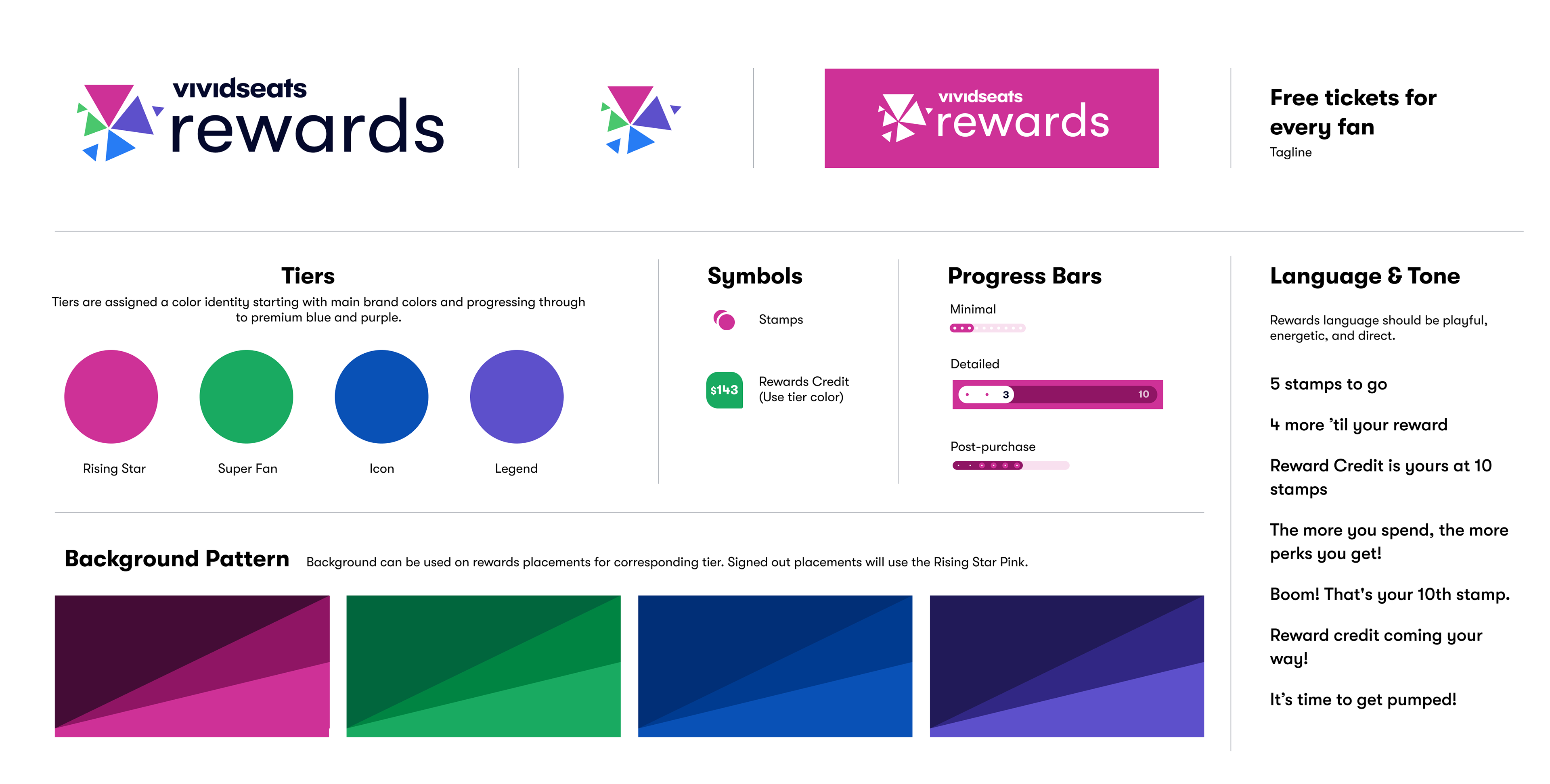
The new four-tier structure was designed to reward our long-time customers and entice spending with new experiential benefits like extended expirations, surprise upgrades, and customer service priority. We refreshed the tiers with fun new names and assigned distinct colors per tier that started with brand colors and progressed through blues and purples because they carried a ‘regal’ perception. Color-coding throughout the experience can now instantly communicate tier status.
Main Rewards Experience

Before
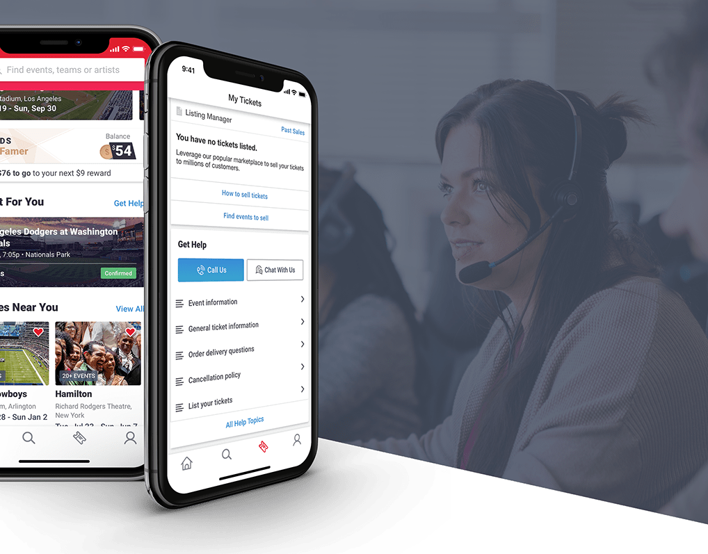
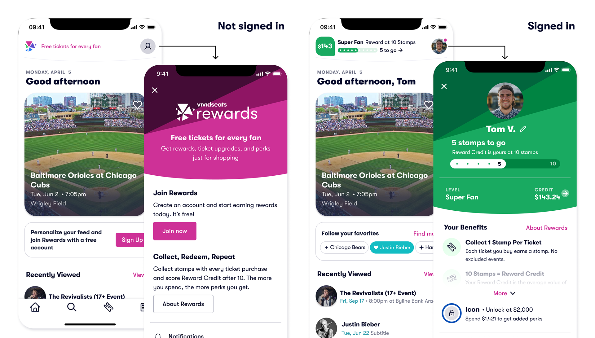
-Rewards has a prominent placement on home page and while the core experience now lives within the user's profile. Referencing rewards at the top of home instead of in its own module helps integrate the program into the main app experience and let's us use Rewards to prompt sign in. The integration of Rewards into the user profile is a strategic decision to create a personalized feel that is deeply woven with their account.
-The visual hierarchy of the main rewards placements allows users to easily understand the most critical pieces: rewards progress, available rewards credits and rewards level. Credits are prominently shown when available. The progress bar design provides both at-a-glance understanding to progress towards a reward with the overall fill, and detailed tracking with small dots and number callouts. In order to keep the main interface simple and focused, I chose not to overwhelm users with the exact value of the reward in progress. This lets the casual user focus on the essentials of reaching the next reward and creates a curiosity gap for users to dig further into Rewards screens to reach these details.
New Main Placements

Showing various states of home + details
Challenges
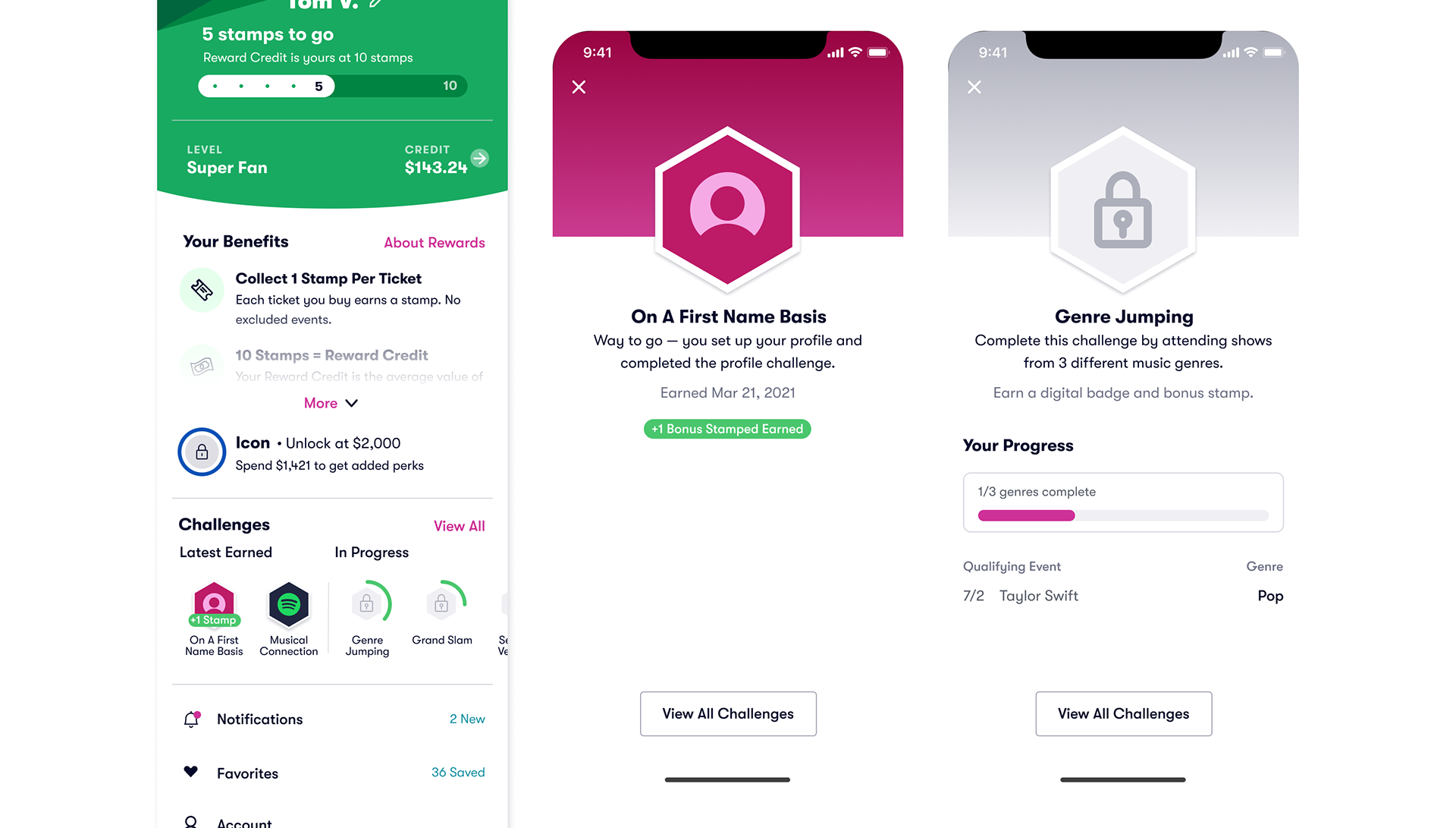
To keep users engaged between purchases, and gamify the experience, we introduced 'Challenges'. These range from purchase-related goals like 'Buy tickets to 3 different genres' to engagement tasks like completing your profile or sharing tickets. Each challenge can award either digital badges or bonus stamps, creating multiple paths to rewards that don't always require purchases.
Rewards History
The tickets credit view was drastically evolved into a comprehensive history view. This view details the value and expirations of current stamps and credits. It also clearly outlines any activity that affects earn, burn or expiration with direct links to related orders. This single screen dramatically reduced customer service calls about rewards tracking as it clearly laid out history and current balances.

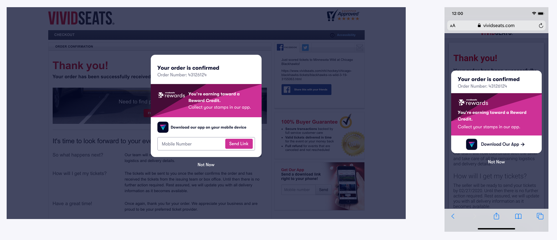
Rewards Messaging in App Shopping Experience
Before
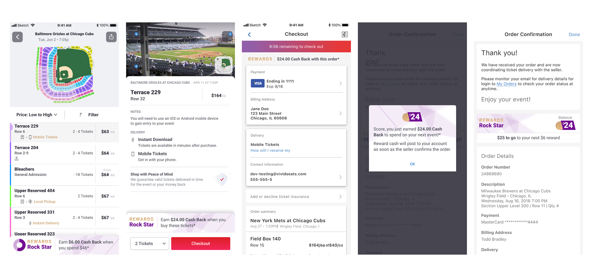
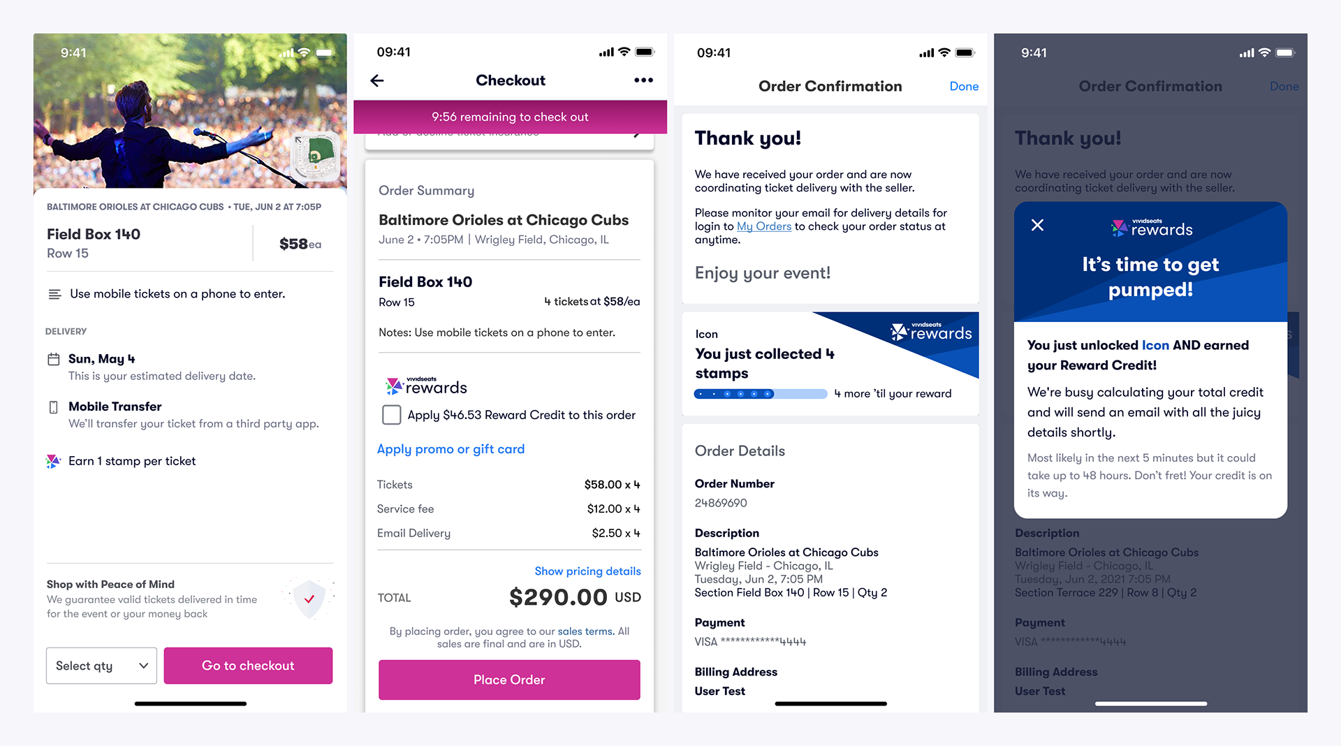
With scaled-back funnel placements for the initial launch, we integrated a subtle reminder of earn on ticket details, and kept a place to apply credits in checkout. Then post-purchase, we clearly communicate earn and celebrate key moments like level jumps or reaching a reward.
Marketing / Informational
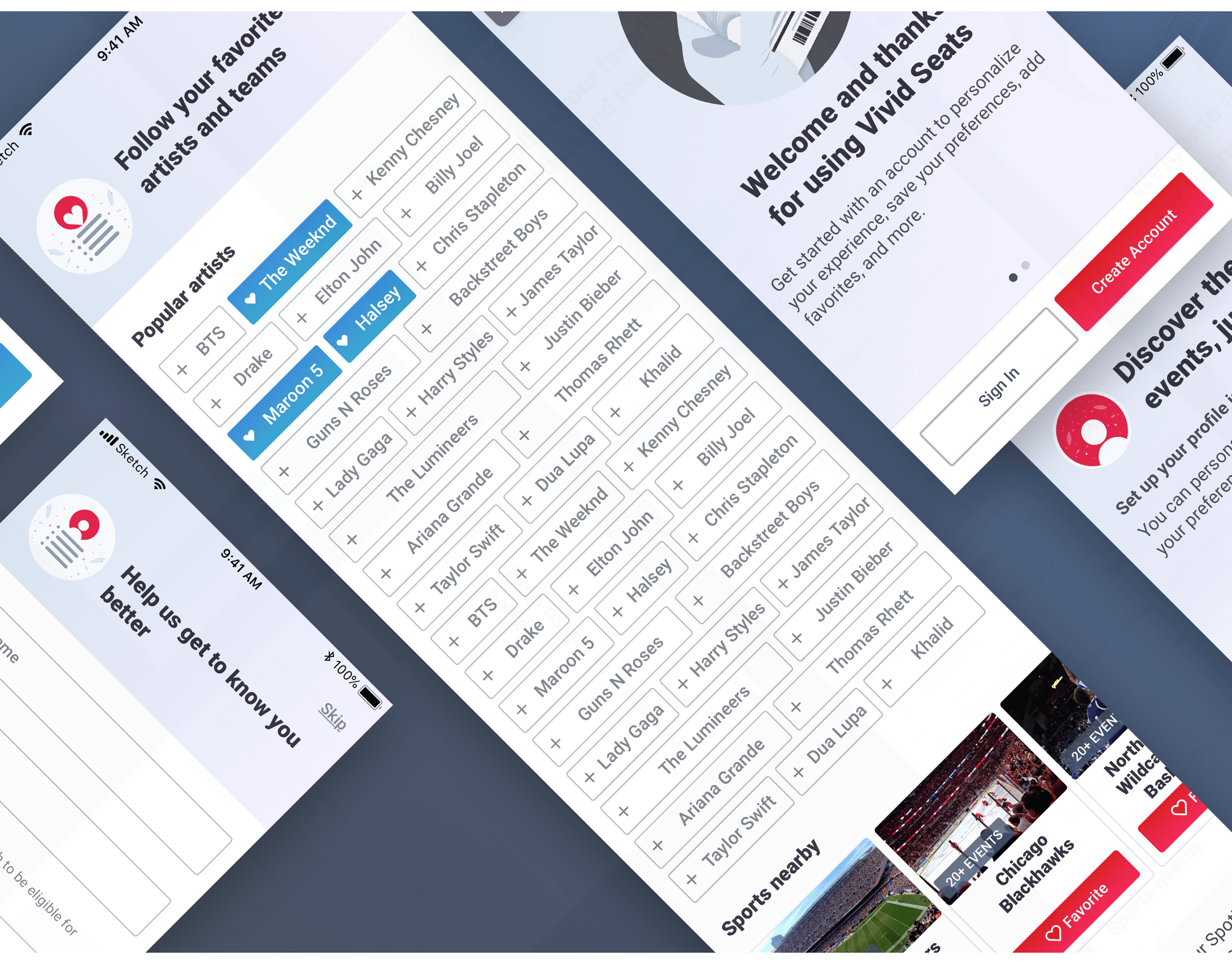
I created a singular page to be used on web to advertise the program as well as pulled into the app as webview to explain mechanics and answer questions. By using one view across web and apps, we could support updated information on the program and provide a place for users to really understand how the program works and be able to deep dive on topics like collecting stamps, reward credit value and tier benefits.
Web Strategy
Initial rollout for our web experience allows users to focus on completing their order and only intercepting after the fact to push users to download the app and start tracking their rewards. Future scope would add more messaging about Rewards earn into web purchase flow for awareness and help push conversions. Our approach allows users to earn Reward credit on web purchases for no additional friction but forces repeat users to move into the app to utilize a reward on a future purchase.
The Process
Identifying Core User Needs
Our discovery started with cross-functional sessions to identify program shortcomings. We analyzed customer service calls, reviewed usage metrics, surveyed users on program perceptions, interviewed a handful of users and completed competitive analyses of programs in adjacent spaces. With this research, we were able to identify target users, their behavioral patterns, and their pain points. We focused on three user types and how we could move users through the groups: the first time user, the repeat purchaser, and the brand loyalist.
Our findings revealed that the current program felt too promotional and intrusive, the rewards were too small to influence purchase decisions, annual tier resets were discouraging, and widespread confusion with tracking credits and standing contributed to more than half of rewards-related calls. With these research insights, I was able to establish clear goals for the redesign that would address user needs while achieving business goals.
We needed to make sweeping change to the core program to give more meaningful rewards and compelling tier benefits. We also were focused on using the program to encourage users to buy more often and buy more expensive tickets. We needed to provide transparency into how the program works and clear tracking information. We wanted to garner excitement for the brand and program with an integrated visual identity and prominent placements that clearly communicated earn progress.
Ideation Sessions to Shape The Program
I participated in several discovery sessions with cross-functional groups comprised of product and design members to discuss rewards mechanics, progress visualization concepts, tier structure, terminology, and engagement ideas.
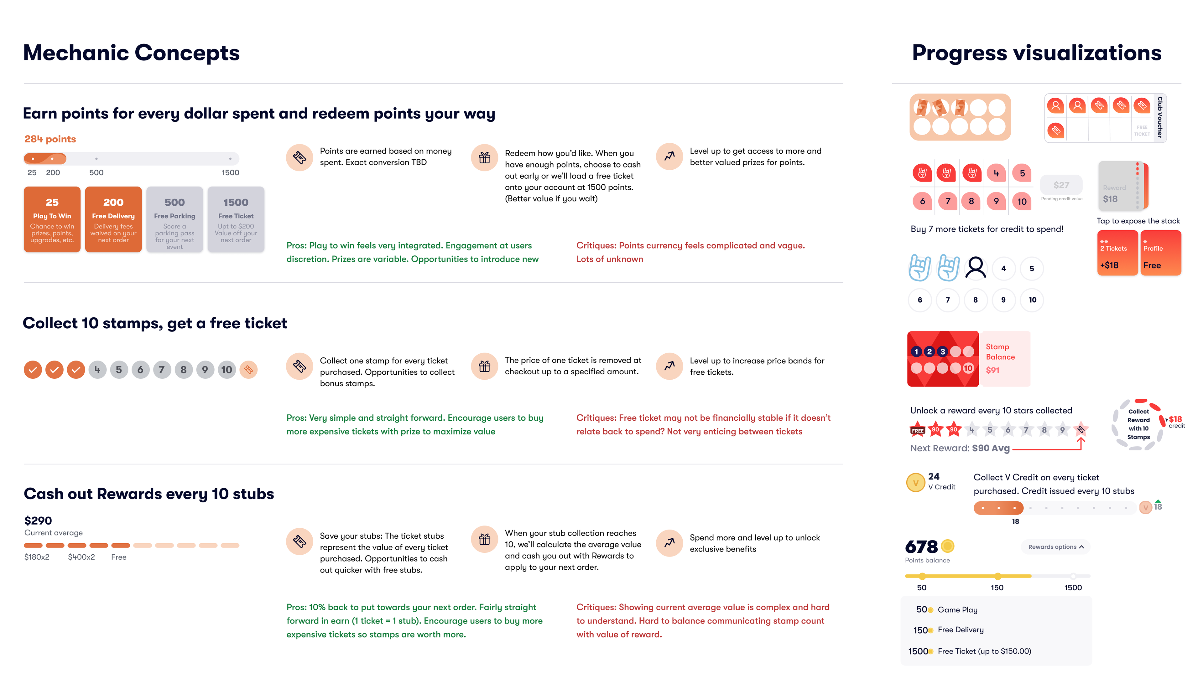
Focusing first on rewards mechanics, we did a broad exploration and then evaluated these three core approaches: a more complex points-based system that would offer flexibility, a stamp card concept with a free ticket as the reward, and continuing with a percentage-based cashback system but rewarded after a certain number of tickets instead of a certain spend amount.
For each concept, I created various progress visualizations that would effectively communicate status while maintaining visual appeal. We evaluated them against key criteria including clarity, perceived value, and user complexity with finance weighing in on sustainability and engineering on implementation feasibility/complexity.
I used this mapping to identify where we could pull back promotional messaging, where rewards information was truly valuable to users, and how we might create awareness from different entry points.

Testing Initial Concepts
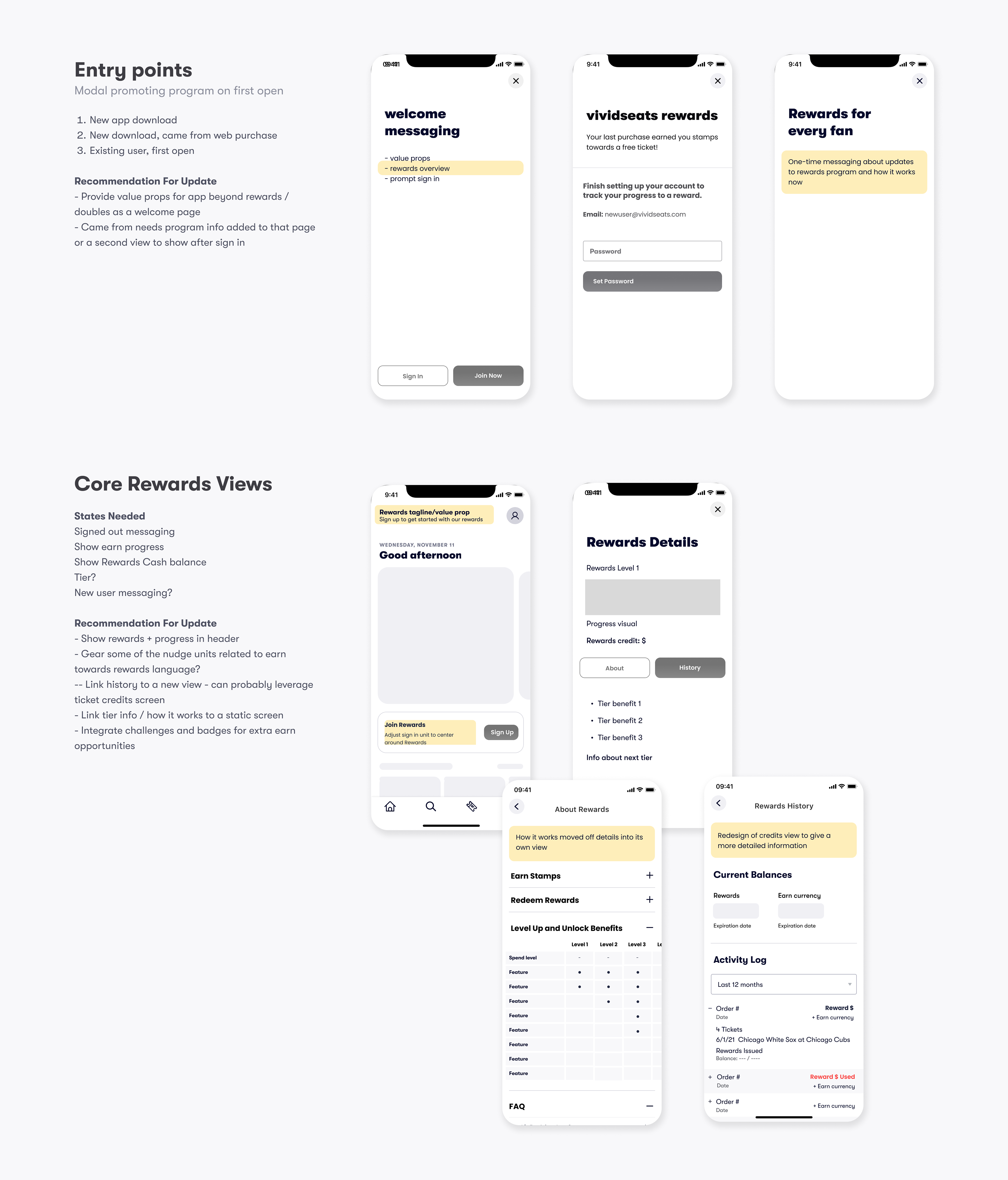
The stamp card concept initially emerged as the favorite in team discussions because it offered both simplicity and a concrete reward that users could easily understand. This first prototype brought together our initial concepts into a cohesive experience that I branded as the 'Fanatic Club' featuring a stamp and voucher based system and led users across sign-up, shopping and checkout on the app. This early testing was crucial for identifying conceptual issues before detailed design work.
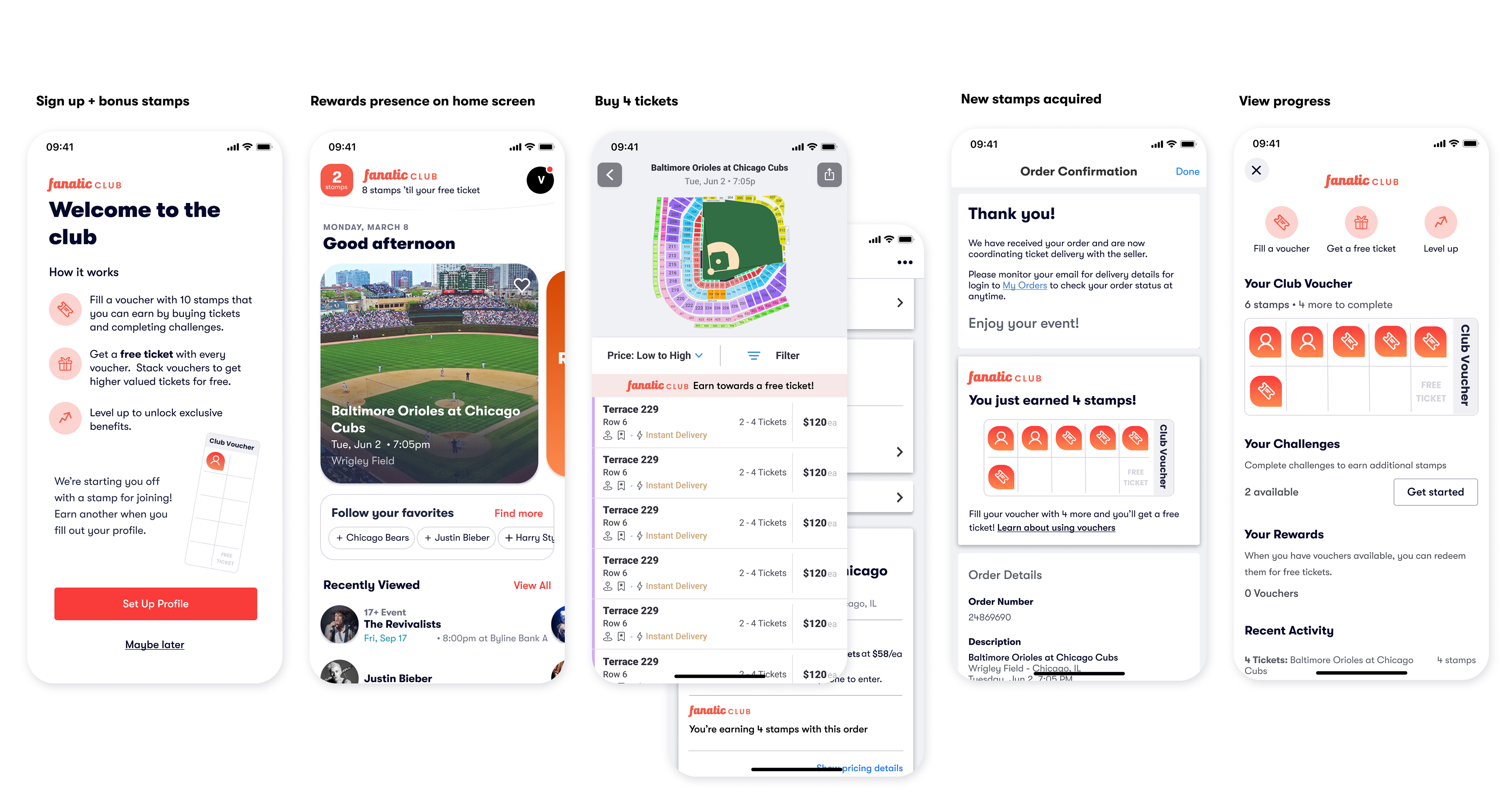
Initial user testing of our stamp card prototype revealed several key insights that shaped our next iterations:
-The dual currency system—collecting stamps to fill vouchers to trade in for tickets—confused users, leading us go after a simpler 10% mechanism where the Reward value was a set value.
-Users felt the stamp card felt dated and out of place in the digital context, prompting us to explore more modern and streamlined visualizations.
-Users were skeptical about the "free ticket" messaging, questioning what restrictions might apply. This led us to shift to more transparent "Reward Credit" language that felt more honest and flexible.
Evolution of the Core UX
In the second iteration, I explored multiple progress visualization concepts, focusing on how the progress bar would display in detailed views and the home page header. With adjusted mechanics and progress visuals, and some early concepts for tiers, I tested a second prototype.
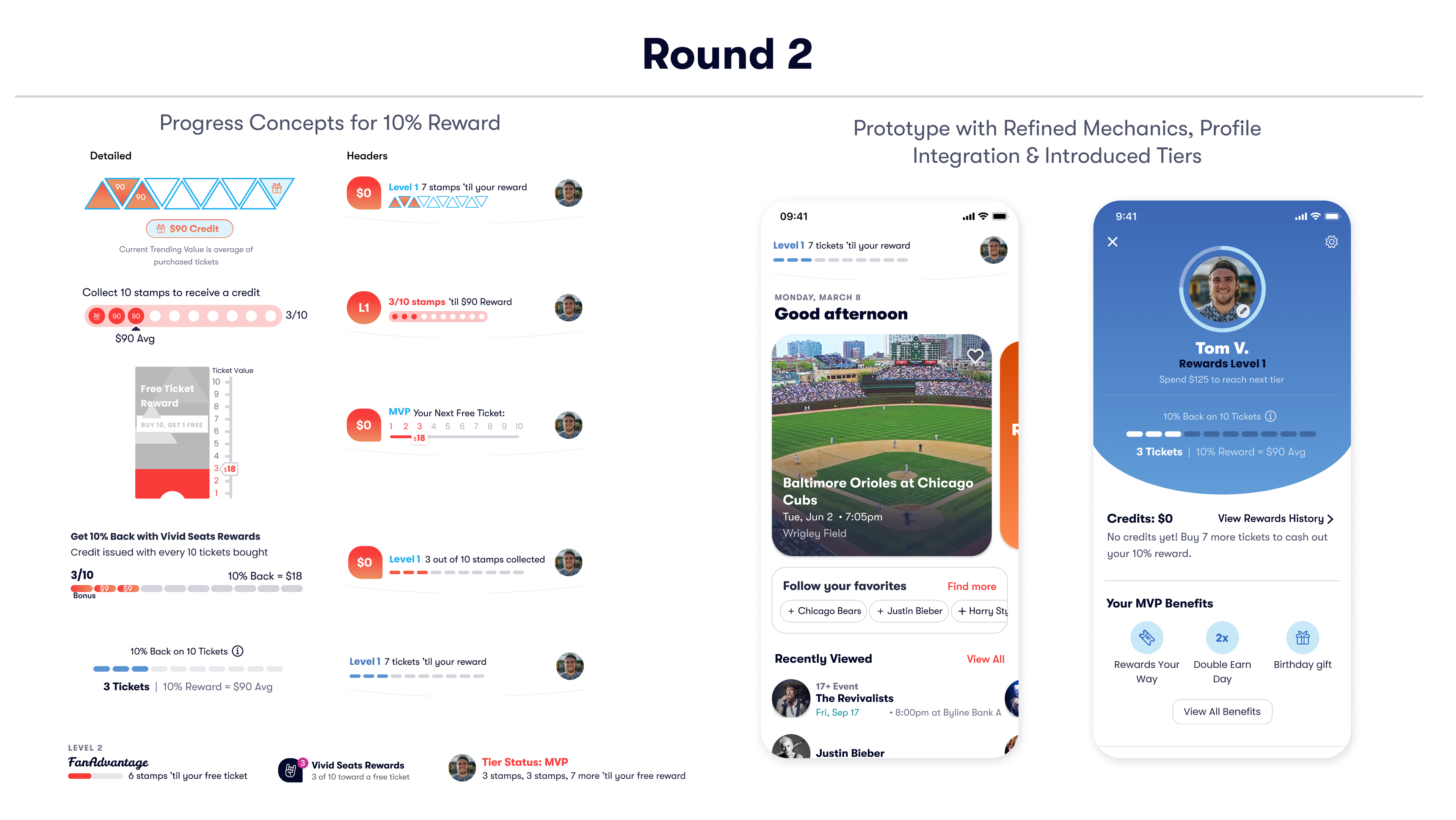
At this point, we had removed additional earn currencies and opt for a very straight-forward: earn 10% back on 10 tickets. User testing this prototype revealed that our approach of taking an average of ticket values to calculate the 10% reward created a fluctuating reward value that users found confusing and demotivating. This led us to reintroduce stamps as an earn currency, valued at 10% of ticket price, thus ensuring the reward value consistently increased with each purchase.
Another key design decision was integrating rewards with the user profile rather than keeping it as a standalone module and view—directly addressing our research showing users wanted rewards to feel like a core part of their identity on the platform.
Simplifying the Core Experience
In the third round, I pursued ultimate simplicity while maintaining clear progress tracking. When testing this concept shown on the right, users felt positive and clear about their rewards progress in its simplified state on the home page, but struggled to understand the Reward Credit value that was shown to them on the details screen. Ultimately, getting caught up on the trending value detracted from their focus and understanding of their progress toward receiving a reward.

This led to an important design decision: simplify the main interface to focus purely on stamp progress toward 10, while letting users who wanted to track the value do so from a deeper view. This minimalist approach removed unnecessary elements for casual users while creating a curiosity gap for those who wanted more detail—perfectly aligning with our project goals of creating a clear, glanceable experience.
Gamifying the Experience
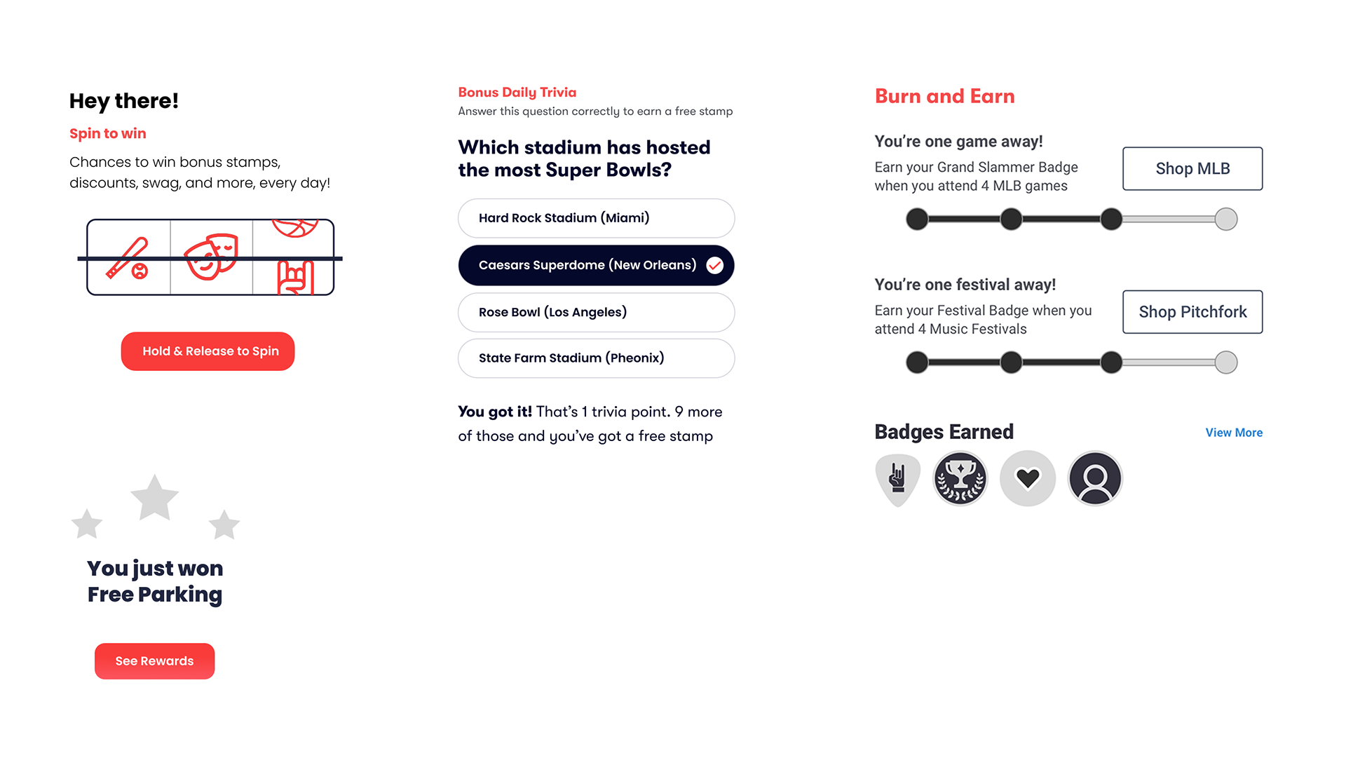
For between-purchase engagement, I explored several concepts for ideas that could lead to quick daily engagement. and then we tested these three concepts: a spin wheel, trivia games, and badges. User feedback revealed the spin wheel felt gimmicky, and trivia added unnecessary complexity to get to a stamp. The badges, which evolved into a concept we called Challenges, emerged as the most natural fit, offering clear goals that felt integrated with the core experience while providing flexibility to support future initiatives. This approach directly addressed our goal of creating meaningful engagement between purchases.
Visual Program Identity
We were in the midst of rolling out a new brand which ultimately informed the visual identity of the loyalty program. We matched Rewards components with our new brand colors and chose colors from the new palette to visually represent each Rewards Level. We wanted the level to be easily identifiable so the respective level color cascaded the Rewards UI.
Working along with our digital designer, I helped to concept logo marks to use with Rewards program that would be cohesive to our new logo and UI. The end result was a logo that worked off our brand logo with geometric shapes, creating a confetti-like mark that exuded ‘excitement’ and ‘rewards’ while representing our tiers with 4 distinct colors.
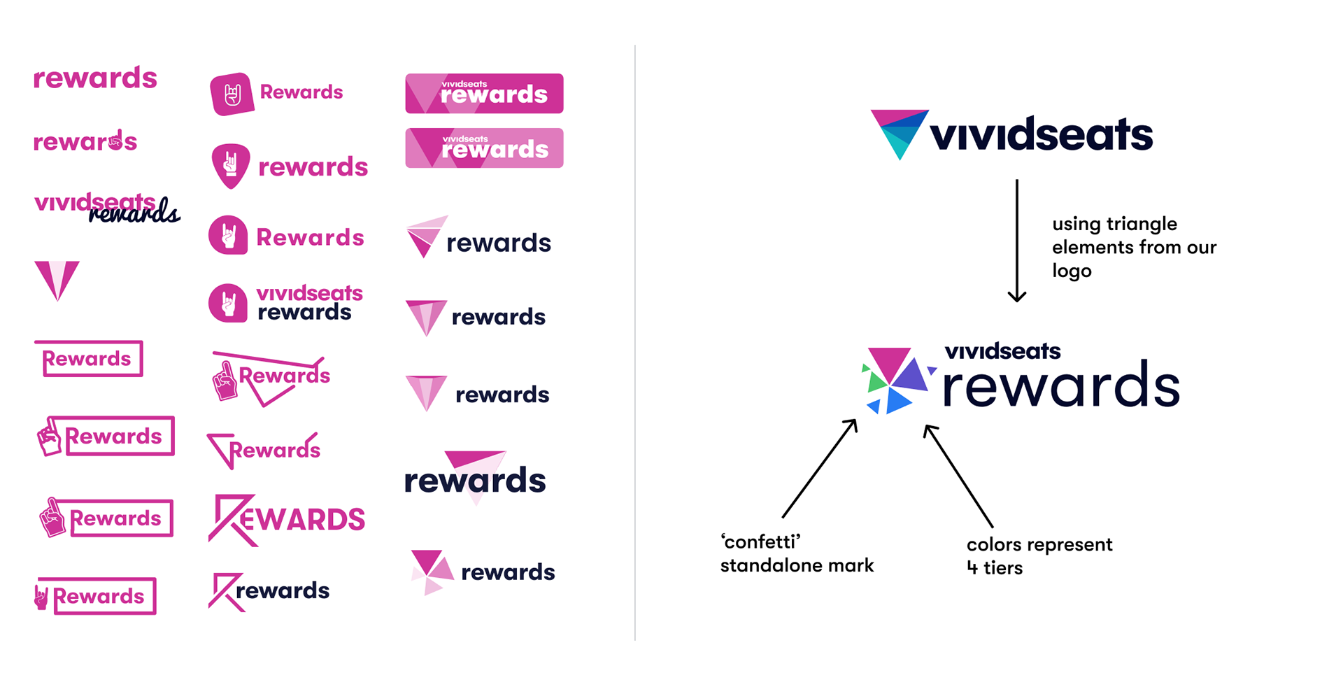
Developing a comprehensive visual system was crucial to usability, cohesion, and supporting our goals of creating a program that felt valuable and distinct. Beyond the color strategy, I also defined symbols, badges and progress indicators and we established a tone that was energetic, playful and direct.
Iterative Release Strategy
We had a hard launch date to coincide with the re-brand release so it was pertinent to prioritize only core features for our first release. The core progress UI was the focus of our MVP release including main progress tracking on Home, Rewards Details, and Order Confirmation. We removed all the old placements and supported the ability to earn, view progress and spend credits. We also supported a transition strategy for our existing customers using our previous Rewards program to maintain an existing credits and start fresh on progress.
The Reward & Credit History view was part of second release to add in much-needed tracking transparency with a detailed activity feed. From there, we layered in features with iterative releases, by adding in the funnel placements, celebratory dialogs, and then combining Rewards Details into the User Profile. There were some final simplifications to the progress bar so that the component could be more reusable in multiple places. Our final release added in a basic addition of Challenges to start to gamify the experience.
Outcomes
Our redesigned loyalty mechanics created a more sustainable program for the business, reducing Rewards business costs by 25% as we paid out less in rewards for small purchases, and first or second time buyers.
We were able to achieve our goal of reducing rewards-related service calls by nearly 40% within months after launch, thanks to the new detailed History, and About views.
Other immediate impacts included:
- A 15% increase in users reaching higher tiers, signifying better retention rates
- Rewards interaction at 1.3x per session (up from .7x previously), signifying increased engagement
- Conversion rate holding steady, signifying Rewards placements are not detracting from buyer journey
- A 15% increase in users reaching higher tiers, signifying better retention rates
- Rewards interaction at 1.3x per session (up from .7x previously), signifying increased engagement
- Conversion rate holding steady, signifying Rewards placements are not detracting from buyer journey
Most importantly, user feedback. showed the program felt both clearer and more valuable, despite its more complex mechanics. User sentiment that "it feels more valuable to earn a free ticket" validated that the new mechanics were enticing for customers to participate in the program on top of them being financially stable for the business.
As we use the program to attract both new and return customers over time, we will continue to monitor acquisition rates, app downloads, conversion rates, reward credits used, and lifetime customer value as indicators for success.