

By the numbers
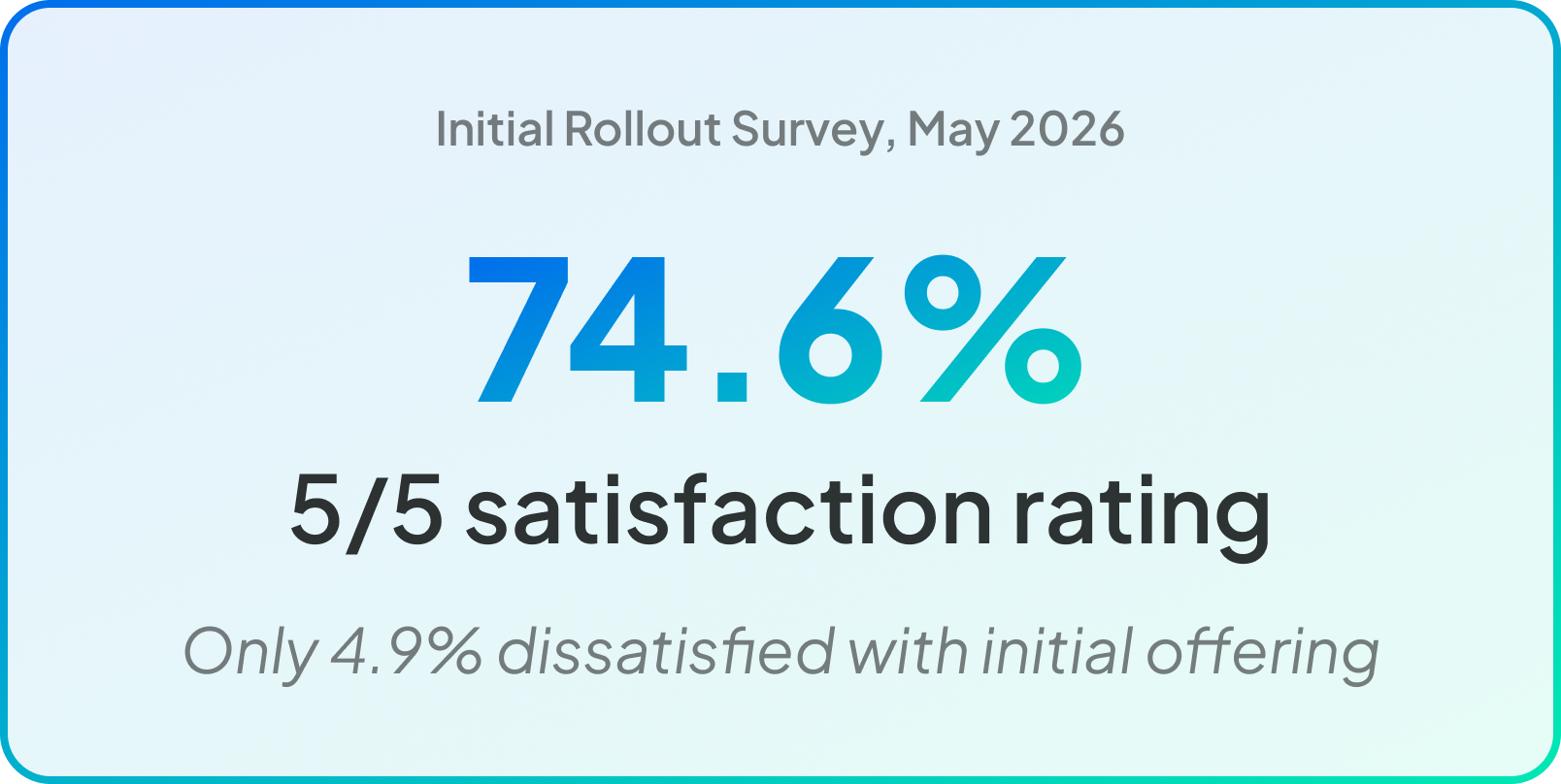
4 months vision to launch • 74.6% rated 5/5 experience in initial rollout survey • 72.4K weekly unique users (avg over first 2 months) • $5.42M handle generated from feed (first 2 months)
Project Overview
A new surface for FanDuel Sportsbook
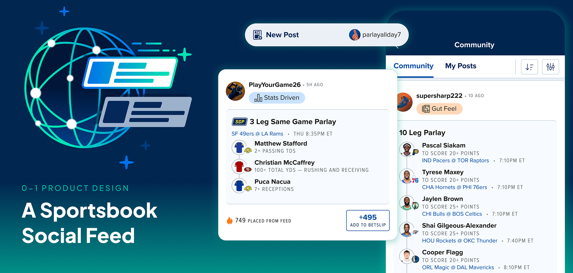
The Community Feed is a social betting feed inside FanDuel's Sportsbook app where users can share bets they've placed, see what others are wagering on, and tail any bet directly to their bet slip in one tap. It's the first permanent social layer in FanDuel's Sportsbook product.
As the dedicated designer on the social stream, I first designed a long-range vision, then shifted to more tactual product work for an initial MVP launch. Since this was a net new section of the app, we had no existing patterns to pull from, no design language to borrow, and no prior data to anchor decisions. The vision phase mattered: it gave the team shared language and a north star to scope against. The build phase was where that ambition met real constraints.
From scoping to launch, the 0→1 design work covered post creation, feed browsing, betting badges, social proof signals, user identity, filtering, and entry point strategy — the full surface, built from scratch.
Team: 1 Design · 1 Product · 2 Eng Squads · 1 UXR · 1 Analytics
Timeline: Jan – May 2026 (Vision built in late 2025, MTP Design Jan-Feb, Development Mar-Apr, Rollout began late Apr)
Platform: iOS · Android (React Native)
The Problem
Before Community existed, FanDuel Sportsbook had no meaningful way for users to share betting context or discover what people like them were wagering on. The UXR team had been tracking this in monthly CX Measurement surveys: better bet sharing was a consistent and growing ask across the user base.
Two gaps in the product that a social feed could solve for the customer:
1. Bet discovery was static
In-app surfacing was editorial, popularity-based, curated by the platform, not by user interest or peer behavior. Users had no way to see bets from people who bet like them.
In-app surfacing was editorial, popularity-based, curated by the platform, not by user interest or peer behavior. Users had no way to see bets from people who bet like them.
2. No social layer existed
There was nowhere to share a bet with context, see what friends were wagering on, or feel any sense of community around the betting experience
There was nowhere to share a bet with context, see what friends were wagering on, or feel any sense of community around the betting experience
On top of these customer needs, we had several signals that a social feed would land based on previous research and analytics.
1. Users distrusted platform-curated content
FanDuel already had bet discovery surfaces — Parlay Hub, Popular Bets — but research surfaced consistent skepticism toward them. Users suspected curation served FanDuel's interests, not theirs. "Is it really that popular? Do they just want me to bet this?" A bet shared by a real person carries fundamentally different credibility than one surfaced by the platform.
FanDuel already had bet discovery surfaces — Parlay Hub, Popular Bets — but research surfaced consistent skepticism toward them. Users suspected curation served FanDuel's interests, not theirs. "Is it really that popular? Do they just want me to bet this?" A bet shared by a real person carries fundamentally different credibility than one surfaced by the platform.
2. The Share Bet module had strong existing engagement
The existing share bet flow (external app sharing via a custom share sheet), logged over 44M share link clicks from My Bets and the bet success modal across 2025. Users were already sharing bets externally at scale proving that the appetite for sharing was there.
The existing share bet flow (external app sharing via a custom share sheet), logged over 44M share link clicks from My Bets and the bet success modal across 2025. Users were already sharing bets externally at scale proving that the appetite for sharing was there.
3. Discord was already functioning as a pseudo-feed
FanDuel's most engaged users had Discord communities where they shared bets, debated picks, and built social context around their betting. This was the community FanDuel wanted. It just existed off-platform, with no easy to track tail counts.
FanDuel's most engaged users had Discord communities where they shared bets, debated picks, and built social context around their betting. This was the community FanDuel wanted. It just existed off-platform, with no easy to track tail counts.
4. Pass the Leg proved users want to bet together
FanDuel had run two event-specific group betting experiences called Pass the Leg at Thanksgiving and the Super Bowl, where users collaboratively built parlays. Both performed strongly, demonstrating that community and shared betting aren't just a nice-to-have but users are actively seeking it out. Community Feed is the permanent, evergreen version of that social betting impulse.
FanDuel had run two event-specific group betting experiences called Pass the Leg at Thanksgiving and the Super Bowl, where users collaboratively built parlays. Both performed strongly, demonstrating that community and shared betting aren't just a nice-to-have but users are actively seeking it out. Community Feed is the permanent, evergreen version of that social betting impulse.
The Business Hypothesis
A social feed drives incremental engagement without cannibalizing core betting. The design challenge: build just enough to test that, without overbuilding.
Understanding Our Users
Before design kicked off, the UXR team ran foundational research that shaped how we thought about the two distinct user groups the feed needed to serve. 12 moderated interviews across active Share Bet users (N=7) and users who had never shared a bet (N=5).
App-switching was the dominant pain point (N=10)
Users were constantly leaving FanDuel to research bets, bouncing between ESPN, Twitter/X, Discord, and group chats. When they found something interesting, they'd manually recreate the bet inside FanDuel (N=8). Eliminating that loop was the core value proposition of the feed.
Users were constantly leaving FanDuel to research bets, bouncing between ESPN, Twitter/X, Discord, and group chats. When they found something interesting, they'd manually recreate the bet inside FanDuel (N=8). Eliminating that loop was the core value proposition of the feed.
Two distinct sharing personalities
Power Sharers — experienced bettors who shared actively — were motivated by community, credibility, and the social dynamic of winning together.
Non-Sharers consumed others' bets for validation but held back from posting, primarily due to lack of confidence.
These archetypes directly shaped how we designed the posting flow and the feed experience, and they directly predict the Creator/Consumer split we'd later see in post-launch survey data.
Power Sharers — experienced bettors who shared actively — were motivated by community, credibility, and the social dynamic of winning together.
Non-Sharers consumed others' bets for validation but held back from posting, primarily due to lack of confidence.
These archetypes directly shaped how we designed the posting flow and the feed experience, and they directly predict the Creator/Consumer split we'd later see in post-launch survey data.
"When I see everyone winning and get thanks and credit back from bets I posted in the Discord group, it motivates me to share bets more."
—Power Sharer participant describing motivations for bet sharing.
The Vision
Before we got into the tactical work of launching an MTP, I worked on a long range vision of what Community could become. This is a north star that the team could orient around and build towards.
Scoping the MTP
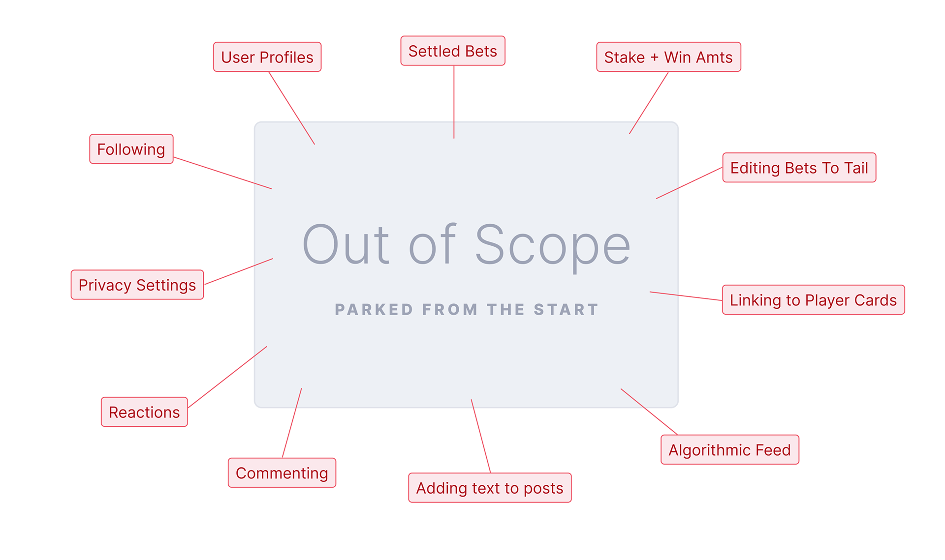
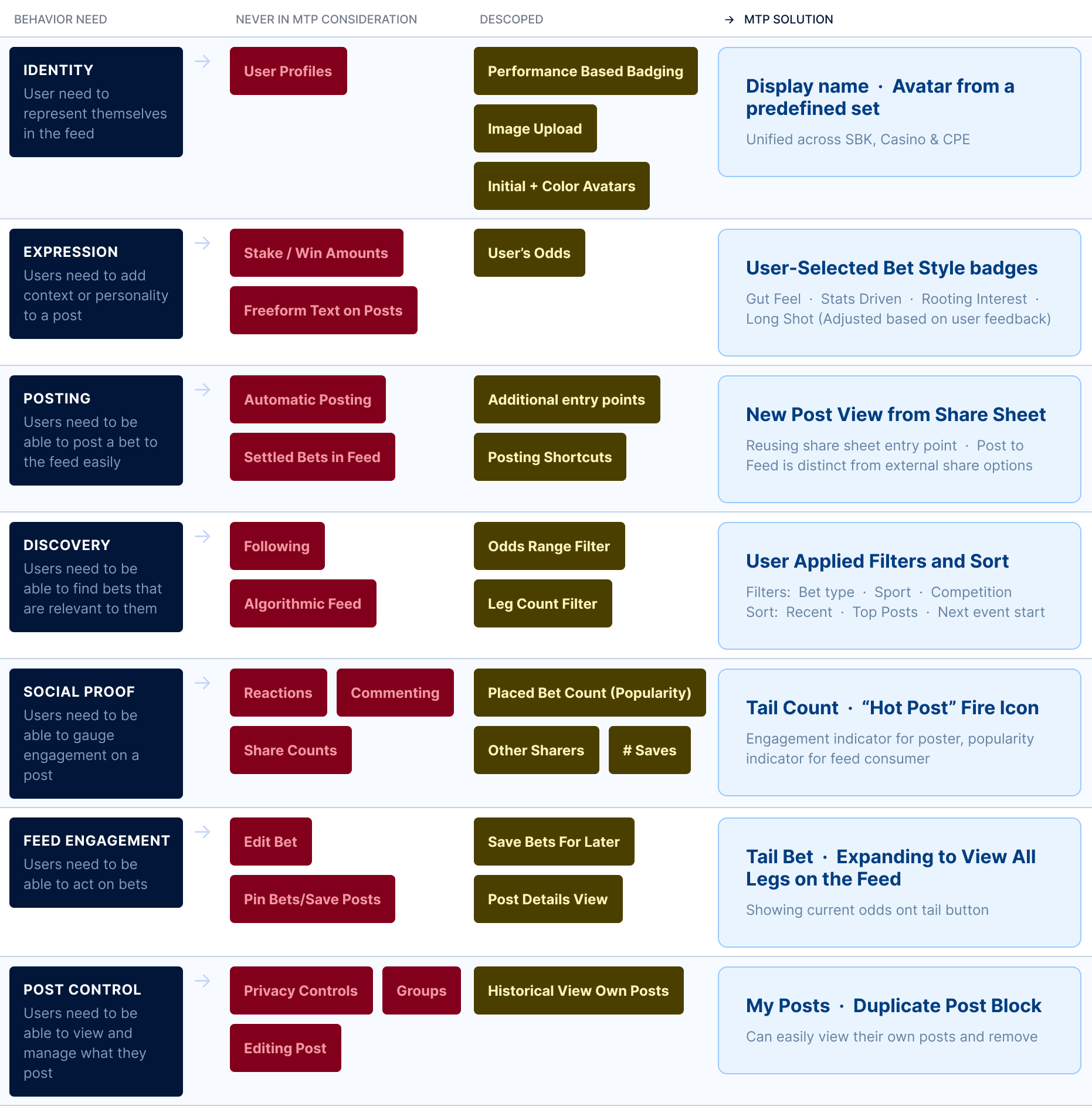
The Community vision I'd designed earlier covered a lot of ground — followers, profiles, reactions, leaderboards, private groups, micro-influencer features, gamification. The MTP had to be a fraction of that.
With PM and engineering, I worked through each feature by mapping it to the underlying user behavior it addressed, then asking: does this behavior need to exist in the MTP to test the core hypothesis? A lot of things we cared about didn't make the cut, not because they weren't valuable, but because they weren't load-bearing for the experiment. A few pieces got designed and iterated before being cut. The scope map below shows how each feature mapped from the original behavior need through the MTP decision.
Designing the Feed
Three design areas consumed the most iteration time: the share entry point, the identity system (display names and badges), and social proof signals. Each had real product tension underneath it.
Entry Point on the Share Journey
The biggest early tension was between posting visibility and external share behavior. We needed the share to be prominent enough to create adoption but not displace the existing external share flow which had strong habitual usage. Other considerations in design were ease to use repeatedly and scalable for future features like captions and additional badges.
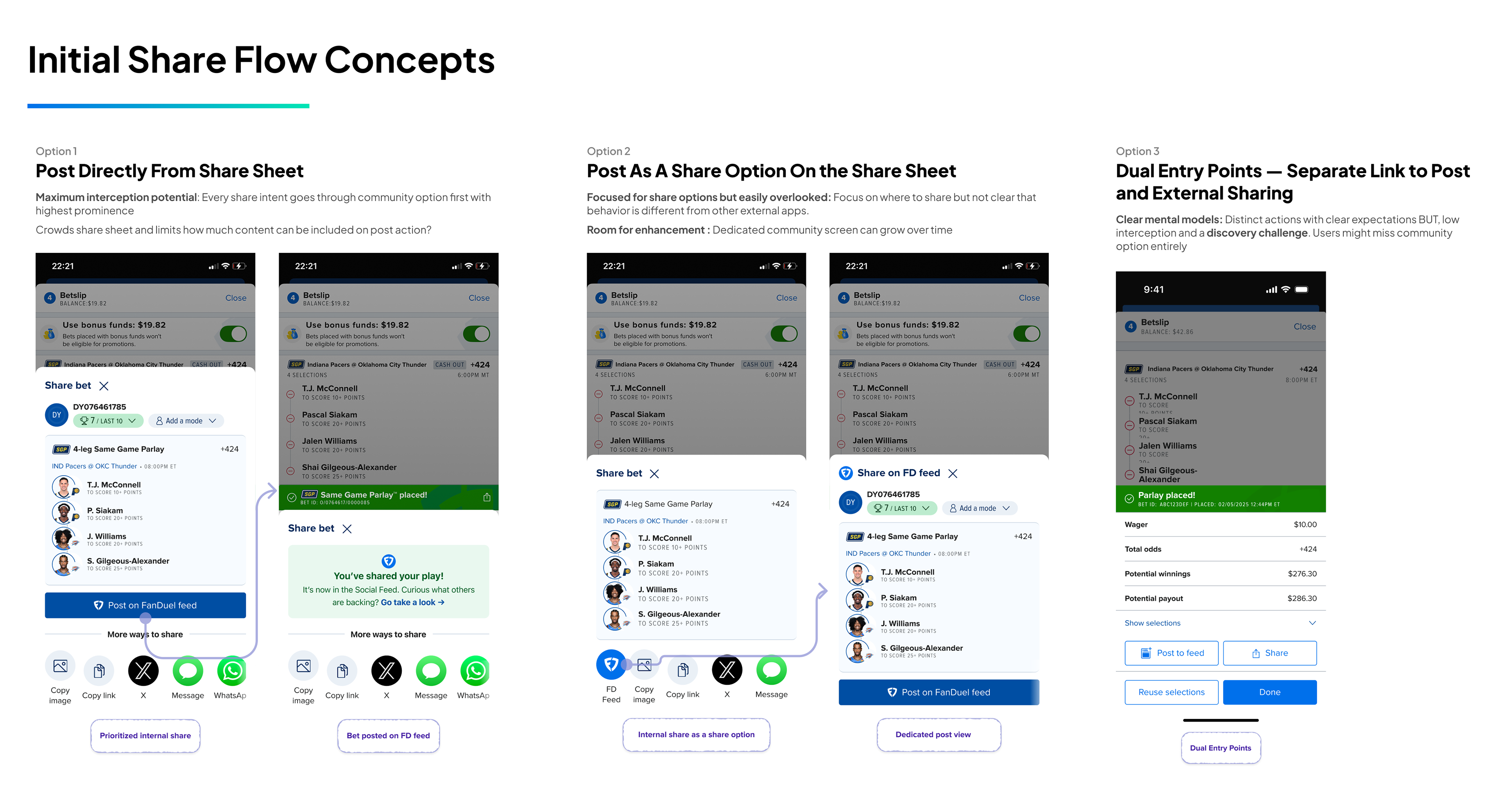
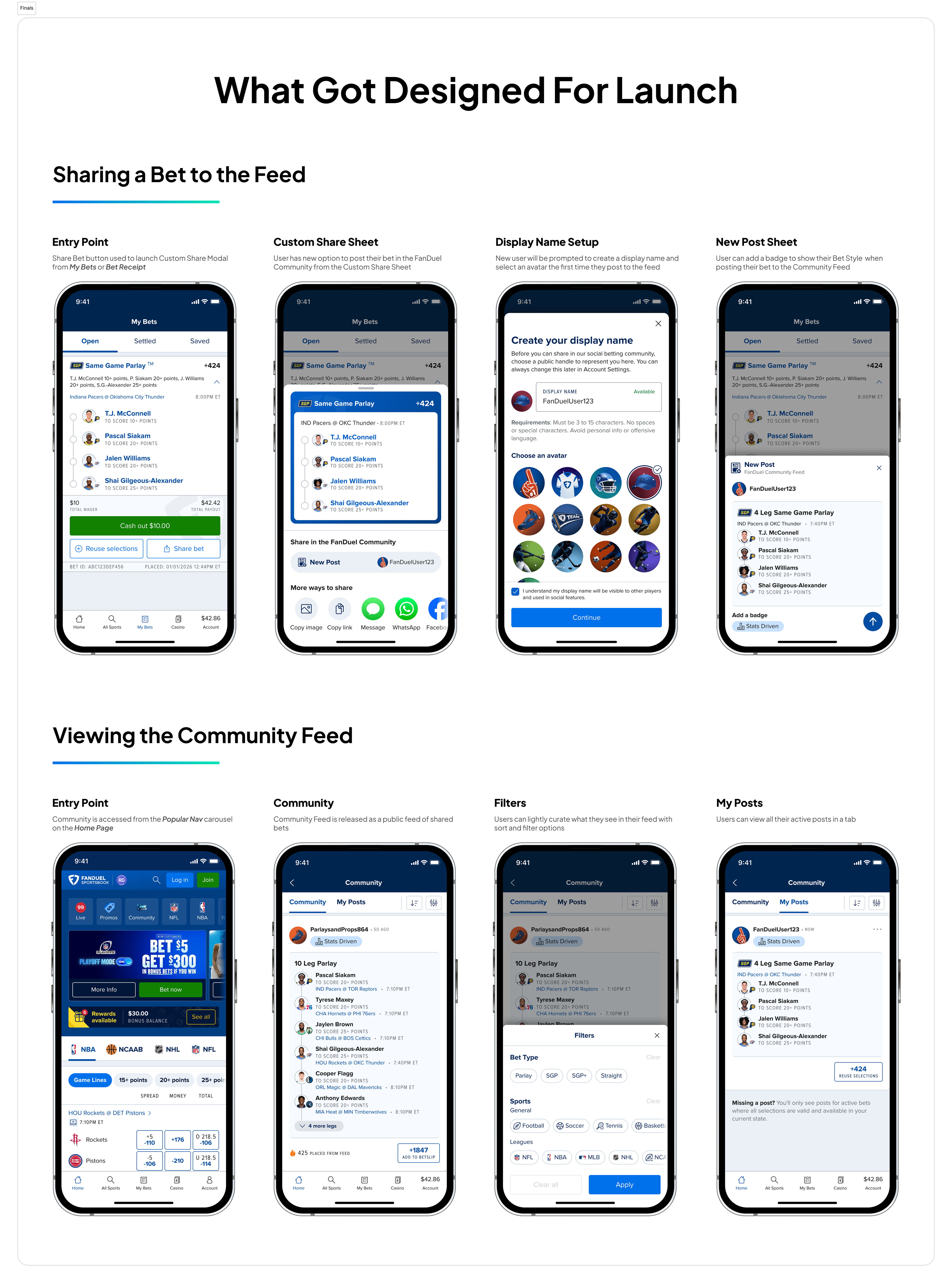
After these initial concepts, we agreed that the share sheet was the right home for posting. It's where sharing was already happening and gave us an interception opportunity with customers who already have share intent. It also allowed us to utilize the Share Button entry point from Bet Receipt and My Bets which is a low cost way to introduce and test a new feature before making changes to views in a user's core journey.
There was a decision to be made between integrating the post creation directly on the share sheet or linking out to a new view. Posting directly from the share sheet presented risks with usability and detracting from current share behaviors. Posting as an option on the share sheet seemed like the right general direction but not prominent enough to stand out as designed. Using a new sheet for internal sharing was a common enough pattern to continue following here.
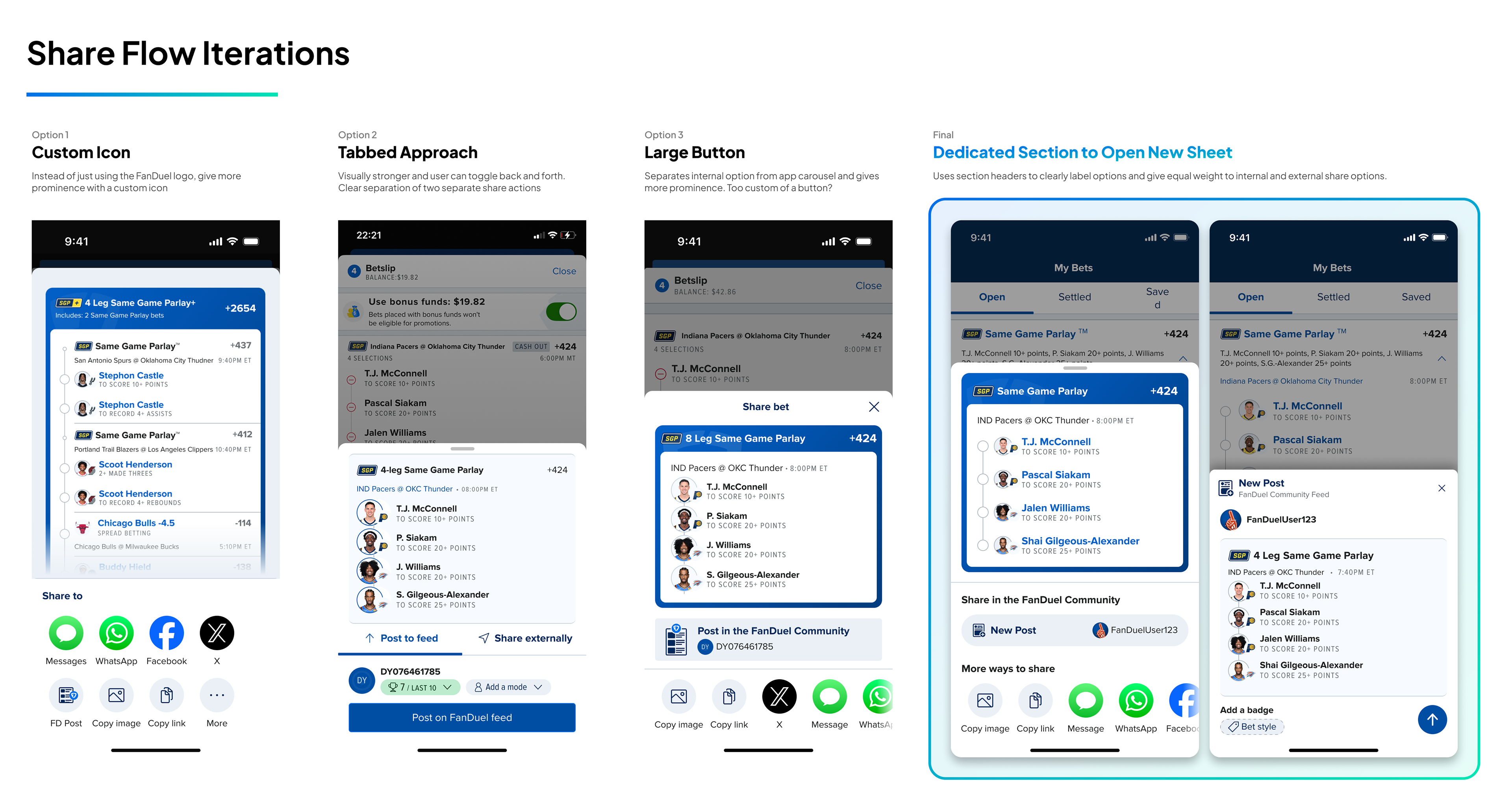
The next concepts planned a single entry point from our existing Share Button and a link to its own "New Post View" but experimented with different levels of prominence. What we settled on: Post to Feed in its own section, above the carousel. It's separate enough to notice but doesn't disrupt current external share behavior. It places the New Post in its own view which gives us flexibility to add in more pieces to the new post view over time.
Sharer Identity System
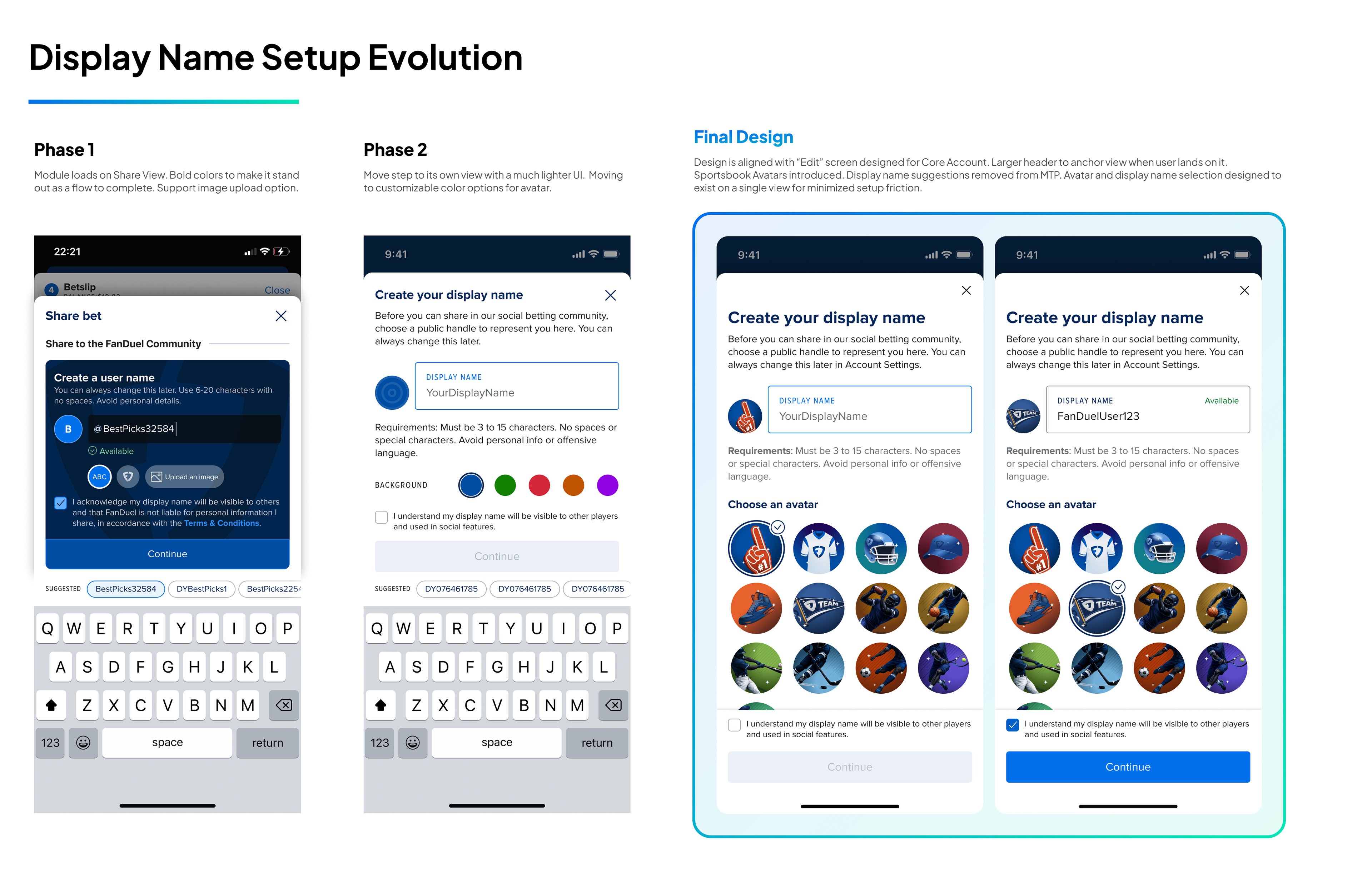
Users need to represent themselves in the feed, but we couldn't build profiles for MTP. The minimum option for MTP was to have the user set a display name and assign an avatar so that they would have unique representation in the feed. I designed a first-time share flow where we'd intercept a user without a display when they attempted to share their first post. They would be prompted contextually with a lightweight onboarding to make Community setup feel like a natural part of the sharing flow.
Early on, I designed for image uploads where users could set a photo. Storing and moderating images were a concern that we didn't want to take on for MTP. The next iteration of the avatar design was to use the username initial with a color selection which took away the moderation risk while still allowing for variation in avatars across the feed.
After some cross team alignment with our Casino team and our core product team, the plan shifted to encompass a more holistic customer experience. Our Casino team was already developing a predefined avatar set for their social areas that the core team would host. We could plug into that shared system, define sports specific avatars for some personalization and use a unified display name across Sportsbook, and Casino. Beyond a consistent customer experience, this was a win on the engineering front as it streamlined the work needed to be done to process and store user names and avatars. We had flexibility to define images and predefined images were a lighter lift than generating avatars with more custom colors and initials.
The initial avatar offering included 13 choices that covered a variety of sports. It's important that we had some variety in the feed and that users could pick an avatar to represent them that they identified with. I used a combination of AI tooling and vector tracing to create our avatar set.
Social Proof Signal Display
The social proof was one of our most debated design decisions. Without reactions or comments, we needed to figure out what signals engagement at all. There were three data points that we zeroed in on to show: Shares, Overall Placed, Tailed from Feed and the design exploration centered around how to display all three of these succinctly and which would link out.
We spent a lot of time on an 'other sharers' view — connecting users who'd posted the same bet. As discussions deepened, it became clear that it was complicated for users to understand, complicated to build, and likely not relevant at early adoption when duplicate posts would be rare. Ultimately we dropped the other sharers functionality from the MVP. The simplicity achieved here is that each post is owned by a specific user with their own engagement metrics. If multiple users post the same bet, they are not tied together in any way.
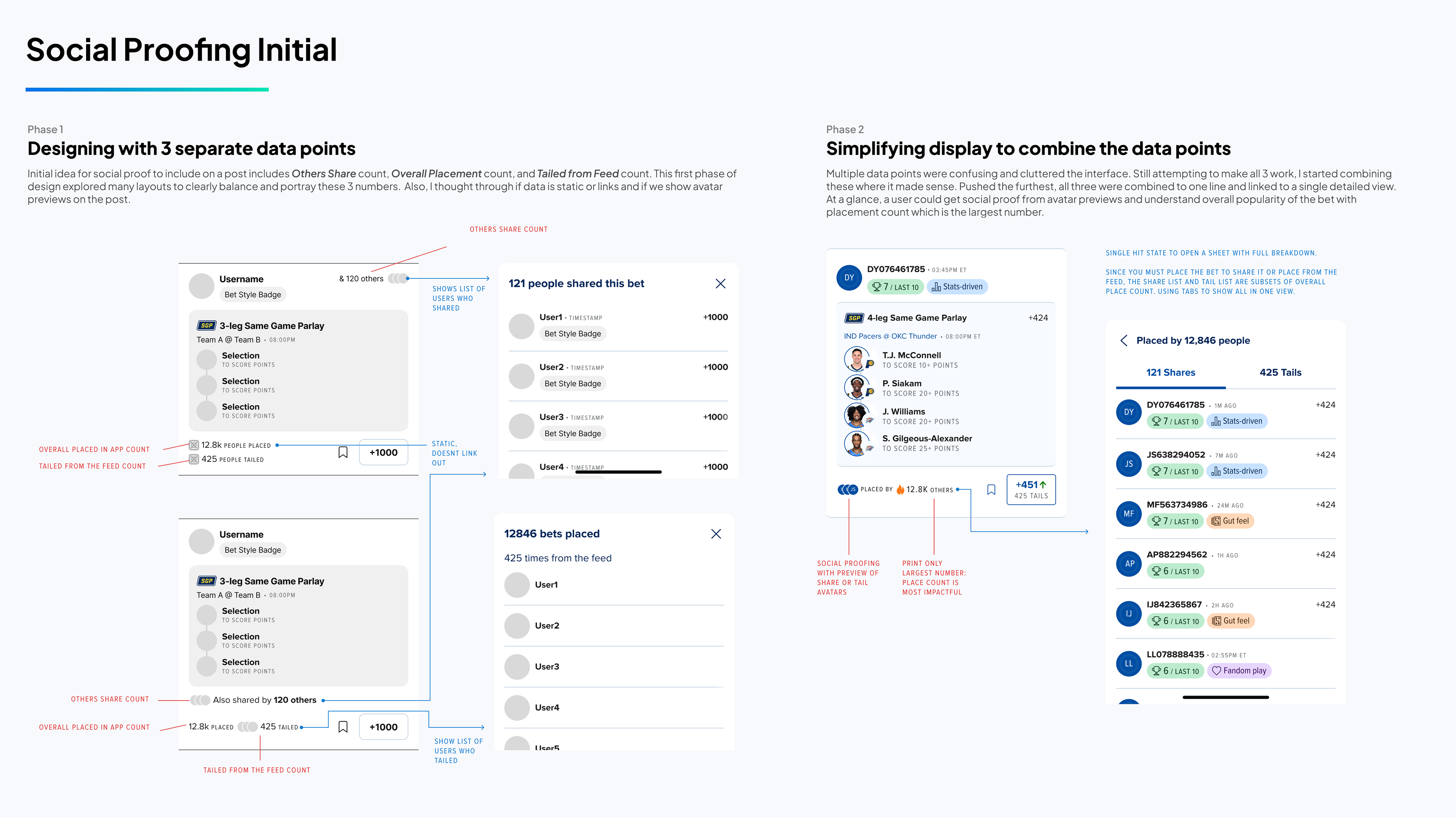
The next round of design centered around how to display placed and tail counts effectively on the post. Although many layouts were explored, simply showing 2 different counts related to users who placed this bet caused more cognitive load than value. Users in testing expressed that they didn't understand the difference in the numbers at a glance or that seeing two numbers were confusing.
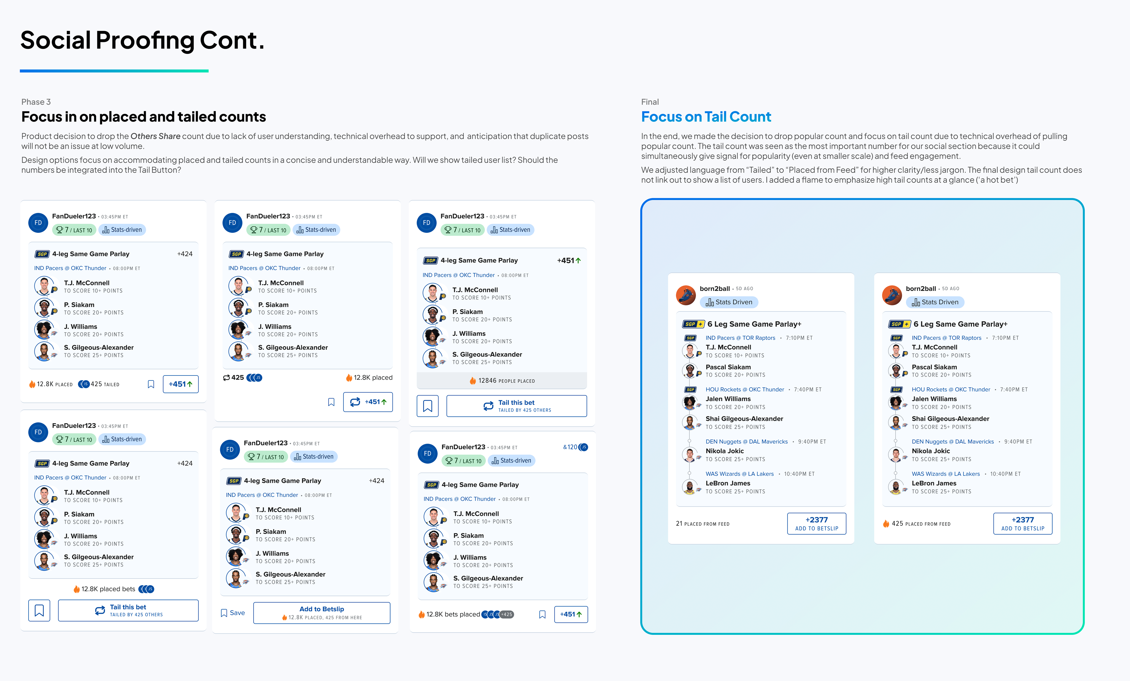
The obvious resolution was to distill it down to a single number. The tail count is a meaningful metric on feed engagement and fits nicely within the Community context. The place bet count gives a much more holistic view on overall traction of a bet and understanding real popularity as numbers are likely to be substantially larger (2k placed vs 50 tailed). There was a split stance on which number provided greater value to the user.
When engineering weighed in that tail counts were much easier to obtain than total placed counts as they lived within the system, that helped to push us toward the end state of using tail counts. Although we lose strong popularity signal, the use of tail count only was also supported by the fact that the tail count could give signal to both the poster and consumer with one number. It gives the poster an engagement signal — did anyone act on my post — and gives the feed consumer a popularity signal — is this resonating with others. We added a fire icon at 50 tails to make that signal more visible comparatively.
Post Design Validation & Testing
By March 2026, the core MTP design was substantially complete and engineering was already building. The UXR team ran N=12 moderated prototype walkthroughs across both user groups to validate decisions, identify friction before it shipped, and build confidence for the April launch.
The concept was well received — but entry point expectations were high. The Social Feed concept resonated across both groups. Users immediately framed it as a replacement for Recommended Parlays, but with real social depth. They expected the entry point in bottom or top navigation. The MTP launched in our popular navigation carousel, a known limitation for prominence.
Badges validated — with one clear exception. All 12 participants found badges valuable for trust and bet context. "Stats Driven" and "Gut Feel" mapped naturally to how people already thought about their bets. "Fandom Play" created confusion — participants weren't sure when to use it. About half skipped badge selection entirely because "Share bet style" wasn't prominent enough as a label in the posting flow.
Filter highly valued; sort icon created confusion. Filtering by sport, league, and bet type was considered essential by most participants (N=11), and the filter icon was identifiable without prompting. The sort icon wasn't — it wasn't clear what it did until participants clicked through. Both shipped; sort was flagged for future iteration. Odds range filtering was the top missing feature request (N=8).
Core share flow had zero friction. The end-to-end posting experience — selecting a bet, choosing a badge, previewing, posting — was completed without hesitation across all 12 participants. No meaningful usability barriers in the primary path. The research validated that we could ship with confidence.
"I could definitely see myself using this. It'd be great to build my own community for betting ideas"
—Concept Test Participant feedback on using the prototype
Engineering Handoff
The handoff happened across a tight timeline with two engineering squads — one on the feed surface, one on the post creation and share module. I ran design reviews in the weeks before development kicked off and stayed in sprint cadence throughout build.
The filter experience required some scope adjustment during build — a few filters got cut and we had to think carefully through how sport and league filters would stack on mobile without becoming unwieldy. We also encountered a tech limitation that wouldn't allow more than 10 filters to be applied to a user experience. We had to build into the experience a state when the maximum number of filters is selected so the user wouldn't be able to select anymore.
I worked with engineering on edge cases and handling of error states, empty states, duplicate posts, etc. As we were getting closer to our projected release date, we had to make more scope cuts that we would circle back on. This included things like hiding bets that had suspended legs and pushing off header scroll behavior to a later release.
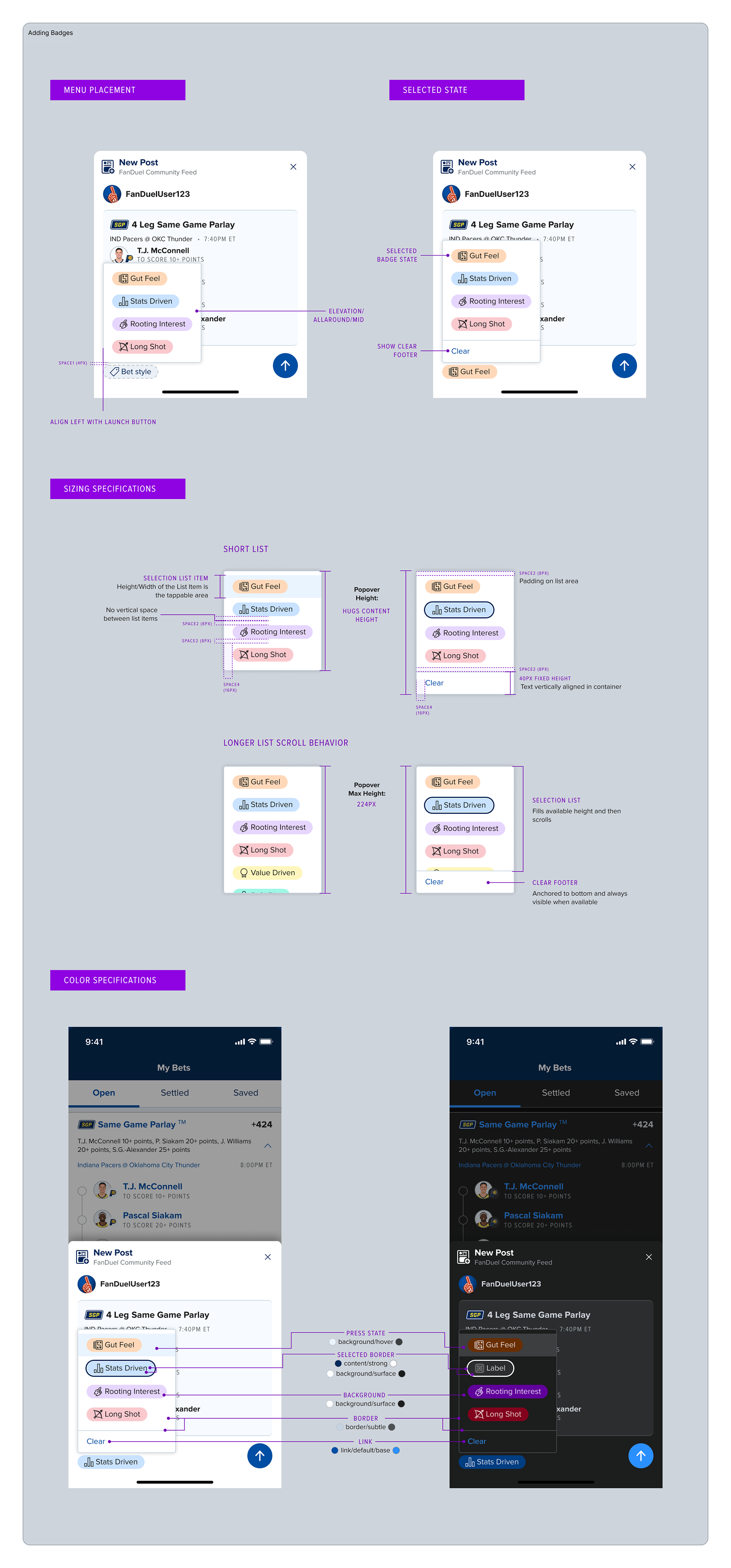
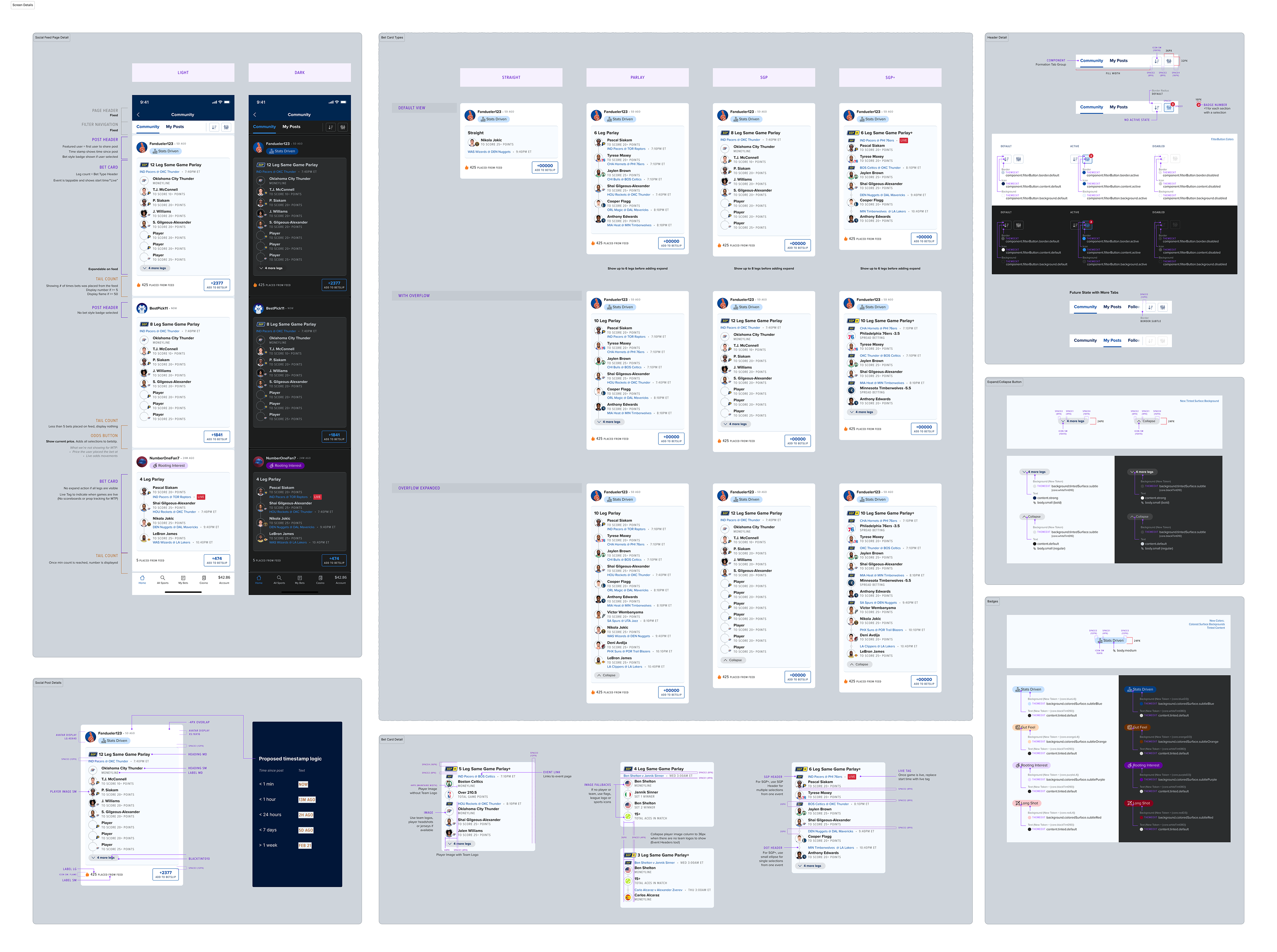
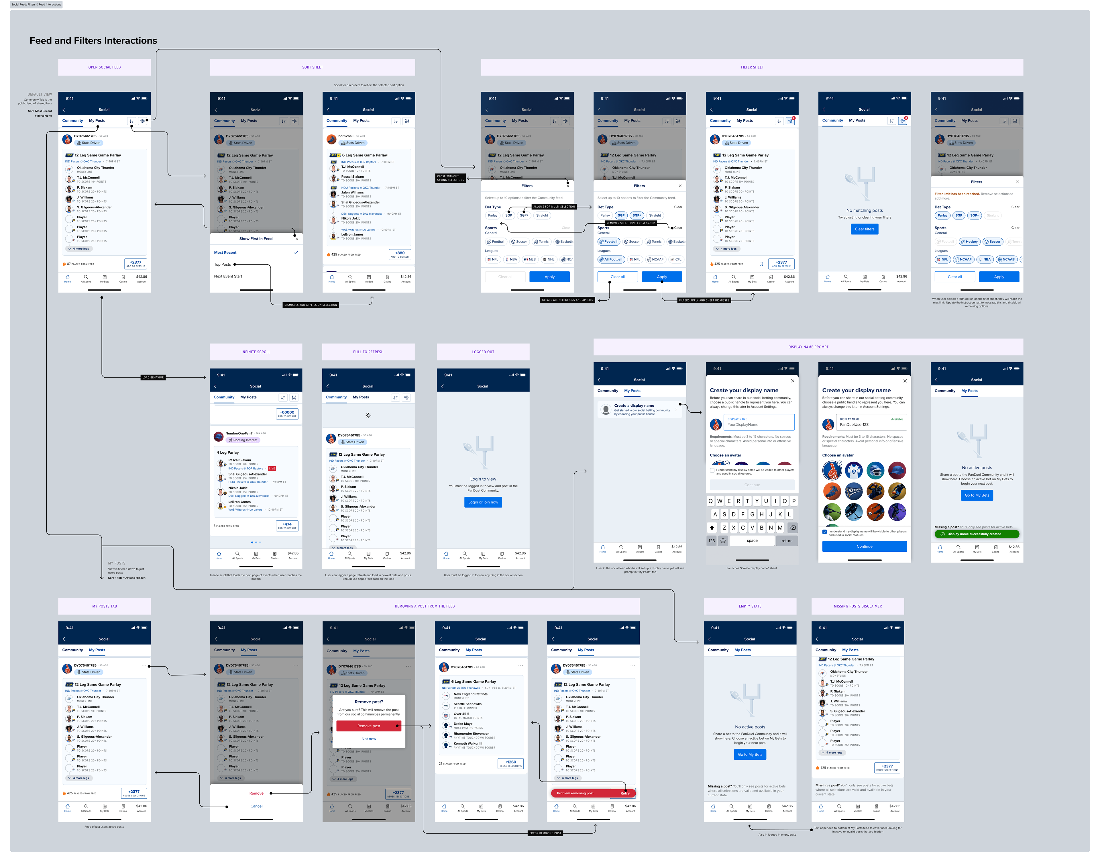
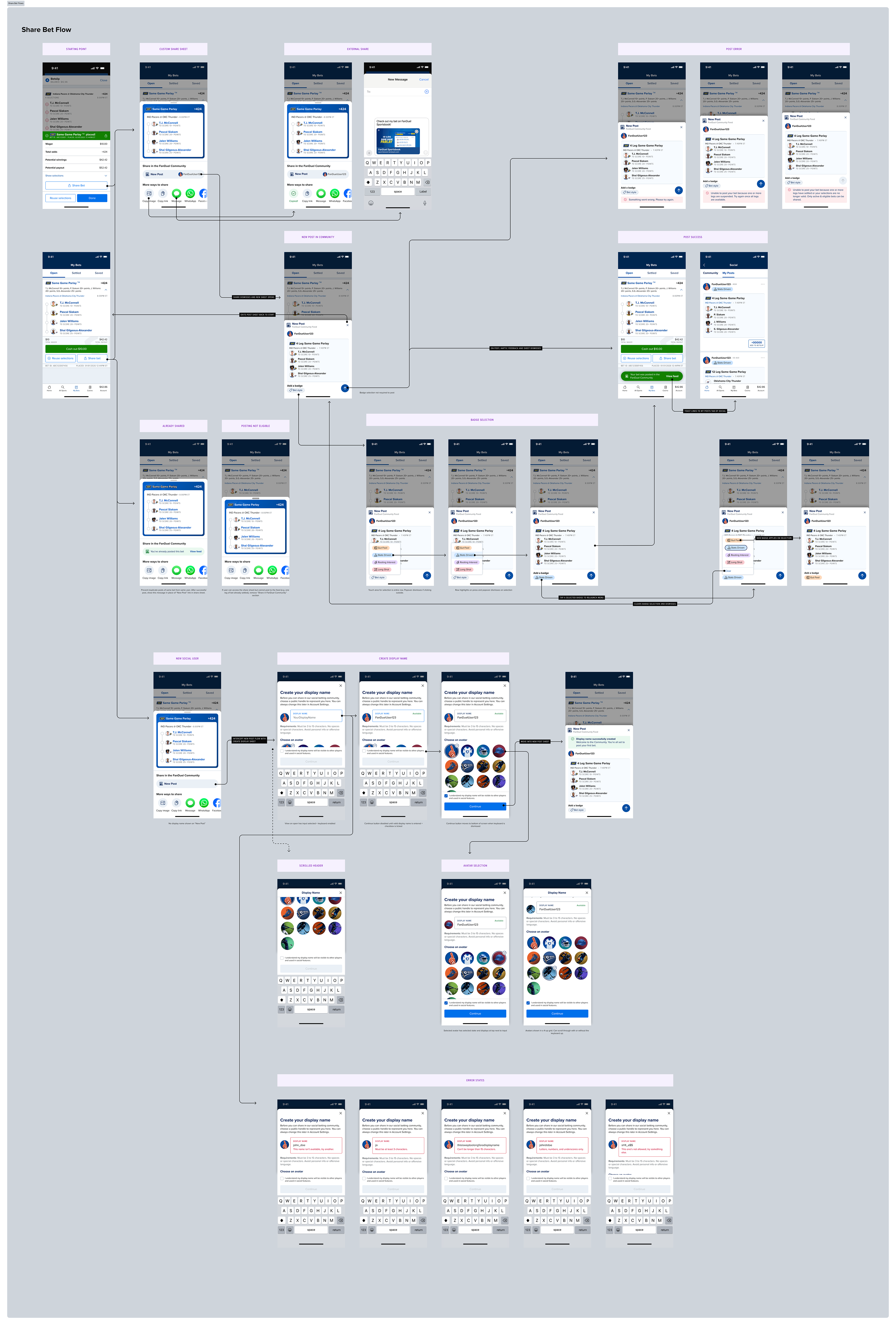
Some of the spec work given to engineering to demonstrate flows and view details.
Launch & Experiment
Community launched as a controlled experiment — not a full release. This was intentional: the hypothesis was that a social feed drives incremental engagement, but we hadn't proven it. The experiment design let us test that directly before scaling.
• April 27: 10% rollout, 50/50 variant/control
First users get access to the feed. Primary metric: Active Session Rate with Community engagement. Guardrails: handle/user, bets/user, original ASR. Watching for "open to scroll but not bet" behavior.
First users get access to the feed. Primary metric: Active Session Rate with Community engagement. Guardrails: handle/user, bets/user, original ASR. Watching for "open to scroll but not bet" behavior.
• May 15: 50% rollout — initial UXR survey launched
In-app survey triggered for users who'd viewed the feed and posted at least once. ~12,000 unique users eligible. First post-launch qualitative signal collected.
In-app survey triggered for users who'd viewed the feed and posted at least once. ~12,000 unique users eligible. First post-launch qualitative signal collected.
• Late May: 100% rollout — Launched a World Cup dedicated feed
Curated event-level feed for the FIFA World Cup launches alongside full rollout. Homepage banner entry point tested. Curated filter tabs introduced for the tournament. 70,000 community posts over the course of the World Cup.
Curated event-level feed for the FIFA World Cup launches alongside full rollout. Homepage banner entry point tested. Curated filter tabs introduced for the tournament. 70,000 community posts over the course of the World Cup.
• July 2026: Full launch, Post tournament readout
Stable at 100%, feature flag is pulled. Second round of UXR. World Cup performance shared to marketing and commercial partners. Product roadmap informed by commercial signal: user profiles, following, settled bets next.
Stable at 100%, feature flag is pulled. Second round of UXR. World Cup performance shared to marketing and commercial partners. Product roadmap informed by commercial signal: user profiles, following, settled bets next.
"I love seeing what others are betting on. It helps me feel more confident in my own picks"
—Community Feed user via a UXR survey
Impact
The metrics tell the story of a feature that landed well at launch and kept improving as rollout expanded. The numbers below are from the initial rollout phase and the first 2 post-launch surveys. They are a snapshot of product-market fit in the first 2 months from 100% rollout.
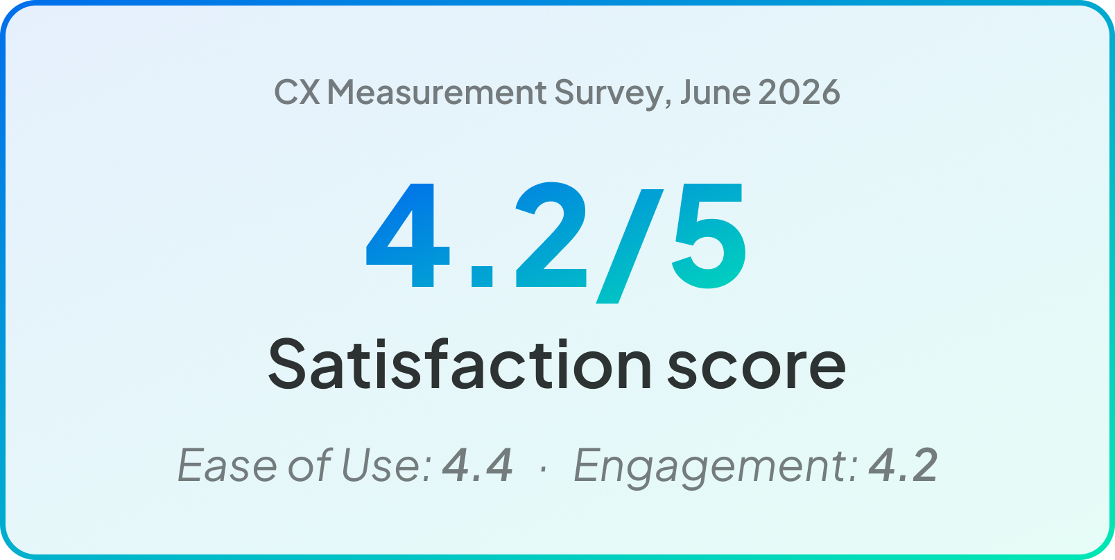
"The community tab has been a genuinely great improvement to this app."
—Unprompted open-ended feedback in CX measurement survey, June 2026
Satisfaction ratings were exceptionally high for a feature at launch. Our initial rollout survey (launched at 50% rollout) showed bet discovery and social validation as the primary draws for usage. Users loved seeing others' parlays. The dominant complaint wasn't bugs: it was the absence of richer social features like comments, reactions, and following.
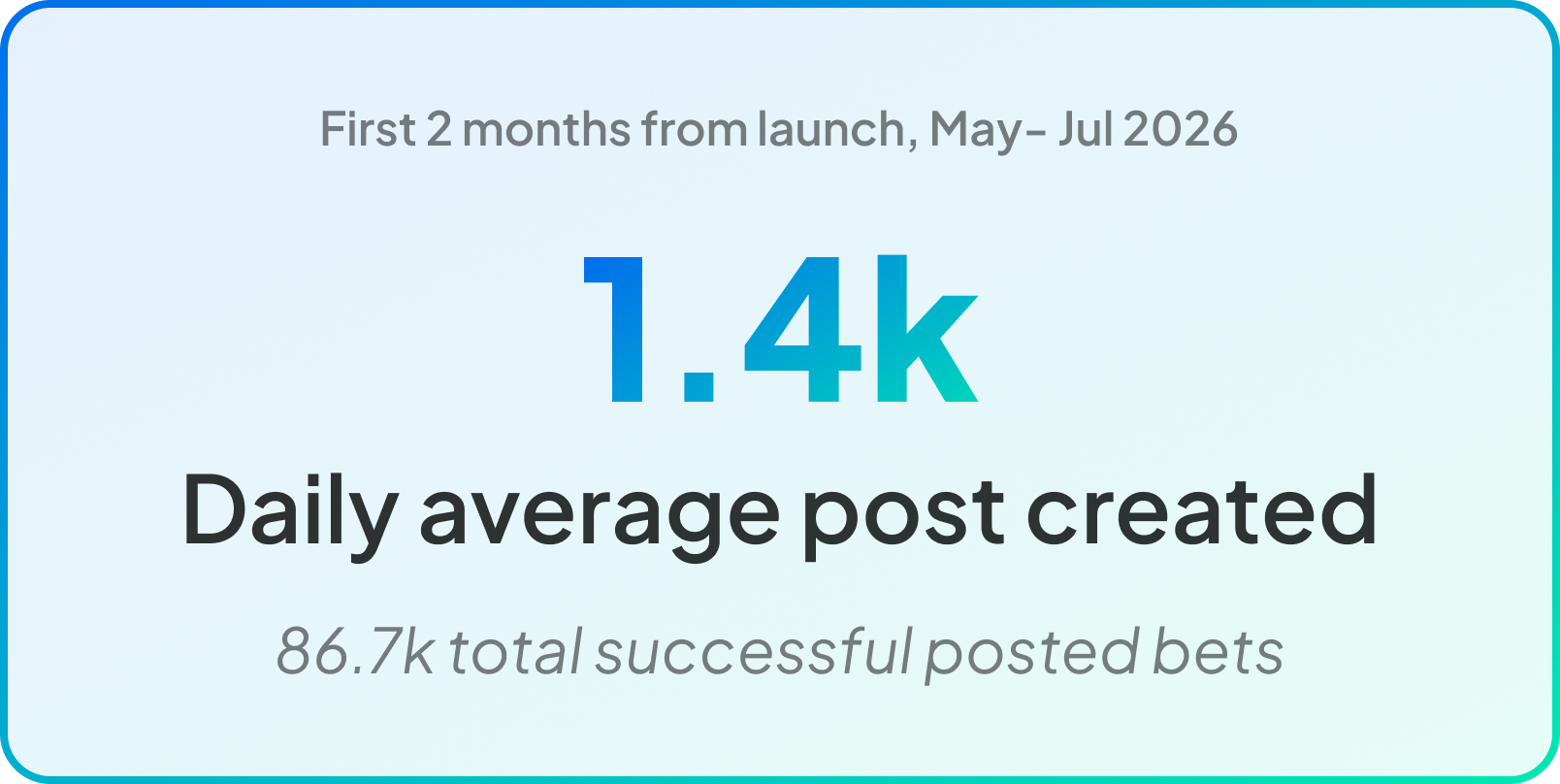
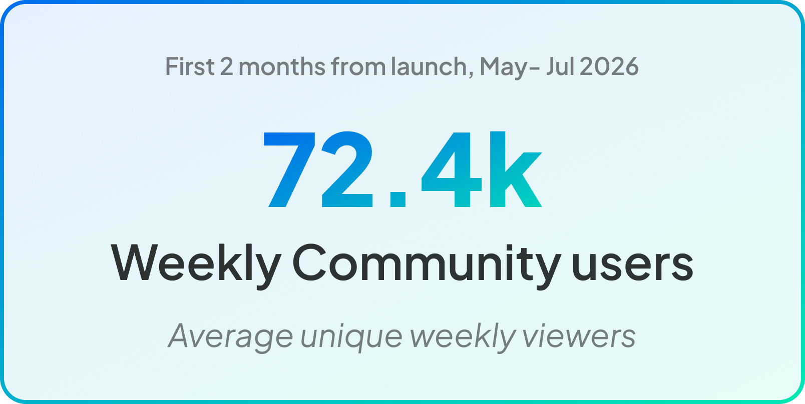
The first two months post full-rollout showed steady, organic usage on both sides of the feed. 72.4k unique weekly viewers established a real consumer base, while 1.4k daily posts meant the feed never felt empty. A viewer opening the Community tab on any given day had over a thousand fresh bets to browse. At 86.7k total posts in two months, creator adoption held consistently with surges at the peak of World Cup. As a new surface within a much larger app, these numbers represent a small slice of overall FanDuel traffic — but that's expected for an MTP. The signal that matters is engagement quality: users who found the feed came back, and users who posted kept posting. That consistency is the foundation a social feature needs before it can scale.
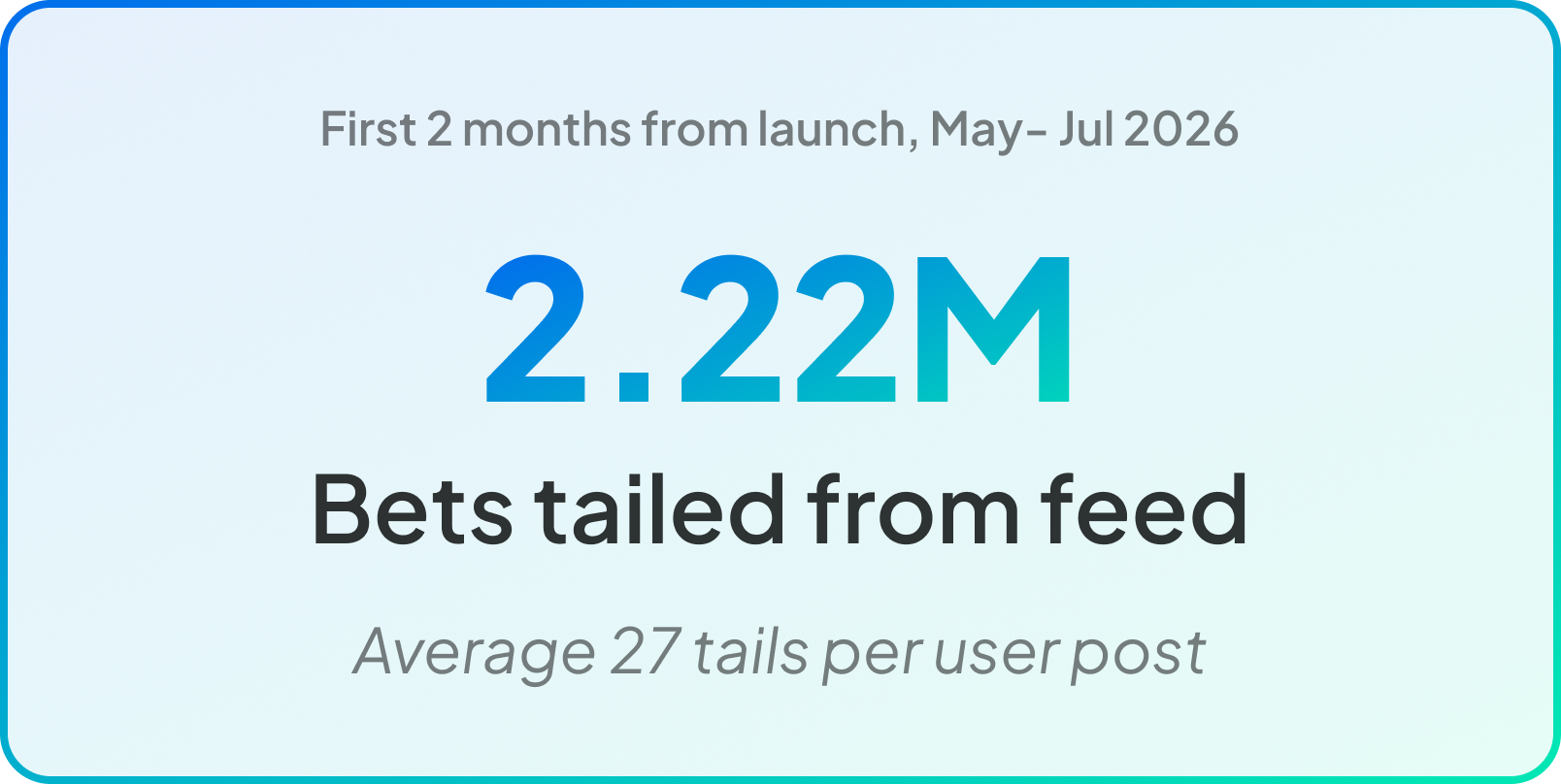
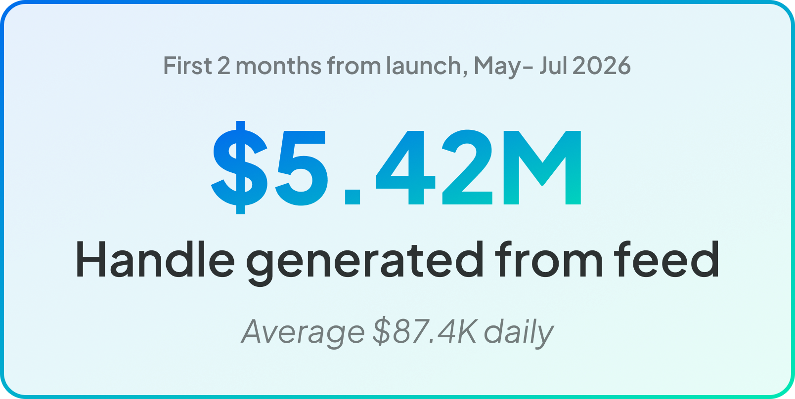
The business case for the feed shows up clearly in the tailing data. 2.22M bets placed directly from the feed over two months — averaging 27 tails per post — means every shared bet wasn't just content, it was a betting prompt that worked. Users weren't just browsing; they were acting. $5.42M in handle generated from feed interactions ($87.4k daily) is direct, attributable revenue from a surface that didn't exist six months prior. For an MTP with no algorithmic ranking, no personalization, and a pop nav entry point, that's a meaningful baseline — and a clear signal that discoverability investment would compound the return.
Reflections
Blue sky design means making consequential calls before you have data
The vision phase wasn't just ideation — it was when the product's character was being set. Decisions about how social, how gamified, how visible this feature should be were being made in that phase, without any user data to anchor them. That phase matters more than it looks like on a project timeline.
Define the behavior before you define the feature
The scope map wasn't just a communication tool — it kept the team from scope creep by grounding every feature conversation in the behavior it was trying to enable. When something got cut, it was because the behavior it served either wasn't load-bearing for the MTP or was already covered another way.